Choosing the Perfect Romabio Paint Color for Our Home.

Good afternoon, Friends!

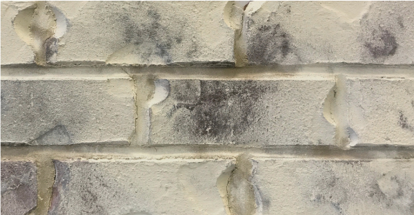
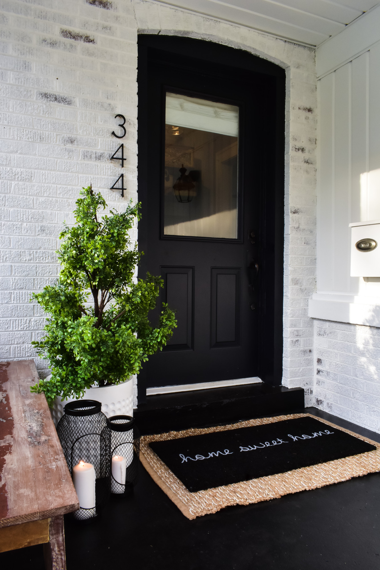
Thank you for stopping by today!! I am so excited to share a company that has literally transformed our home, Romabio! Our home is made of solid brick, which is very beautiful but its natural color just wasn’t for us.  It was dark and didn’t show off our 1920’s bungalow in all its glory.  I started researching ways to brighten our home last summer.  First I thought of painting it white, which was doable but not exactly the look I wanted since I loved the look of chippy- aged paint but I didn’t want to have to wait years to achieve it!  Next, I looked into the German schmear technique and although it was super beautiful I read a lot of reviews that spoke of how time consuming and detail oriented the process was. This is when I stumbled upon the masonry limewash process, specifically Romabio!

Romabio Classico Limewash is unlike traditional paint mainly because you don’t have to fully commit to completely painted brick, and you still get to  achieve that old world imperfectly perfect feel, which I personally love so much.  Whitewashed brick has such a charming Old World feel with a freshly painted look, the best of both worlds! You can update your home while still keeping the warmth of the brick exposed. A win, win in my book!
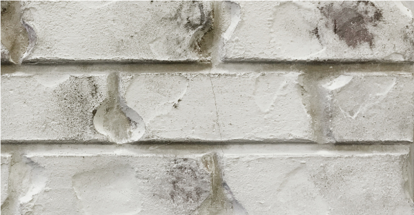
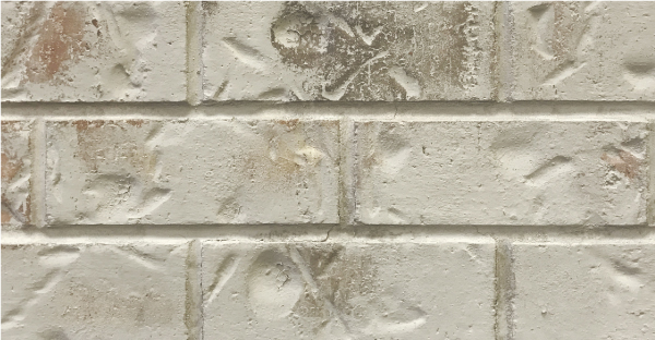
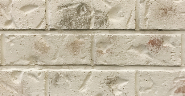
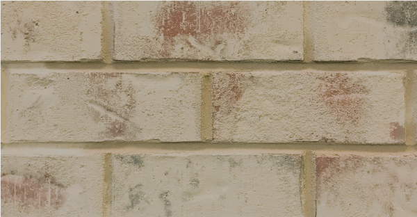
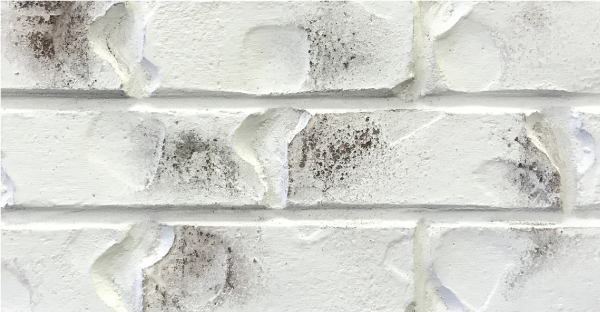
I will be sharing more about the application process in a follow up blog post, but for now I want to answer a question I have gotten asked a lot. What color Romabio Classico Limewash did we use? Since Romabio has a variety of gorgeous colors it wasn’t an easy choice. We had a few samples sent over and tried them out in small patches on our garage. I wasn’t too worried about testing out the colors, since limewash is super easy to tweak, remove or adjust for up to 5 days after its applied. How awesome is that?! Here is a look at all of the limewash options below, can you guess which one we chose?

Avorio White
Avorio White

Bianco White

Bianco White

Cristallo White

Cristallo White

Nube Gray

Nube Gray

Riposo Beige

Riposo Beige

Toscana Beige

Toscana Beige

Tropea Beige

If  you guessed Bianco, well then you were right! I went with the most crisp limewash shade offered and I do not regret it one bit! I love the way the dark brick peeks in from underneath the fresh white.  It gives both an updated and an old look at the same time, like I said before it’s one of the best things about this product! I am thrilled with how it turned out!

Our door was originally white with the dark brick and then I painted it navy.  I never loved the look on our home but I made do with what we had. Once our home was limewashed we painted the door Wrought Iron black by Benjamin Moore. As for the cement steps, they were very stained and dingy so a few years ago we decided to paint them white with cement paint. We kept them this way up until a few weeks ago when we made the leap to paint them with black cement paint. I LOVE the contrast between the white house and the dark entryway! This look by far has been my favorite!
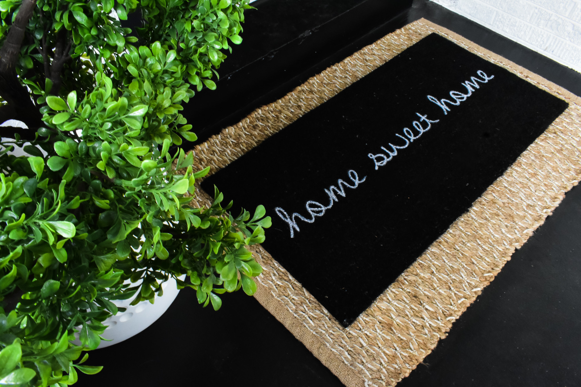
As I was snapping these pictures the sun was bouncing off our home after a rain shower.  Our home seemed to be glowing, and as I snapped away a rainbow formed right next to me! I am telling myself it was a thank you sign from this old bungalow of ours! I just adore how far this old home has come with some imagination and a whole lot of love! (aka work! ha!)

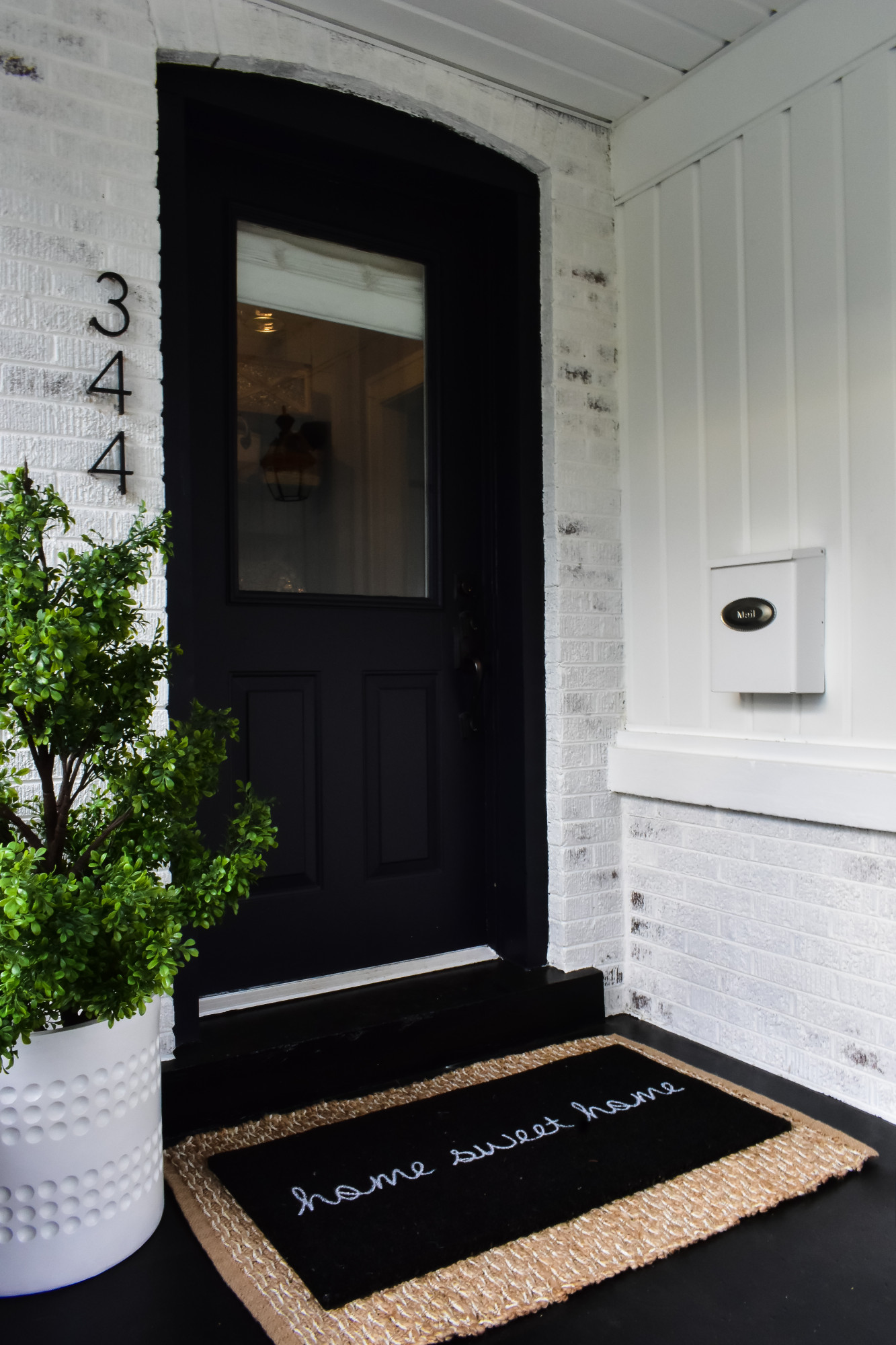
Stay tuned for another blog post coming soon containing all the information about the application process itself! It was such a joy working with Romabio, if you are interested in lime washing anything from the exterior of your home to a fireplace I wouldn’t go anywhere else! And awesome news, you can grab this product at Home Depot! So very convenient!!  Plus, one thing that makes my husband so happy is that the paint is organic and toxin-free.  The helps keep the lawn and plants healthy and gives me peace of mind since when my girls are outside playing they aren’t inhaling any volatile organic compounds that are in nearly every other type of paint.  Make sure to visit their website for additional product info and while you’re there, make sure to say hello to our girls who are pictured roasting marshmallows in front of our freshly lime washed garage last summer! 🙂 As for now, its off to ride bikes and hang enjoy the day! Thanks for stopping by!! xx
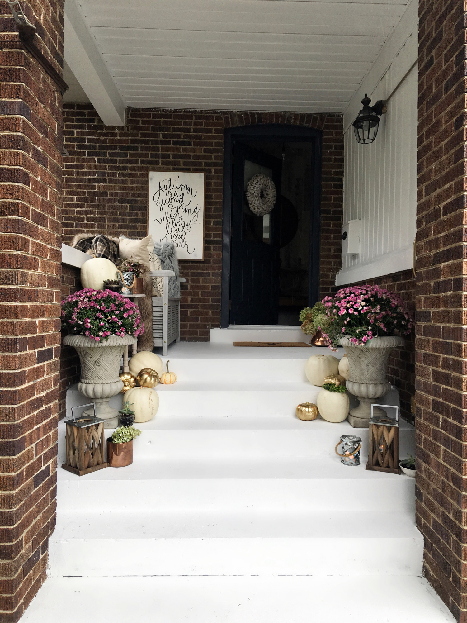
 BEFORE ROMABIO LIMEWASH:
AFTER ROMABIO LIMEWASH:

Designing a Country Outdoor Space with Joss and Main


Good afternoon!!

We are so excited to team up with Joss & Main for their design the outdoors campaign again this year.  This year I knew I wanted to do something different but still something special for one of the most important people in our lives – Grandma!  These past few months have been especially hard after losing Grandpa so I wanted to add some joy and excitement back to their home even though Papa is not physically here anymore.  

Our daughters are extremely close to both sets of grandparents, on my side and my husbands side, and love spending time with them, oh man how I wish Tennessee were closer! But the fact that my mom lives in the area, well an hour away but still driving distance is such a blessing! She lives in the country where yards are large, trees abundant and rosters crow! We love visiting there! Inside, all the grandchildren have a special room but outside, where we tend to spend most all our time in the summer, there wasn’t anything they named their own aside from their ride on John Deer tractor. 😉 So there’s a bit of background about where this idea of Designing Grandma’s Outdoor space stemmed from, the grand kids!

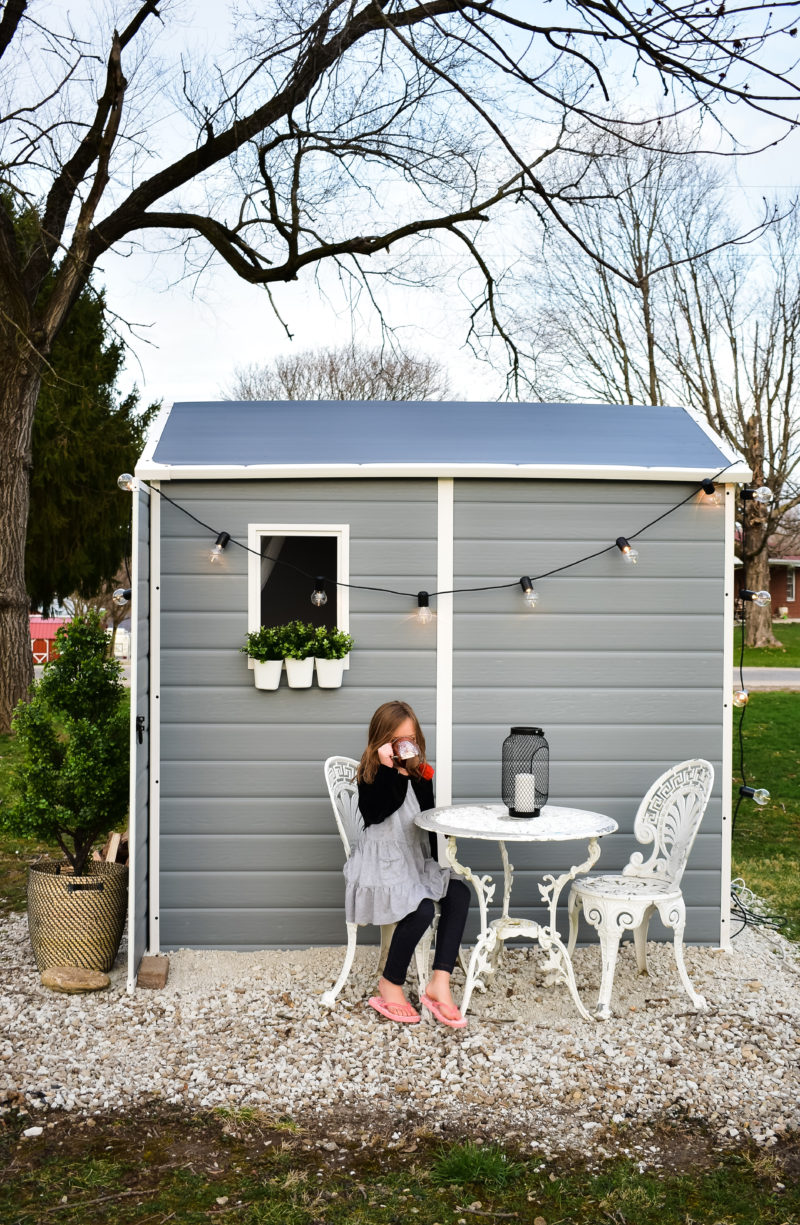
Our girls are really into reading, especially since our soon to be second grader can now read to our youngest, it’s one of their favorite things to do together. And one of my favorite things to witness!  In combination with reading they adore playing outside! I think it’s very important to have the kids spend as much time outdoors as possible. So when I was brainstorming ideas for something special for grandma’s house + reading and the outdoors I came across this shed and I knew exactly what I wanted to do!

Create a cozy reading shed!


This shed is not only durable but it’s also vented so if the girls are out there, they are safe.  I wouldn’t close the door on them but it’s nice for any parent to know they’re safe. (We put logs in front of ours so the doors remained open at all times).  However, it is comforting to know a breeze can circulate through the window and the vented ceiling while they’re being protected from the sun and heat. 

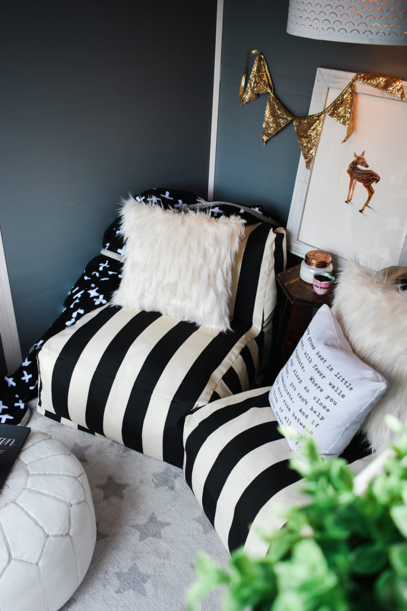
As far as decor goes we wanted the design inside to be based around these amazing “jumpy” chairs as my kids would call them.  They’re super special since they’re functional, pretty and are technically stuffed bean bags which are a huge hit! Bonus, they are indoor/outdoor so both mama and kids feel in love with them since the minute we saw them. And they are perfect for curling up and reading a good book, like the Goldilocks and the Three Bears. 😉  

If your kids aren’t old enough to read yet or they’re not into reading, this will make an awesome playhouse for kids.  It can easily fit a play kitchen for example, and since it’s plastic, the structure won’t rot after a couple of years like wood ones do. Plus the shed is large enough to do many things inside so let your imagination run wild! Mom’s, think “she shed!” 😉

The rest of the decor is a collection of items both old and new!  Another feature I love is how we added a bistro table to the side so they have somewhere to eat a snack (we’re keeping food, drinks and shoes outside since the rug is so light, however, dirty feet are welcome).  

Obviously the shed isn’t wired for electricity so we had to get creative when it came to lighting. To hang the string lights and the hanging pendant we  put the cords through vents in the back of the shed and ran extension cord in between the vent’s slats to the garage. There’s plenty of room to do that and then we just pull the cords in at night when they are done playing. Easy peasy! 

At the end of the day we can use the shed’s sturdy lock to keep everything safe and sound until the next time the girls and us visit grandma’s.  But lets admit it, when the grandkids aren’t visiting I imagine this is a great place for gma to enjoy a cup of coffee (or a glass of wine!) and a good book, too!  But shh, don’t tell the girls!


If your kids aren’t old enough to read yet or they’re not into reading, this will make an excellent she-shed for an adult or a playhouse for kids.  It can easily fit a play kitchen for example. The shed is large enough to do many things inside so let your imagination run wild! 


Now here’s the exciting for you!  Joss & Main are hosting a Design The Outdoors Sale!  They are inviting followers to share imagery of their own outdoor space and tagging @jossandmain and #DesignTheOutdoors for a chance to win a $1,000 gift card to Joss & Main!!!!  So start posting away and make sure to tag @jossandmain for your chance to win. Best of luck I can’t wait to see what you do! 🙂


Click image for link to this amazing shed!


These chairs are sooo comfy. Click to link!

Mercur[izing] Glass

Hi friends!

Thank you so much for stopping by today! This tutorial has been much anticipated by many of you.  Sorry it has taken some time to get it out! Lately I’ve been working on a lot of projects – both professional and personal – that I’ve had to work through.  With everything going on lately you don’t know how many times I’ve tried to write this post.  I never really understood how hard it was going to be to watch someone so close to you suffer and then ultimately lose them.  With my family, friends, and God-winks 😉 and the peace of knowing that dad’s okay I’m now so happy to get this out to you.

On that note, I also want to add in that my wonderful husband, Rob, has offered to help write the tutorials on the projects that I come up with and he executes. 😉   In all reality I’m the dreamer and he’s the one who makes my dreams come true.  I think it’s so funny, since I’ve first spoken about KV I’ve always used the pronoun “we” and that is because I could not do any of this without my other half.  And really that’s what it’s all about – what I’ve been trying to portray since I first started up.  Home is about family, about friends, and about the times shared together.

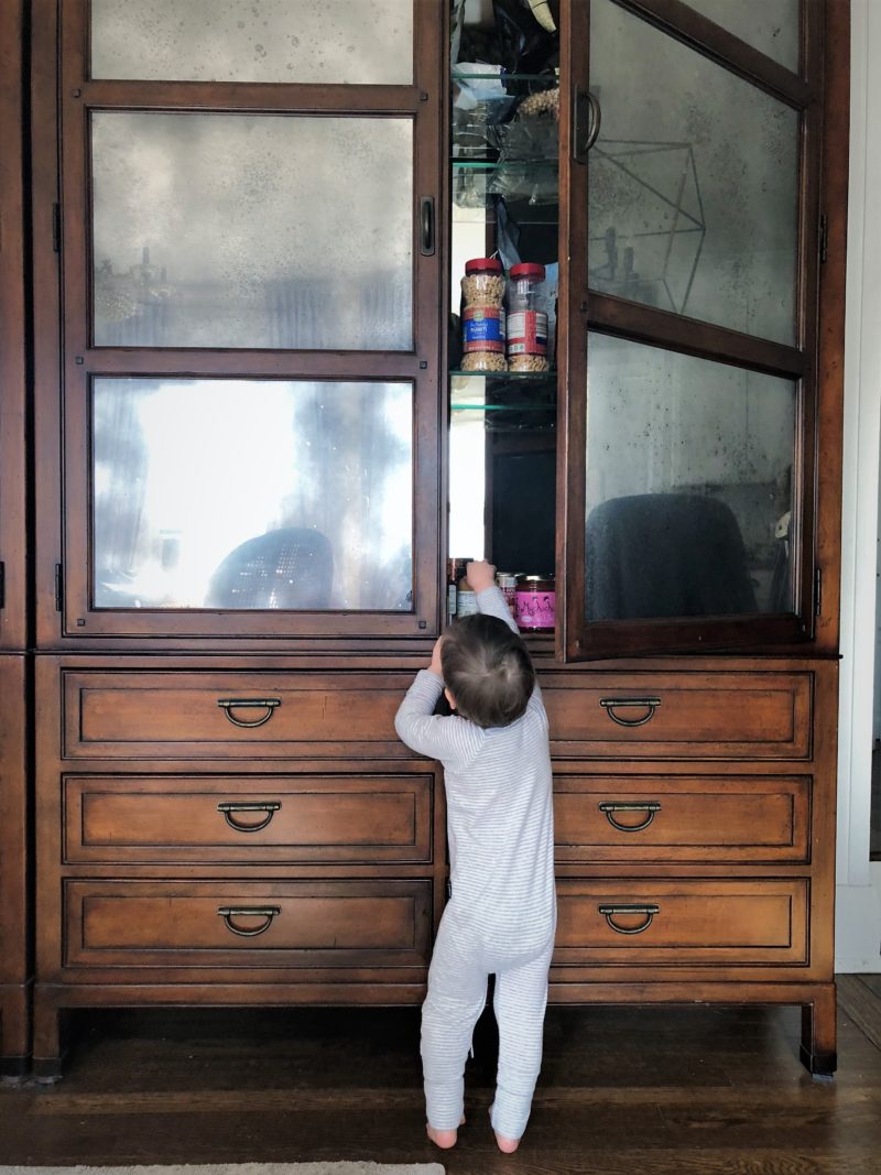
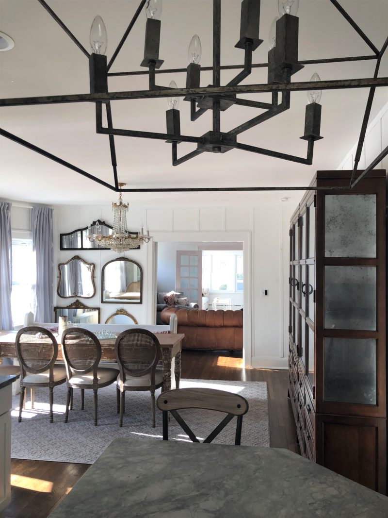
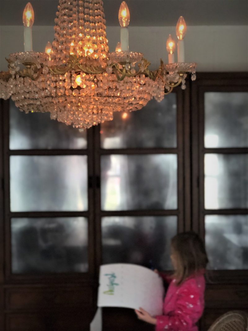
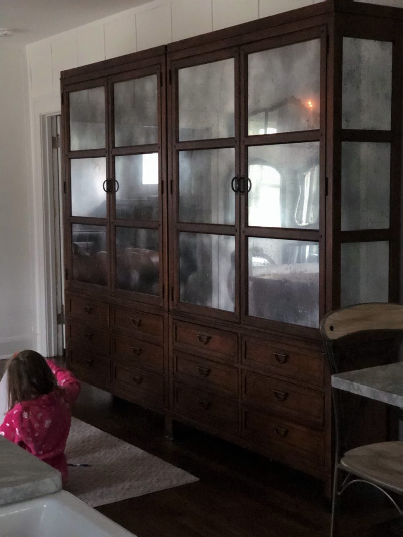
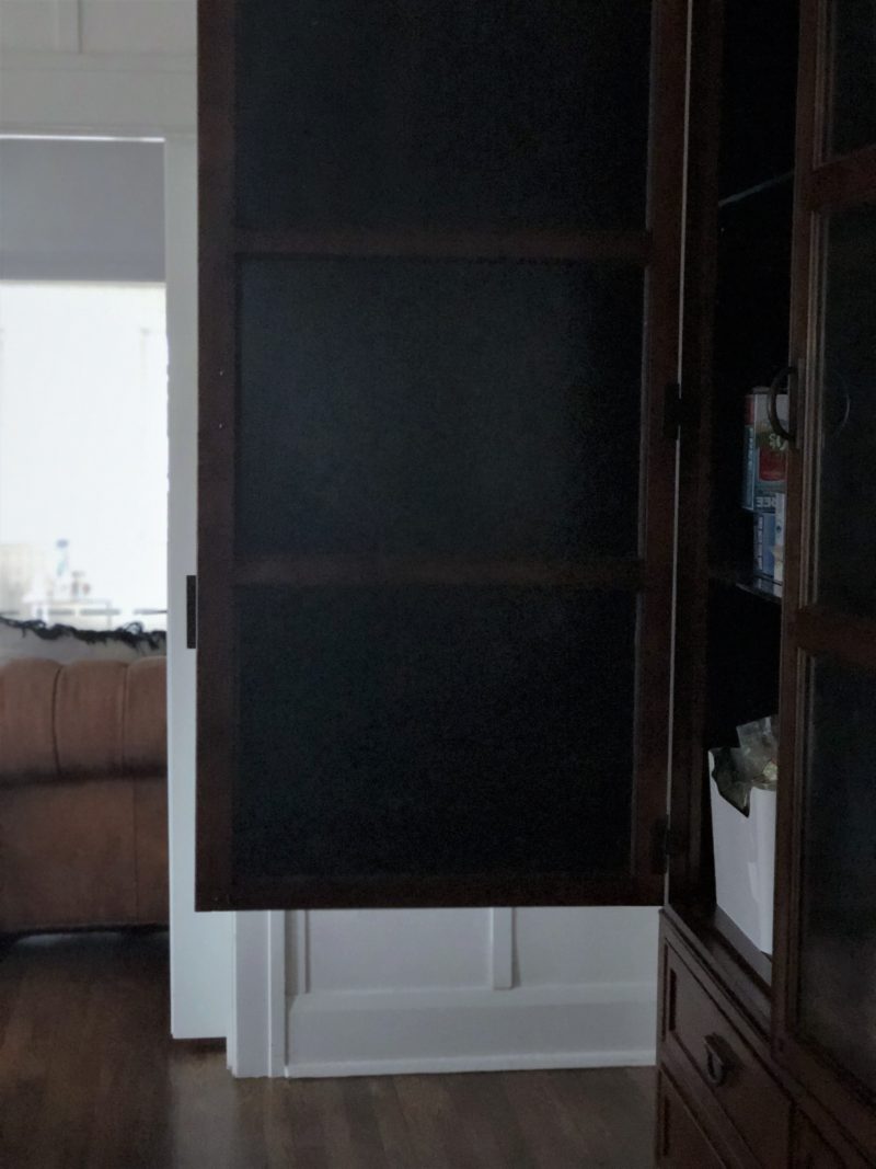
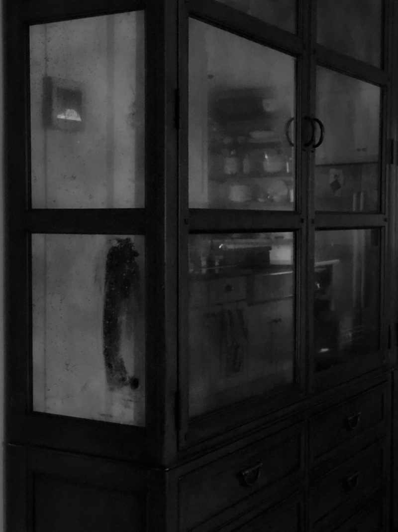
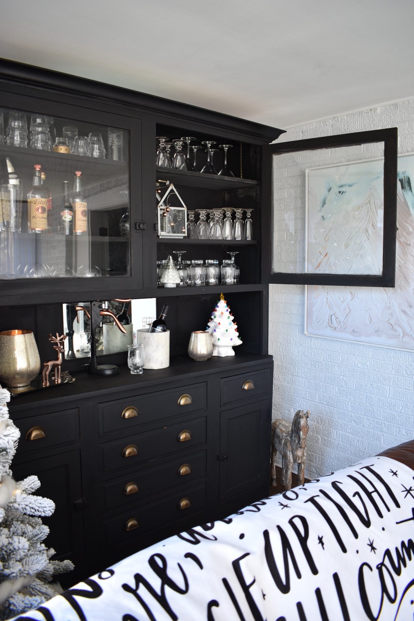
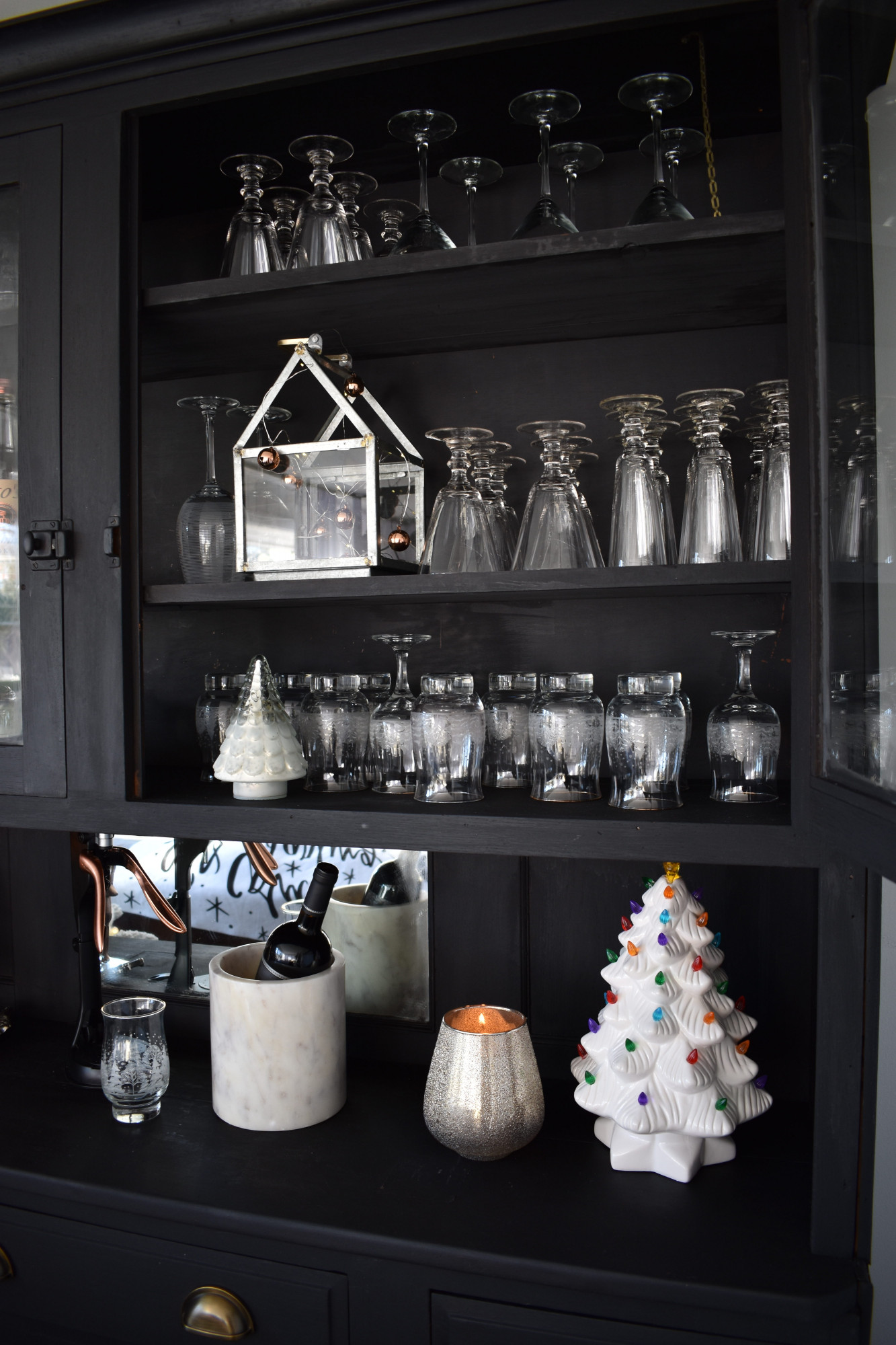
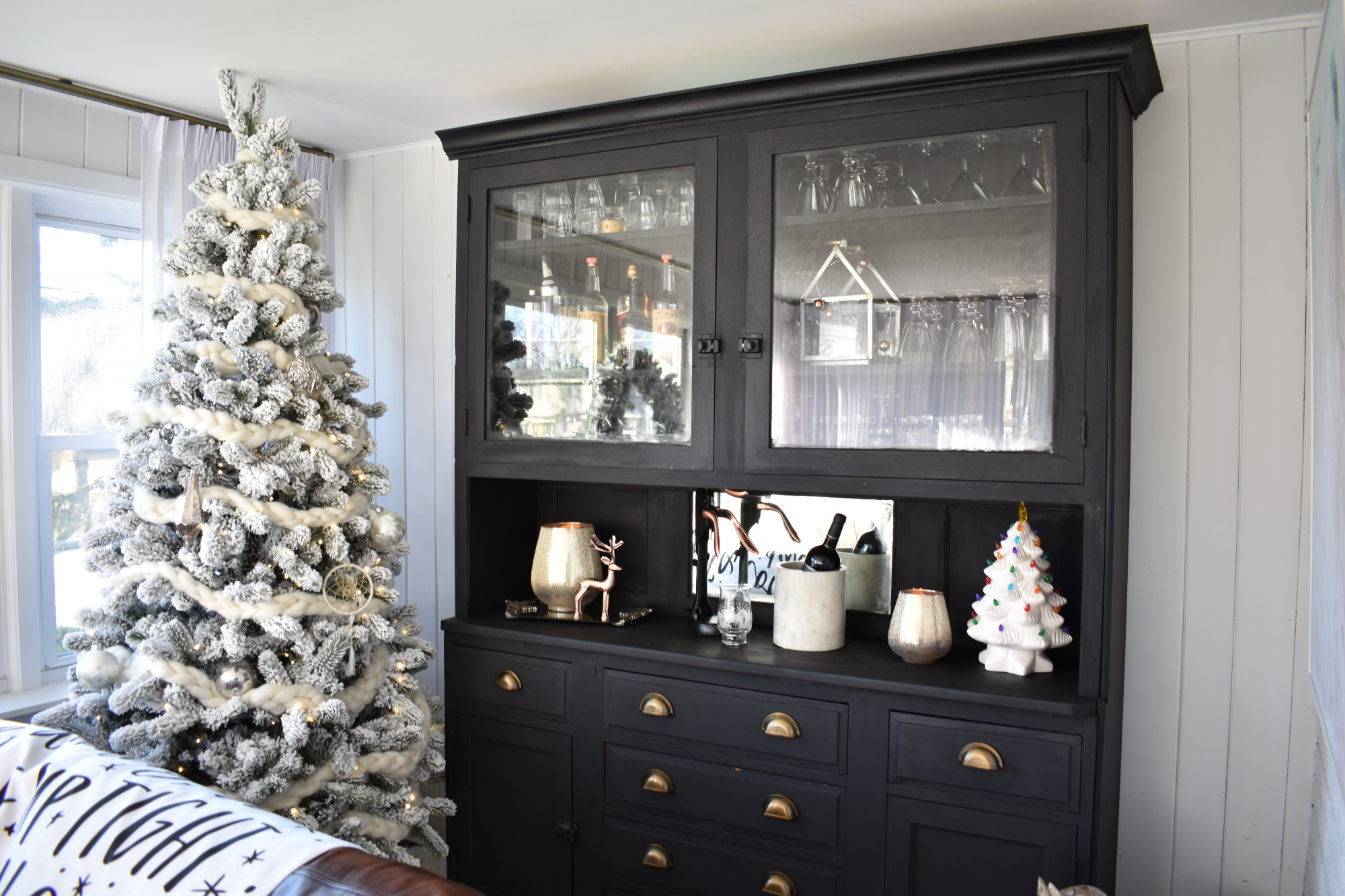
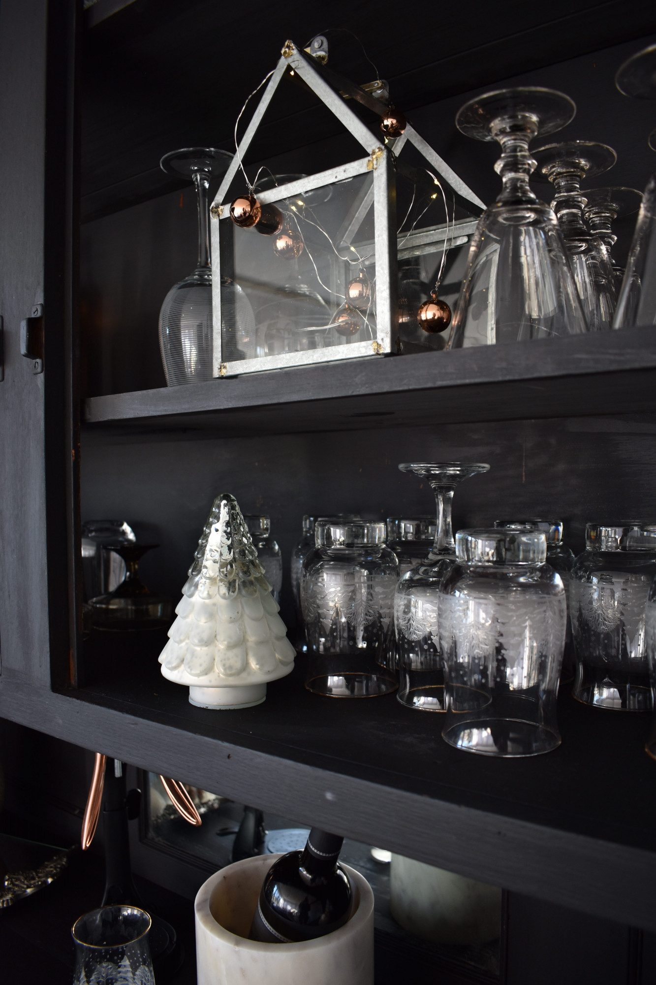
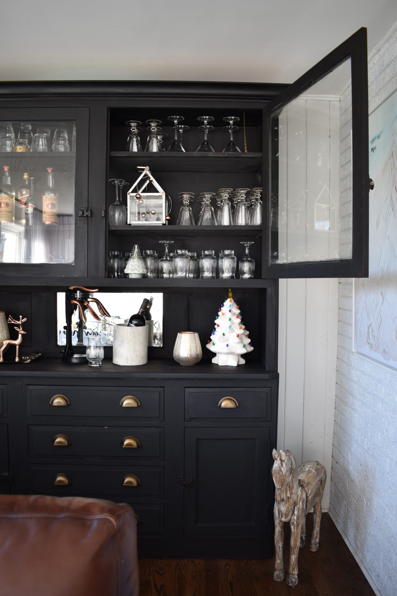
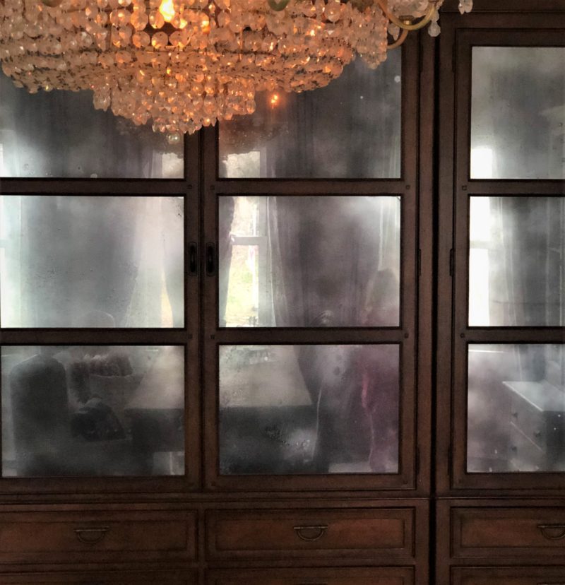
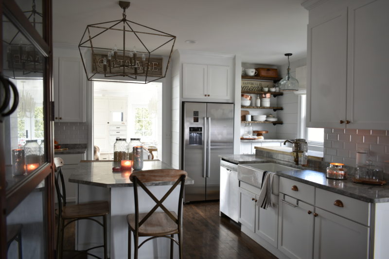
Let me give you a little bit of background about these cabinets…   A few years ago we teamed up with Home Goods on a tour and I chose these massive and amazing cabinets that take up our entire wall.  It may look like one unit but it’s actually two.  I’ve loved them since the second I saw them.  One was slightly damaged and we even had to replace some of the glass panels.  All we had to do is take a panel that was intact to Ace Hardware and they whipped up a few panels that were exact matches.  The reason I’m writing this, if you see a beautiful piece of furniture that’s damaged, it usually can be easily fixed so don’t be scared away.  Home Goods even discounted the cabinet and the cost of replacing the panels was less than the savings we got!  Okay, back the background of these guys.  I’m not really into knickknacks and filling these cabinets would have taken a ton of decorating.  It just never looked right.  There was never a moment that I was actually pleased with the way it looked b\c the shelves were so high and deep so it just didn’t work with our home since we have a lot of other things going on.  And pair with that with the fact that our kitchen cabinets were always overflowing, so it dawned on me to convert these cabinets into a pantry (which we needed) because the last thing I wanted to see was macaroni labels as we ate dinner through the original clear glass.  And since I’ve always loved the look of actual cabinets that have that mercury glass antique look, the fact that we could achieve the same look with out buying new cabinets sold me.

As you read on there’s one thing that about this tutorial of ours (that you’re about to read) that none of the other tutorials I researched had.  And it’s definitely a vital piece…

So without further ado, here’s the man behind the magic (and the scenes…)

_______________________________________________________________________________________

Hey World!

Rob here. Helping SQ out with the blog.

What a stud.

I want to dedicate this post to all those that want credit for accomplishing something cool but really, really, really hate working hard for it.  To those scared of power tools, failure, or even giving too much effort.  And lastly, to those who are simply really lazy and can think of at least a 1,000 different excuses for not attempting any sort of home project.

If you’re one of those people just know first that damn it, I respect you because I would be one of you if SQ didn’t ever so slightly persuade me to “help me real fast”.  Second, if at any time in your life you actually think there’s a chance you’ll ever want do a house project but know that there’s a 99.5% chance you’ll quit at the slightest hint of perspiration, this is your project.  Mercur[izing] (word?  Probs not) glass requires a 2/10 on the effort scale – more than opening and drinking a beer, but less than making a PBJ to enjoy with it.  BUT, no one else really knows how to do it so you’ll get way too much credit for very little effort.  So grab that beer my prior sentence reminded you that you wanted and let’s freaking GO!

Material:

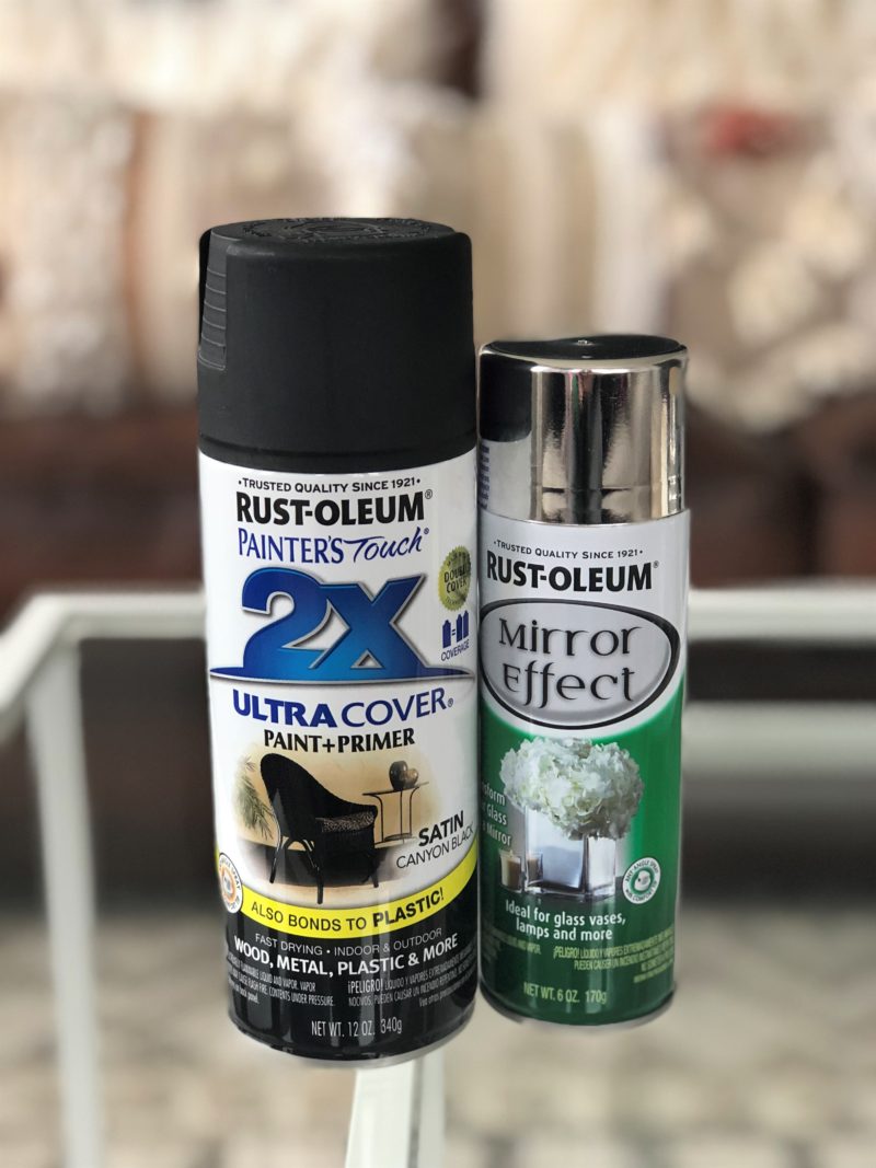
1) Black Spray Paint ONLY IF you’re painting a sheet of glass.  This isn’t needed if you’re painting a standard mirror or something.

a) We used matted but it doesn’t really matter

2) Mirror spray paint.  The cans were always super small in both Menard’s and Home Depot.  No idea why.

3) White Vinegar.  Buy the smallest bottle you can unless you use if for cooking.  This’ll be mixed with tap water.

4) Spray Bottle

We went through four cans of the small mirror paint bottle and two cans of black for our 24 glass panes which were about 1.5’X2′  Or if you’re like SQ, they were a little bit bigger than a typical computer monitor (which includes both the screen and the frame around it, but not the base).

Step 1: (If applicable)  This is the vital step that is missing in so many other tutorials!!!  😉

If it’s a sheet of glass like mine was (i.e. not attached to anything) take out whatever you’re painting.  Ours piece of furniture had the glass in its doors, so I just popped them out.  Lay those sheets down on a surface that you don’t care about because it will be painted.  Once that’s done, spray paint it black.  There are instructions on the bottle but really it’s shake for five minutes (you’ll hear a ball inside the can) (also, if you’re lazy feel free to knock of three minutes of shaking.  It’s fine.)  and spray from two feet away.  Do two layers.  Drink a beer between layers to know you’ve given it around 10 minutes to dry.  This step is necessary for transparent glass panes without backing in order to achieve the mirrored look.  Furniture pieces or mirrors that you’re mercur[izing] already have this backing.

Here’s what’ll it look like if you don’t spray the back black.  Obs way too transparent to achieve the mercury look.

Also, we attempted to display the benefits of painting the back black but instead of spray painting it black we only used a marker for this glass pane.  This is an example of what not to do.

Step 2:

After the second layer of black is dry flip the sheet of glass over.  Or if you’re painting a mirror or something tape off whatever you don’t want painted.  If you’re painting a mirrored dresser (SQ used to have one so I know that they’re out there), I’d take off the knobs if you don’t want them mirror(y) looking.  So same deal as the black spray paint above.  Shake, two feet away, and two coats.  Boom done.  Drink another beer.

Step 3:

This is the last and hardest step.  It involves mixing and more spraying.  So two steps in one.  I may have lost anyone super lazy here but honestly the mixing isn’t hard and cannot be messed up.  In a spray bottle mix 1/4 cup of water and 1/4 cup of vinegar.  Don’t measure.  If it’s slightly off in terms of 1:1 ratio it doesn’t matter.   And feel free to pour water and vinegar directly into the spray bottle to mix in there.  It works just fine doing it that way.

Once mixed spray a mist, or spray a stream, or both – everything looks good – onto the mirror painted side.  One, two, or three sprays on each panel or section of the piece will do just fine.  Wait 10 minutes and the paint will have a mercury look.

That’s it.  You’ve mercur[ized] your glass.  Reinstall it into your cabinet or tear the tape off.  You’re amazing.  You accomplished a home project.  E-High Five from me to you.

Note 1: never use Windex or anything to clean them.  The paint does come off.

Note 2: You may think to yourself, “wow that’s crappy that the mercury look just comes off like that”, but know that SQ priced out mercur[izing] the glass professionally and it ranged in price from $600 – $2,000.  That’s just ridiculous when the cost of all the spray paint needed is under $10.  Yea professionally done it probably wouldn’t wipe off as easily but just repaint or ignore it.  (We’ve been ignoring our cleaning mix up).  And honestly, SQ is a perfectionist who is making a career out of interior design and she cannot tell a difference in the look between our method and the $1,000 dollar approach.

That is all for today.  Thanks for reading along and if you try this, please let us know how it turned out.  Also, please let us know if it is as easy for y’all as I think it is.
True Tuesday’s

I’m a little bit embarrassed for you to read what I am about to write. Because as an influencer I am so very guilty of several components of what’s to follow. But lately I am feeling tired. And by lately, I would say this past year especially. Tired in all forms of the word, physically and emotionally… you name it. I know for a fact I am my own worst critic and that I am also a perfectionist to a fault, and perhaps you may be too? Perhaps you’re feeling the same itch for change that I am regardless if you’re an influencer or not.

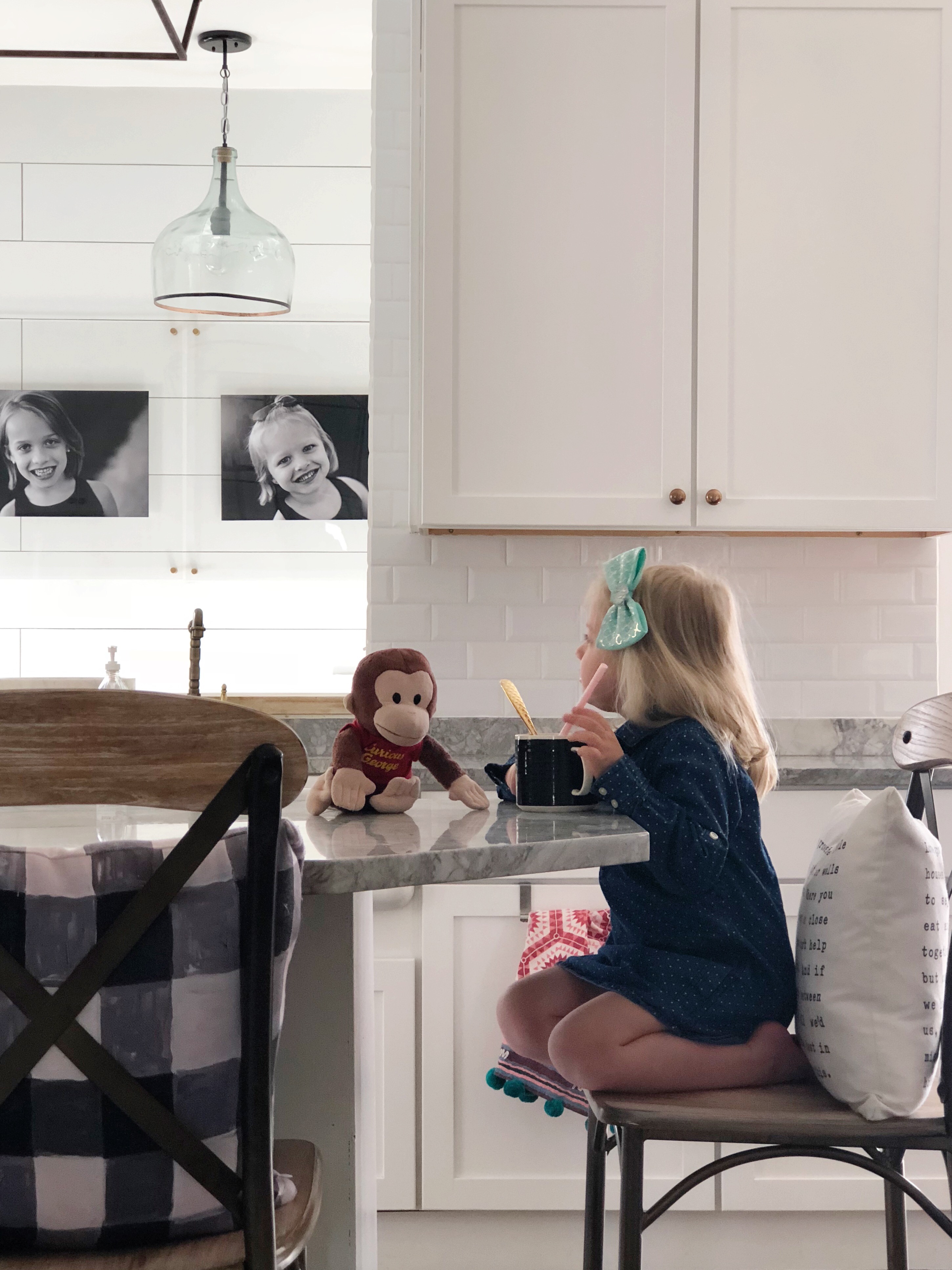
Something hit me like a ton of bricks this morning. I had just returned from bringing my oldest daughter to school, poured my first cup of coffee, when my sweet troll pj wearing, Curious George cuddling, bed head sporting little girl shuffled in and asked me for hot cocoa. (Yup, it’s cold enough here for hot cocoa still! grrr.)

I said yes, and got her all set up. Extra marshmallows and sugary chocolate are always a great idea for breakfast right? 😉

As she sat there, helping Curious George add the marshmallows into her mug I couldn’t help but take the sweet moment in. I watched her for a few minutes and then like most parents these days do, I grabbed my phone and snapped a picture of it. I captured a moment I always wanted to remember, I was doing what I do as a mother. It was innocent, it wasn’t fancy, it was imperfectly perfect and it was ours. It was our moment and I never want to forget it.

She finished her hot cocoa and proceeded to get down and go play when I said, “wait one second babe!” And ran upstairs. I returned with a hair brush, a dress, and a headband. Got her all dolled up and then asked her to finish what was left at the bottom of her mug so I could take a picture. This is where the line gets grey. I didn’t do anything wrong, per se, but what happened is that I didn’t capture life as is for you. I captured what I thought you would want to see.

I flipped through the photos and you know what? The original snap is the one that spoke to my heart most. The one that was natural and full of life. It stood out loud and clear. Something you can’t fake in a reproduction. It’s also the one that sparked this whole entire post. And guess what? I think it’s even more beautiful, Target pjs and all.

So here it is, me pouring my heart out on the blog since the caption I wrote ended up being way too long for Instagram’s limits.

Let me back track a minute and say this, I view Kindred Vintage as a place to share inspiration, ideas, home projects, happy moments, designs etc. and for a long time I chose to keep it that way plain and simple. A place that was strictly that, one where I never showed my face, my family, my life. But as I grew not only on social media but as a person, my heart started to pull me in a different direction. I couldn’t show the life and the love I had for our home without showing the entire reason it has love to begin with, my family. To everyone else a picture is just a kitchen, or a bedroom, but to me it sometimes required moving my children from that kitchen table to snap a “perfect shot”, which I would upload, post and then look at, and feel a sense of emptiness. Because to me, it looked so much warmer the way it was before I intervened.

Now here is the other thing, the other side of the coin, which goes right along with my over thinking/over analyzing self. I love to show our home on Instagram along the lines of what you would see if you were to sit down and flip open a book, or a magazine. Pretty and put together. Of course I have loads of laundry to do and dishes in the sink, but so does everyone. We’re ALL human and we ALL have messes. I just don’t want to advertise mine, I mean frankly it stresses me out to have clutter so why would I want you to be stressed about it as well?

So my goal? To not overthink every single thing. To enjoy. Enjoy my surroundings and share a mix of the pretty and the staged but also to not shy away from sharing our little portion of the world just as it is.

On that note, I am craving a bit more natural and relaxed. Not only for me but for the culture of social media. So I’ve been questioning myself asking, “Well, Susan how are you going to do that and play your part?” How am I going to mesh together all the things on my heart? The real and gritty but still pretty and inspirational and informative, the heart of our home which is our family, the projects we do and sharing the products we love, how can I mix all these things together?

So I challenged myself and this is what I’ve come up with. I need to take it easier on myself. I need to be kinder to myself. I need to gain back the naive passion I had three years ago when I started KV and had no clue what I was doing. I need to share the imperfect photos of our home and our life, as well as the picture perfect ones that are published in magazines. I need to let YOU know I struggle too. I am NOT perfect. Neither is my home. Etc.
My wonderful husband and I have worked so hard to get where we are. It wasn’t all a stress free ride like it may have occurred to be on Instagram. And if you have ever looked at my feed and thought to yourself, “wow, she’s got it all together!” Well, I’m sorry, because I don’t. But I do my best, just like I’m sure you do, and we’ll, that’s all we can ask of ourselves.
In light of this, I will be starting a little hashtag that I would love to share with you. One that I would love for you to share with me as well. I decided to name it #kindredvintagetruetuesday. I will be participating via Instagram stories by sharing intimate snaps of our home in its TRUE current state every Tuesday, starting today. Whether its Insta worthy or not. 🙂 Just touches of our home and the things happening within it that day. Basically, I will be sharing the little messy breadcrumbs of our home in the form of photographs. Photographs that I would have naturally tweaked but didn’t.  We look forward to sharing a little more of our home and heart with you each week, and I sincerely look forward to seeing and sharing yours.

Much love and many hugs to each one of you.

KV Privacy Fence

This is Rob here taking over Susie Q’s blog.  Apologies in advance for the less than professional picture quality.  She’s the talented one in that regard.  But I posted a few of her pics below so keep reading… 🙂

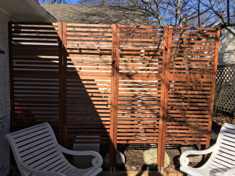
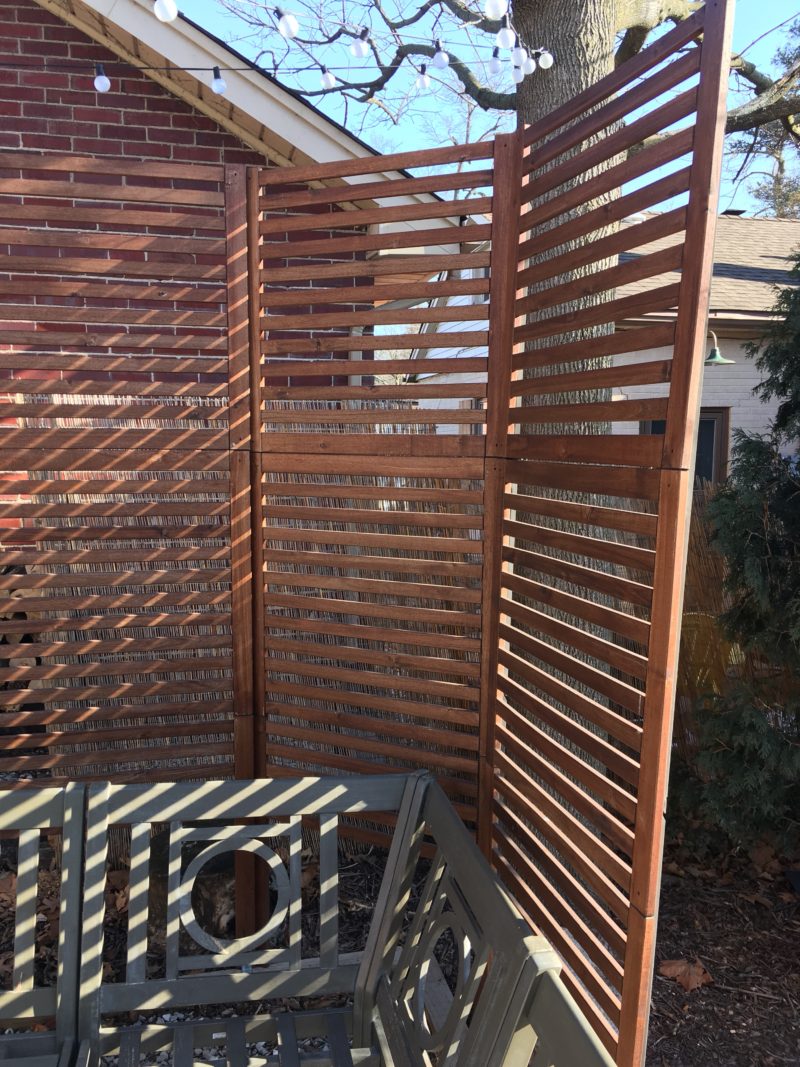
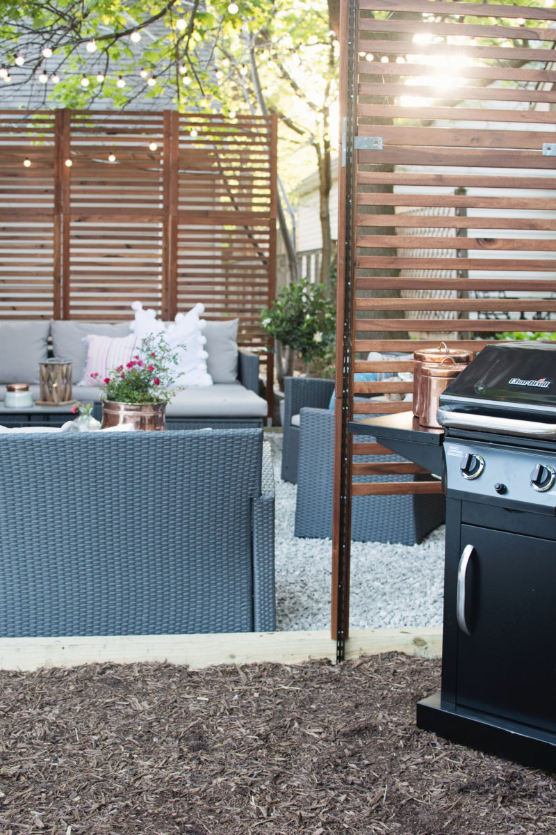
Susan told me that she heard back from y’all that a lot of you would like to learn how we put together the privacy fence in our backyard.   The secret though is that the privacy fence is not an actual fence at all. It is an amalgamation of Ikea’s Applaro Wall Panels, Home Depot’s closet rods (called ShelfTrack), wooden 4X4s that our gardener used to outline the patio (conveniently he secured them into the ground), and about 1,000 screws.


Amalgamation > Fence


The process began by laying the Applaro panels on a table.  (I wish I had a picture of this.)  Ikea originally set the height of its panels to be about six feet; however, we wanted a taller wall to provide more privacy.  So for each section width (the long wall on the west side of the patio has four sections and the cornered side has three) we combined one and a half sets of the original Applaro panels.  (Ikea sells the wall panels in two parts, a top and bottom piece. We had to use two top pieces stacked on top of the bottom piece).

The slight tilt was intentional I promise


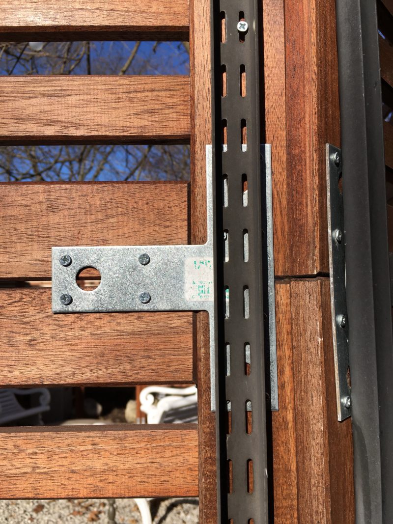
Once the panels were laid out on a table I screwed in various pieces of builders hardware/brackets to fasten the panels together.  Here is a link to some examples of what I used.  IMPORTANT: I recommend using small screws or to drill a hole prior to using the screws so the Ikea boards don’t splinter.  I chose to use a lot of small screws rather than drill due to the high number of screws going in and the fact that the Applaro panels are at most an inch thick.  With my luck I’d end up drilling a hole through the panel.

Small screws


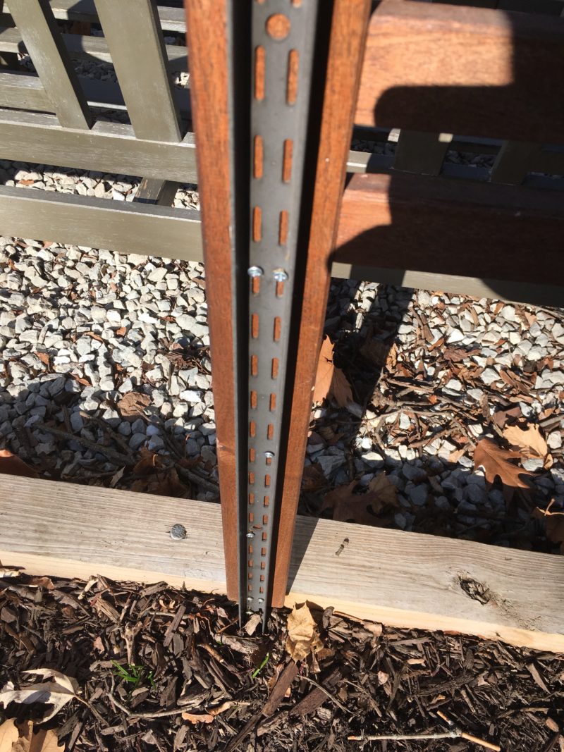
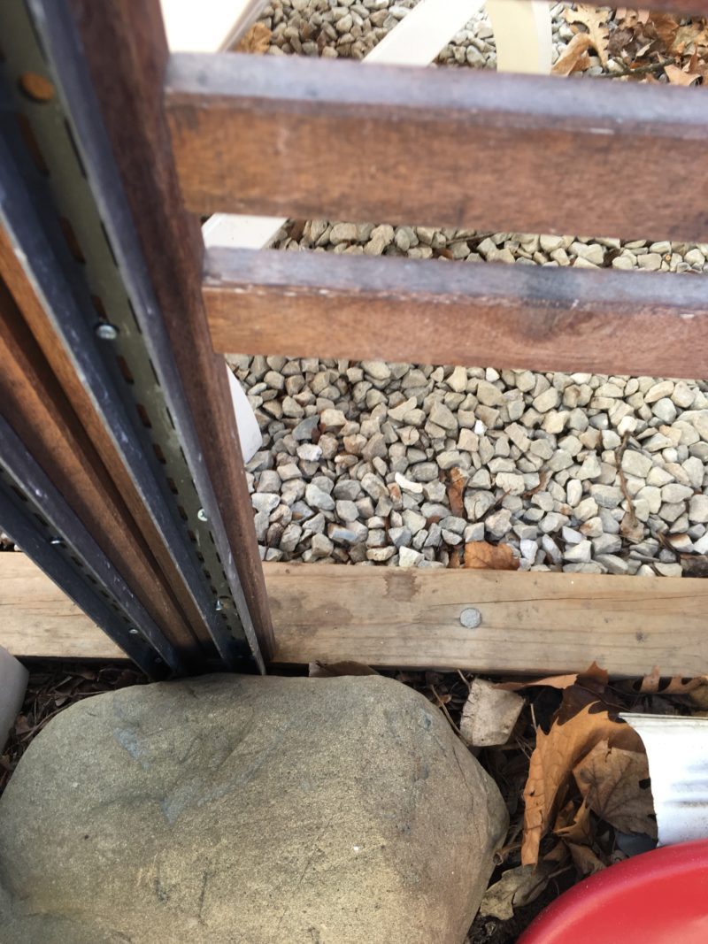
After I had fastened 1.5 pieces together to make an eight foot tall section I screwed the closet rods into the back.  I found the aluminum rods that you may see used people’s closets to support the wire shelves worked really well.  They were tall enough (roughly 8 ft), rigid, already had holes in them, and came in brown to match the wood.  The trick was that I extended about two of the eight feet of rod passed the legs of the bottom panel. This allowed me to use them as support stakes into the ground.


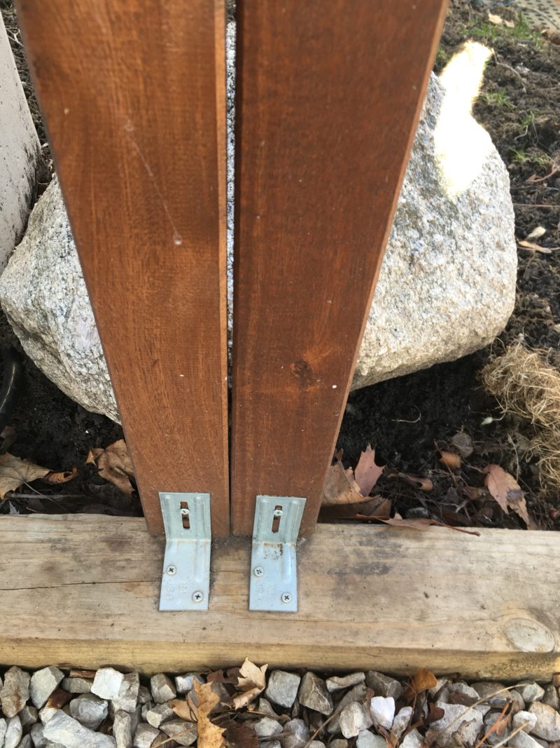
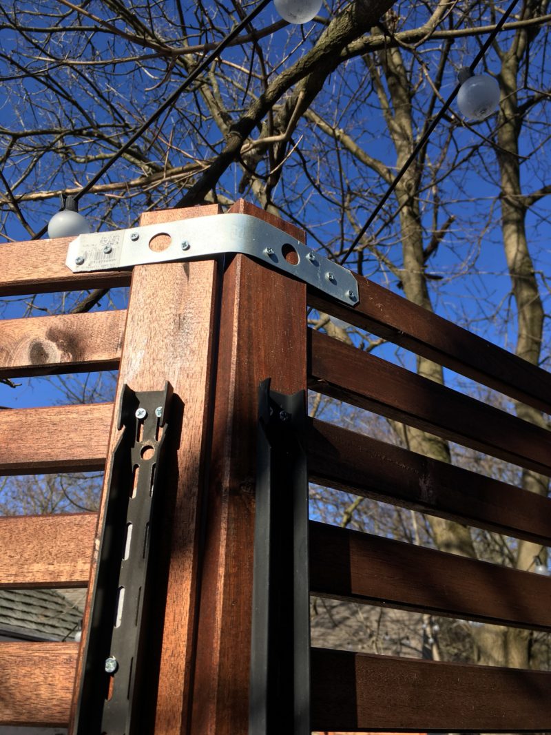
Once I had finished connecting seven sections together I installed them in place.  To do this I shoved the two feet of closet rod into the ground right up against the 4X4 wooden beam divider that was installed by the landscapers who put in our limestone floor.  L-brackets were installed on the front side (the side people see), on the back side I screwed in the closet rods into the 4X4’s, and lastly (and probably excessively) I pressed heavy rocks as extra support against most of the rods.  Really lastly, as I installed each piece I fastened them together using metal brackets.

Front side L brackets
Backside stakes and heavy rocks
Fastened together. I bent this piece myself.

So I’m not a carpenter nor do I have any experience in construction but so far these two walls have survived two years of Chicago weather.  It definitely helps that wind can blow through the slats so we don’t have to worry about them being blown over.

To date we’ve really enjoyed the added privacy and beautification these walls provide.  We haven’t tried hanging flowers or anything yet from them but if we did, I’m mostly sure that they wouldn’t spontaneously combust.

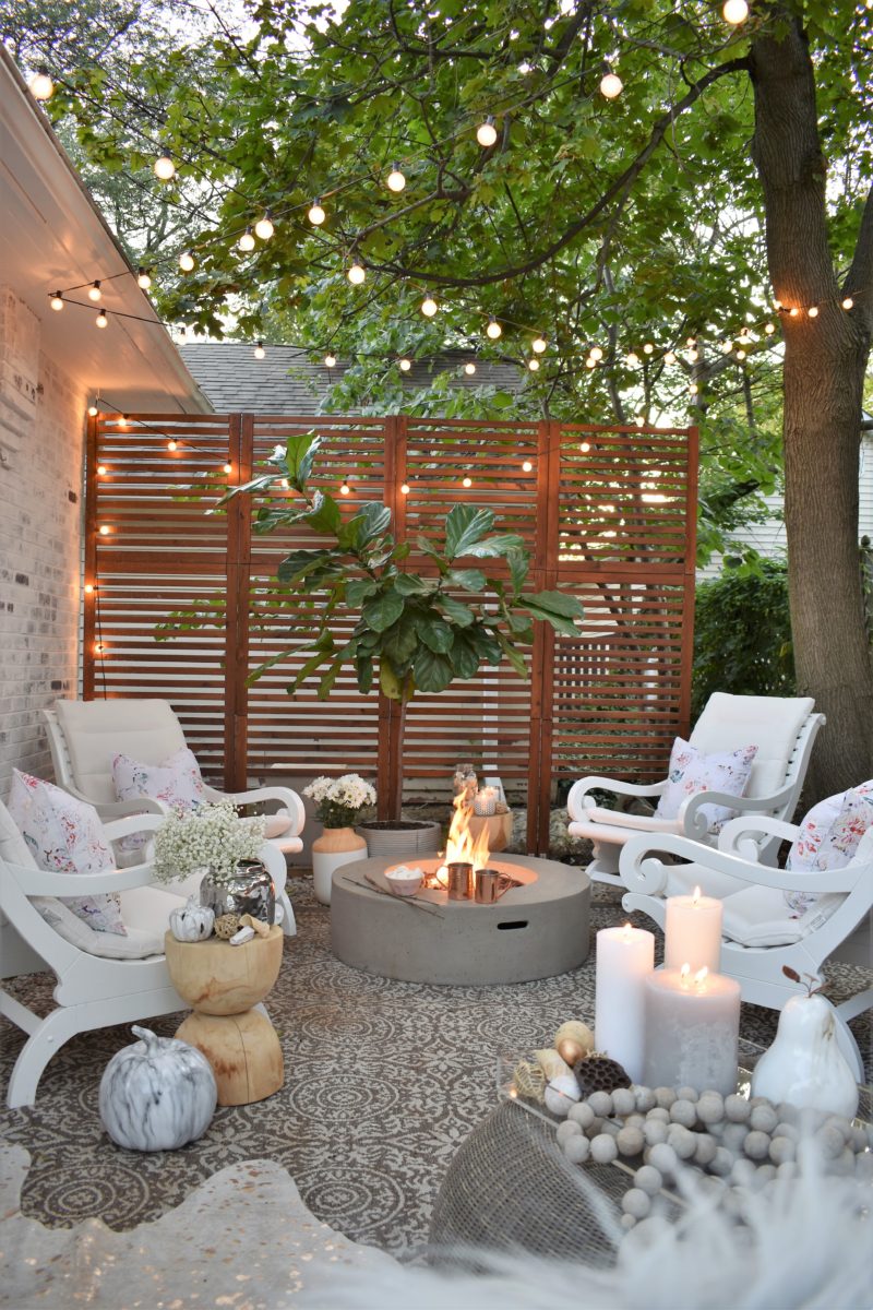
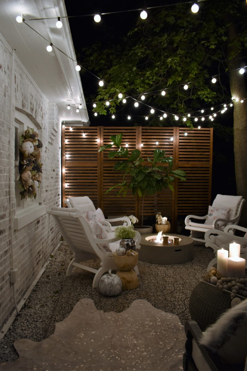
And here are a few of the styled pictures that Susan would appreciate me including.  🙂

Told you she was the talented one.


This tree was heavy so I’m including two pictures of it.


IMO, focus should have been on the L brackets… 🙂


Check out the closet rod cameo!


And lastly, our backyard before privacy fences.


Our cabinet makeover, using Miss Mustard Seed’s Milk Paint

Hey World!

Rob here.  SQ’s favorite hubby and her part-time male model.  She asked me to write about the application process of milk paint since I’ve helped her with several milk painted pieces.  As someone who has worked with many different brands and types of paints, from water-based to oils, I have to write that milk paint is definitely the easiest paint I’ve ever worked with.

Initially I was somewhat confused because instead of the gallon jugs that we’re all familiar with, the paint comes in small pouches harboring powered paint that has the consistency of flour.  However, any reservations were quickly overcame by reading the two lines of instructions.  I mixed the 1 part paint, 1 part water combo in an old wide-mouthed workout bottle because I didn’t want to chance ruining a blender and stirring the mixture with my finger wasn’t going to cut it.

I found applying the milk paint was easiest by using a brush.  Since it is water-based, a brush-full extended further than other paint types, plus water paints don’t show the strokes as readily as oils.  However, the most prominent brush vs. roller determinant was that going to get the paint tray hiding in the basement was slightly inconvenient.  Thus I began beautifying this bordeaux behemoth bearing a brush.

The huge bar took two coats and a round of touch-ups.  I initially used the bonding agent to help it stick but that was probably unnecessary and because I didn’t mix it together with the paint very well the white showed through.  I had to cover that mistake which wasn’t awesome.  Lastly, what really impressed me was the hemp oil finish.  The milk paint has a chalky finish that I personally thinks looks cool but wasn’t the look we (read SQ) was going for.  The oil was freaking awesome.  It gave the piece a look of professionalism that required me to take a picture and send it off to my buddy Berg and brag how awesome of a painter I am.  Plus it covered all the second round of touch-ups I should have done but didn’t.

So to reiterate, milk paint is awesome.  Make it in small batches because it covers much more than you think it would and you’ll probably find another piece of furniture that you or your interior decorating wife will want painted.

Thanks for reading this initial incipience into the world of blogging.

Rob

Ella Claire  |  Love Grows Wild  |  Kindred Vintage  |  Liz Marie Blog

French Country Cottage  |  Nesting with Grace  |  Miss Mustard Seed  |  Rooms for Rent

2017 Holiday Housewalk


Good morning friends!!

I am super duper excited to have you here! The Holiday House Walk is one of my all time favorite home tours and I am beyond honored to be a part of it! A special thank you to our tour organizer, who happens to be an amazing blogger herself, jenniferrizzodesigncompany! If you’re not already following, you must! She’s incredible!

If you’re joining in, from zevyjoys incredible home, welcome! I know you received tons of inspiration there! Annie is so talented! And if you are visiting the tour for the first time, you can start from the beginning here, jenniferrizzodesigncompany, everyone’s homes this year are so insanely festive and beautiful!

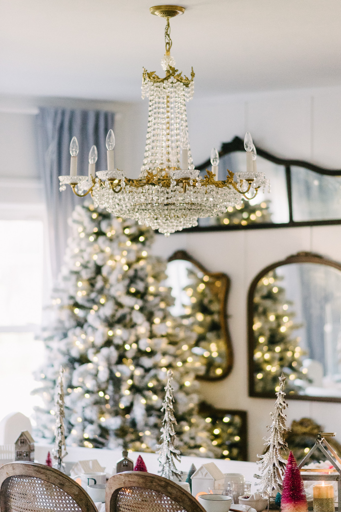
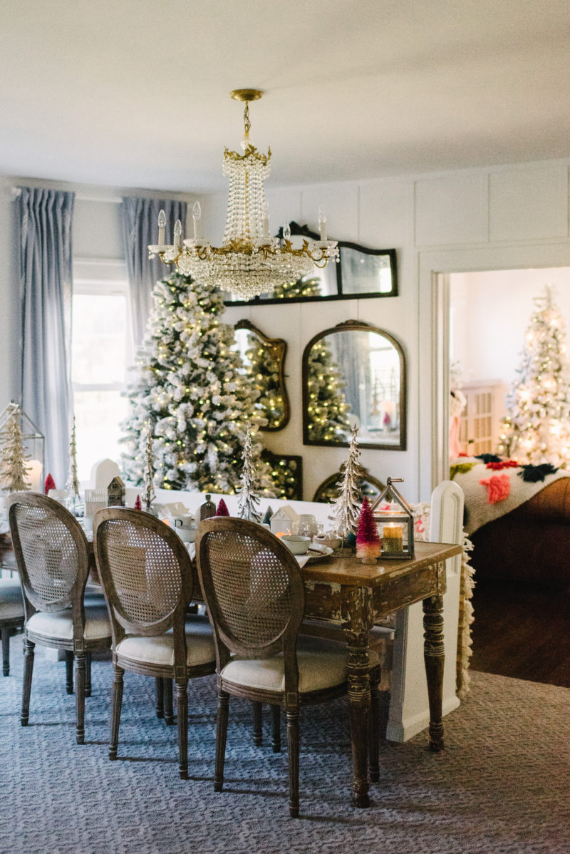
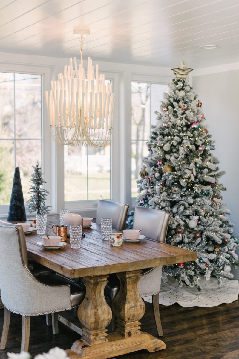
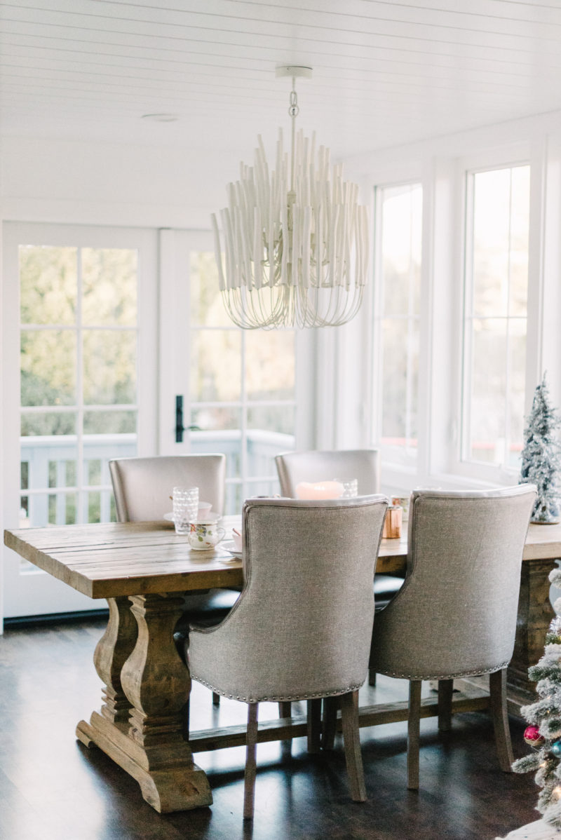
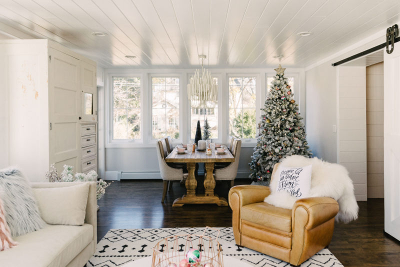
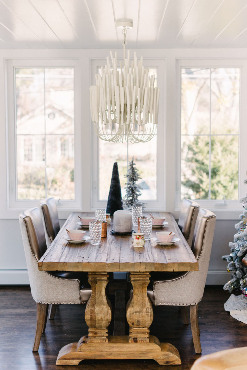
In the dining room I was really inspired by Hearth and Hand, which is Magnolia’s line.  Houses and the homey feel that they’ve created.  The dishes and I mixed in some ceramic tea light houses that I found at Target and Cocoon.  To tie in with the whole farmhouse vibe. 

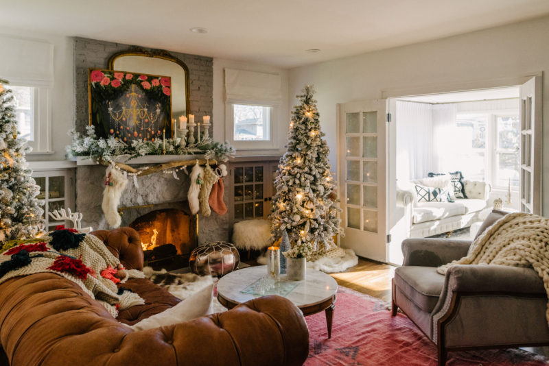
I wanted Christmas this year to feel relaxed and easy going with a mix of farmhouse, meets bohemian, meets modern, meets glam. I’m not sure if that falls into an actual style category but hey, that’s us! We’re a bit difficult to follow. 😉  And if anyone has good name for this chaotic mix of mine I’d love to read your suggestions in the comments.  🙂

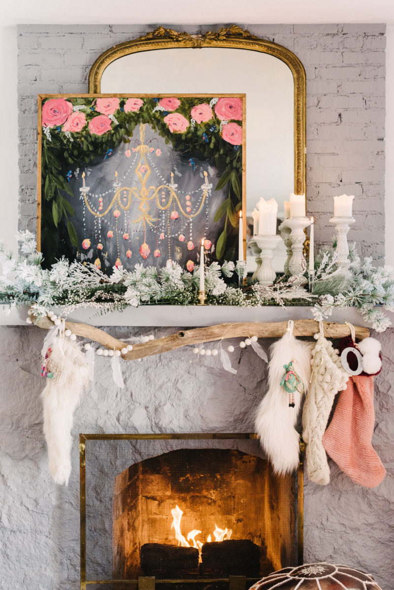
This year, to be completely honest, I wasn’t sure what my vision was going to be. Maybe it’s my creative nature but I didn’t pull the tablescape together until two nights before photos were taken, and this mantel came together an hour before! I’m not lying, and I wish I were because I would have been a lot less stressed out! Haha! 

I added several pieces into our home that just spoke to me. It’s hard to explain but when I see something I love, and I not only love it but can’t stop thinking about it, well I know it’s meant to be a part of our home.  These pieces can be big or little, old or new, wood or fluffy – anything.  I just love to mix it up through texture, color, or aesthetic.  As I’ve said in the past, I think so long as you love something then it’ll never go out of style. 

This gorgeous chandelier from lampsplus, this stunning rug from eclecticgoods and these stunning pieces from hearthandhand are just a few of them. If you look at each piece by itself you may not think they’d all flow together but combine them, and in my opinion, it’s magical!  I’m so happy with the vibe of our home this year!

I have to take a minute and talk about our girls stunning outfits!! They are from @joyfolie and they are BEYOND AMAZING! Everything from their dresses, to that sweet riding jacket all the way to their boots, stunning! And so very well made! If you have a little one you must check them out, I promise, you’ll be in little girls heaven, and they have coordinating mama outfits too!

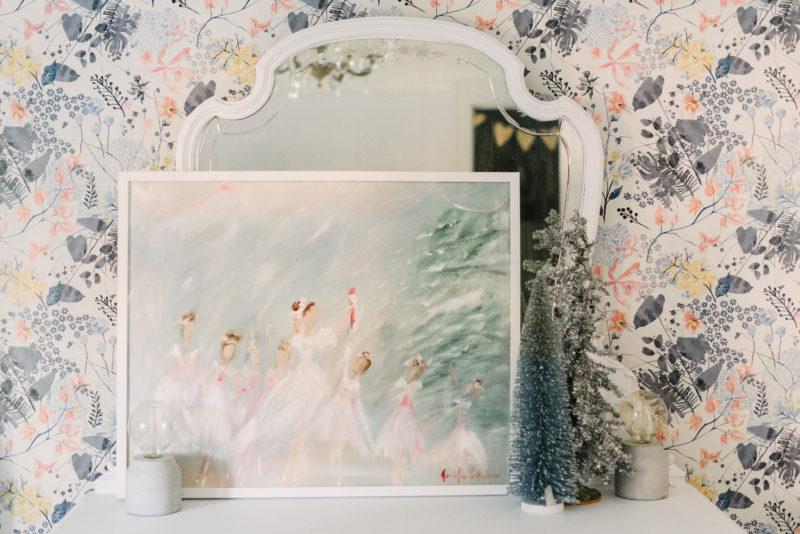
This painting below is so very special to me! It was painted by a local artist just for our home! Jenny Collander is so very talented. I can’t wait to share more about her and her paintings, but for now here is the painting, “The party scene” and it’s magical!

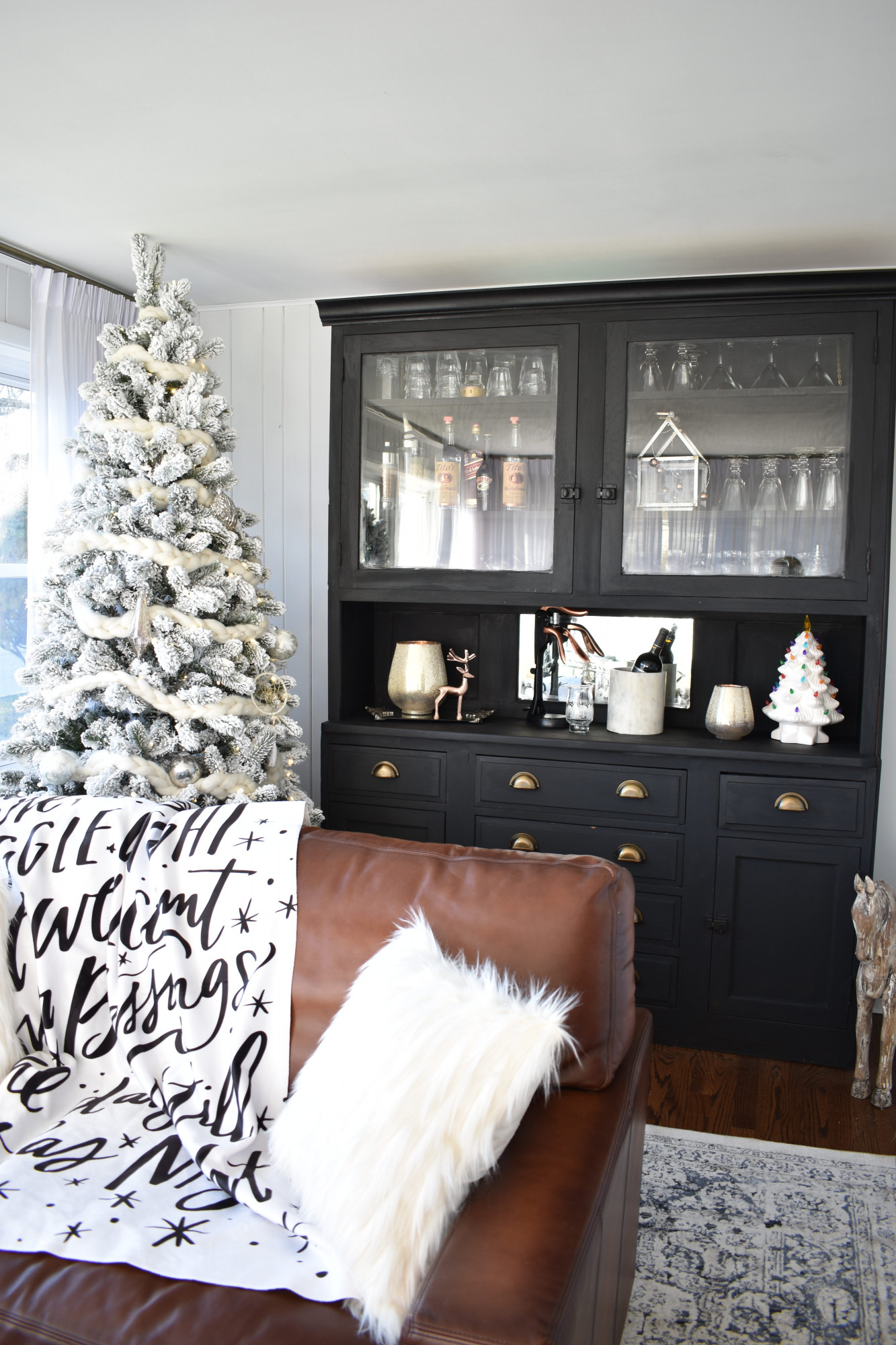
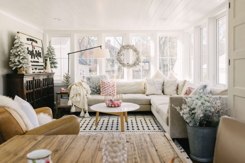
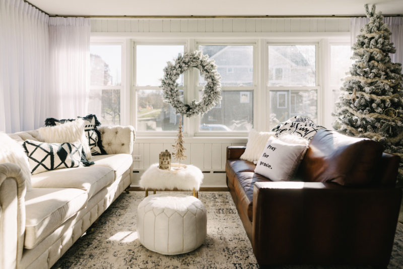
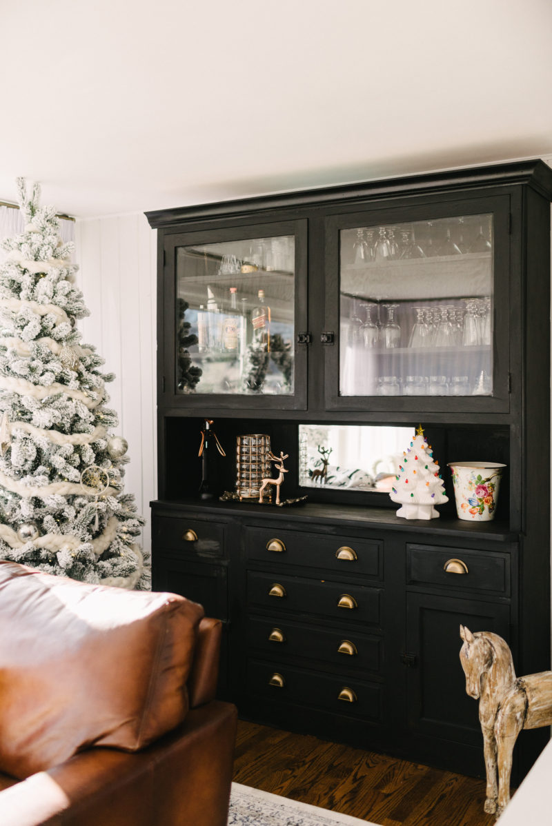
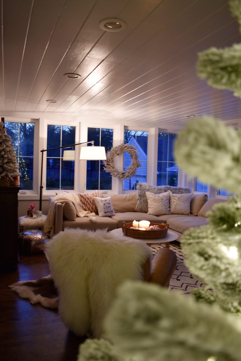
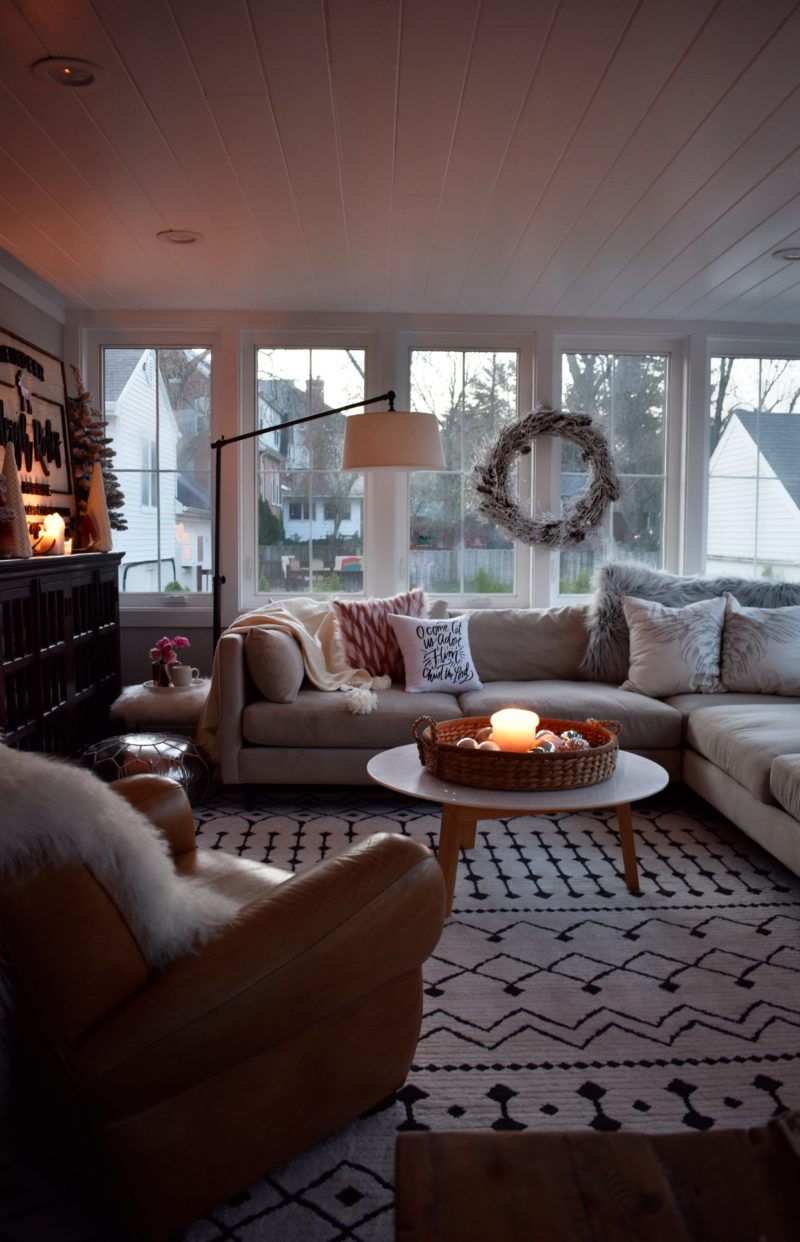
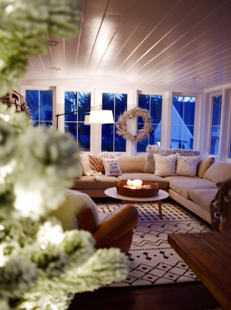
I converted our sunroom room room in the front of our house into a quaint and cozy hangout. I found an old vintage cabinet and my husband painted it in Miss Mustard Seeds milk paint. I’ll be sharing more about this soon! Gorgeous rug is Boutique Rugs, pillows are Loloi Rugs, and pray for peace pillow is lindsay letters.

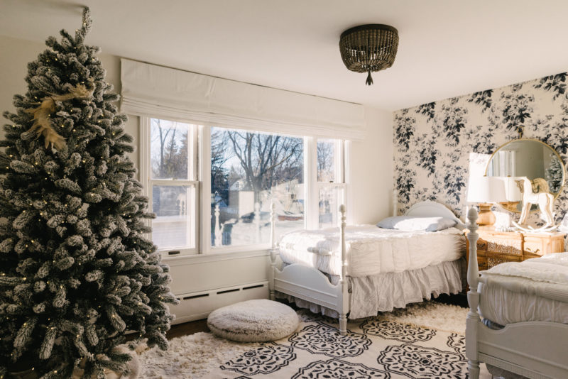
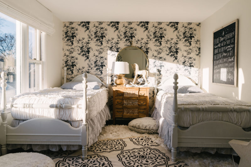
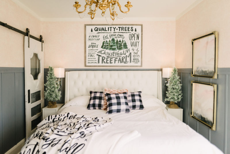
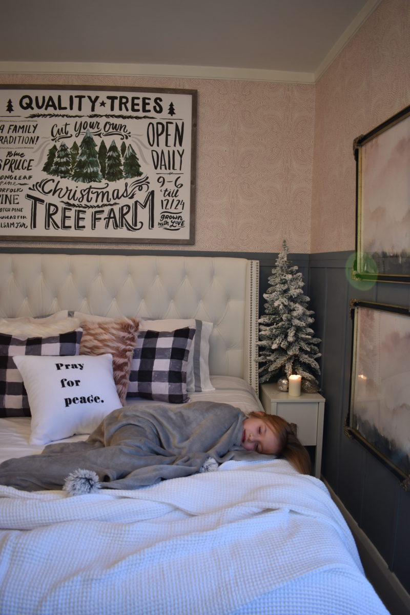
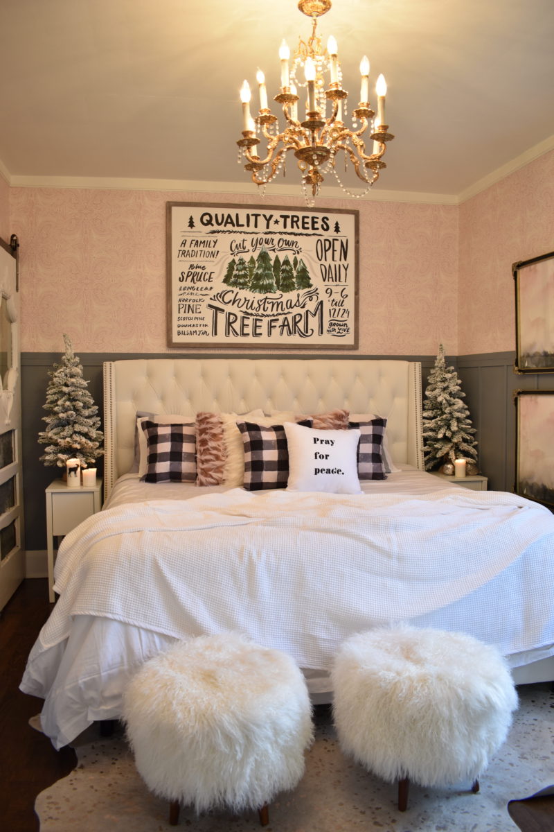
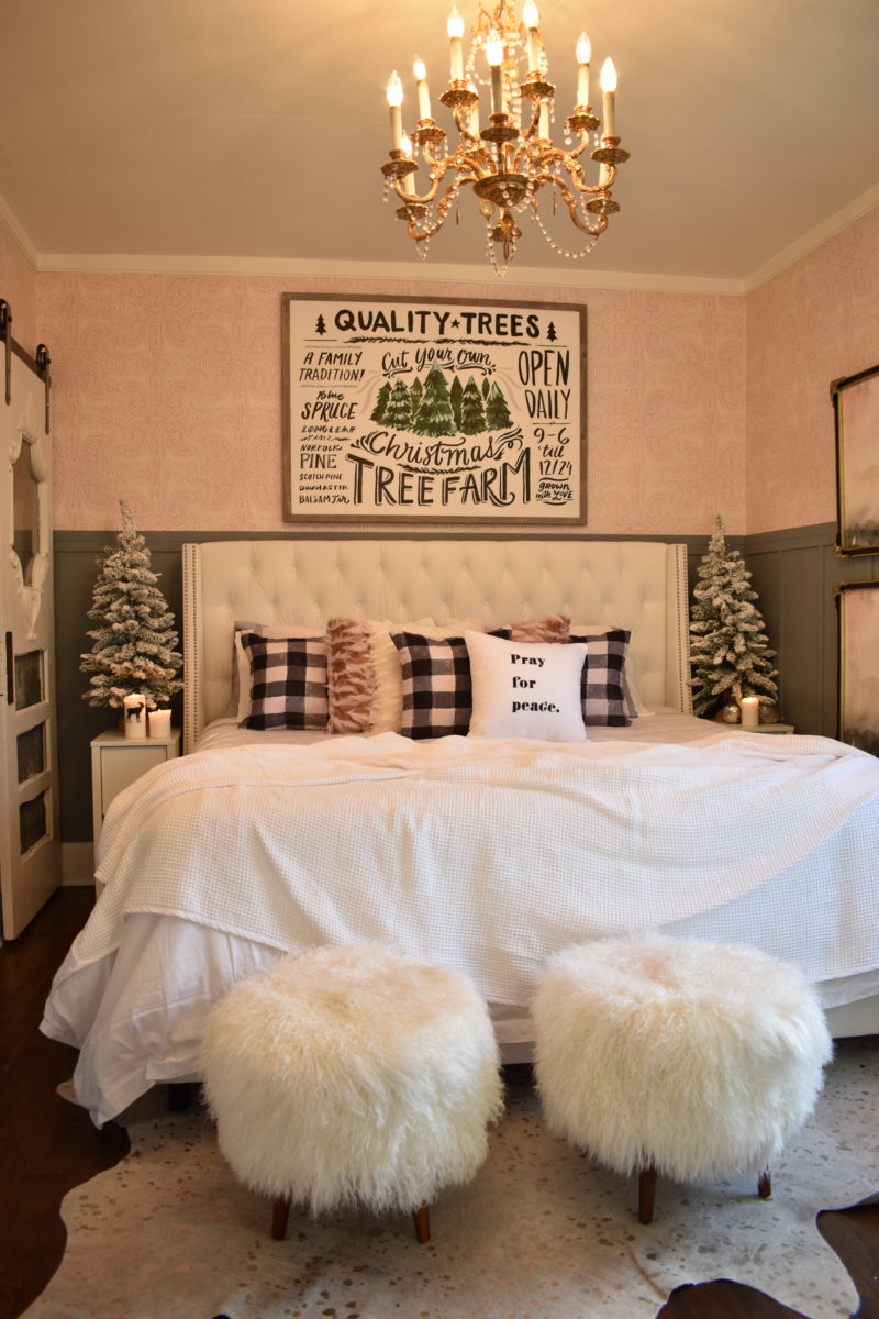
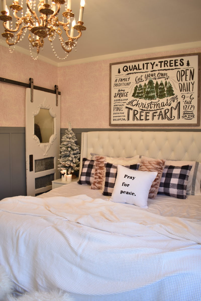
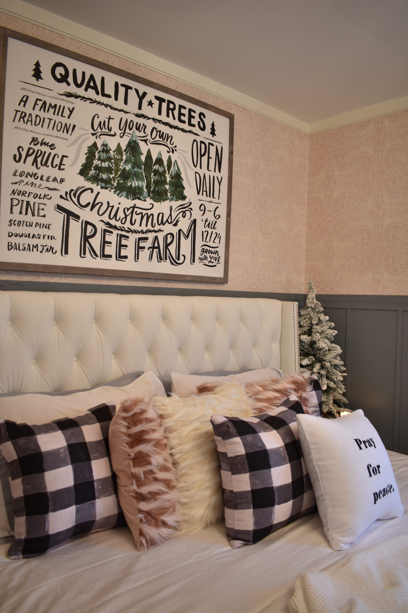
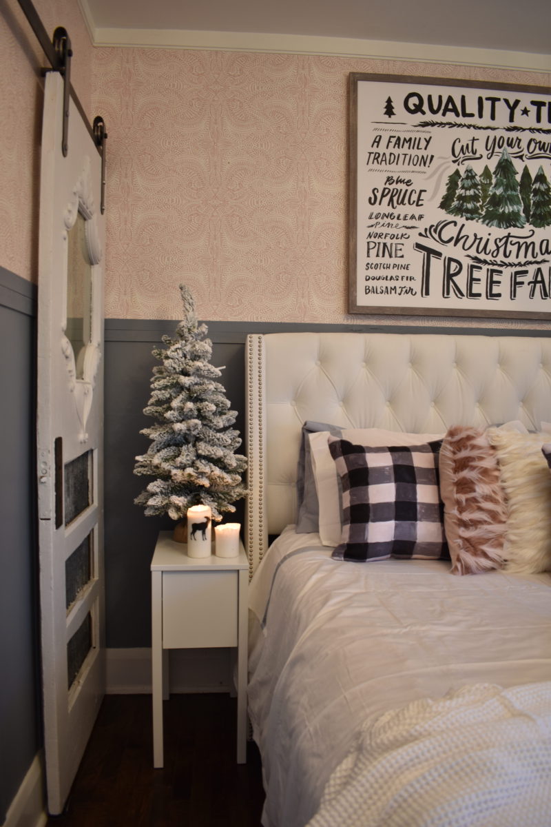
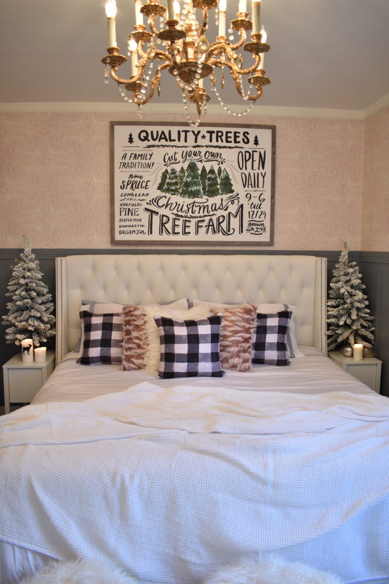
Lastly, here is our bedroom all dolled up for winter! I adore our Boll & Branch bedding, Birchlane bed, lindsay letters art above the bed and her check pillows!

Photography by the super talented, T & S Hughes Photography. Thank you so much for these images, we will treasure them forever!

Make sure to visit the other inspirational homes on the Holiday Housewalk! This tour is bursting with holiday cheer and creativity!

Merry Christmas from our home to yours!

———— SOURCE LIST————-

Sleigh Rides sign from Harper Grace

Living Room and Front Room Rugs are from Boutique Rugs

Whitewash Wood Chandelier is from Lamps Plus

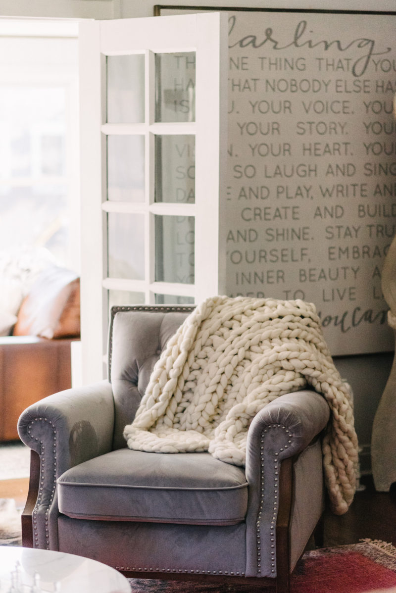
Knitted Blankets are Colorways Gallery

Chandy Picture is from Copper Corners part of my Painted Fox Collections 😉

Stockings are Anthropologie and HomeGoods

Trees are King of Christmas

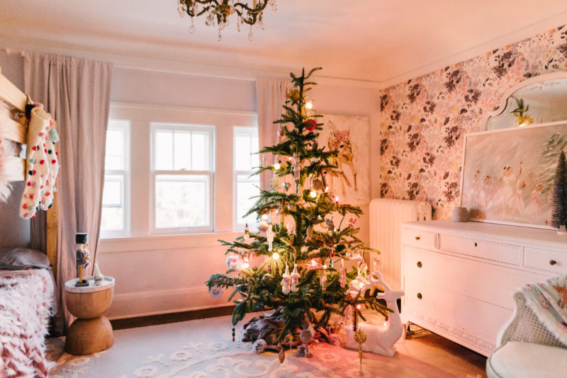
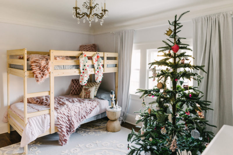
Fluffy Pillows and Stools, plus girls’ Bedding and their Tree are all from Grandin Road

The ballerenna picture is from Jenny Collander

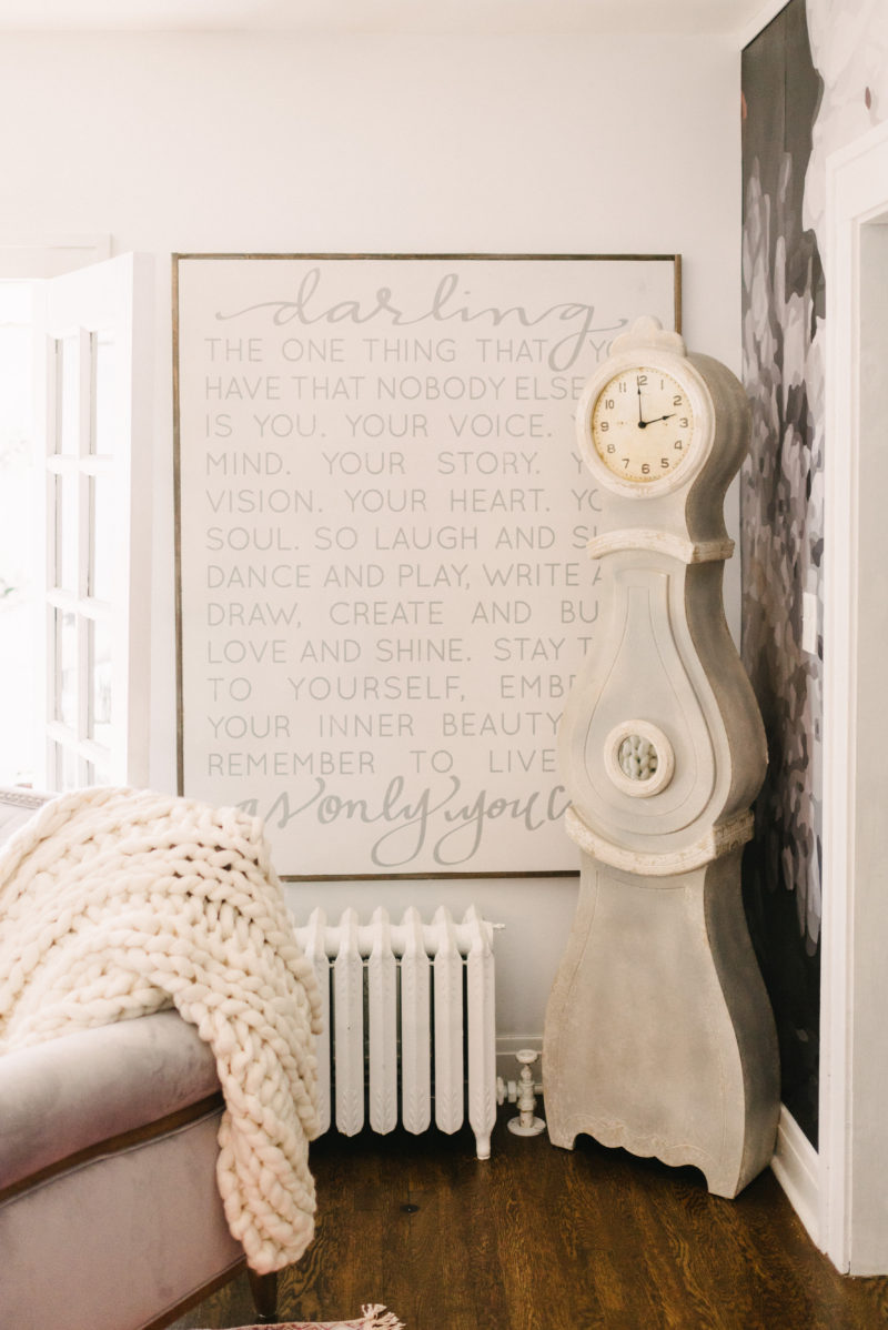
Darling sign by Aedriel and House of Belonging

Our Winter Wonderland Bedroom

Hello!

Today we close out the Seasons of Home Holiday Tour with our master bedroom! It has been such a blast creating these cozy Christmas spaces and sharing them with you! Thank you so much to our series host Kristin Whitby at Ella Claire Inspired for all of your hard work and organization!! You are talented beyond belief, friend!


First of all you may recognize this bedroom as our old guest bedroom! We decided to move our “master” downstairs to give the girls the entire upstairs, I can’t wait to show you what our old room is going to be! 

We actually love the room down here. It’s across from the bathroom which is a nice bonus. Since our home was built in the 1920’s it’s rooms are all small and quirky so there isn’t a bathroom in any of them. It doesn’t bother us any, but it’s nice to have one right outside the door!

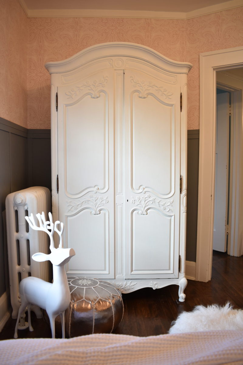
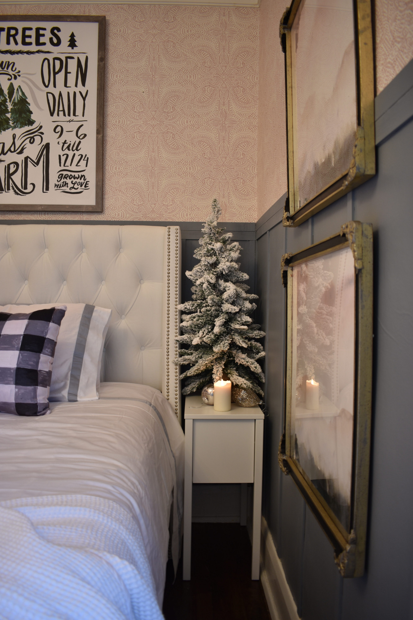
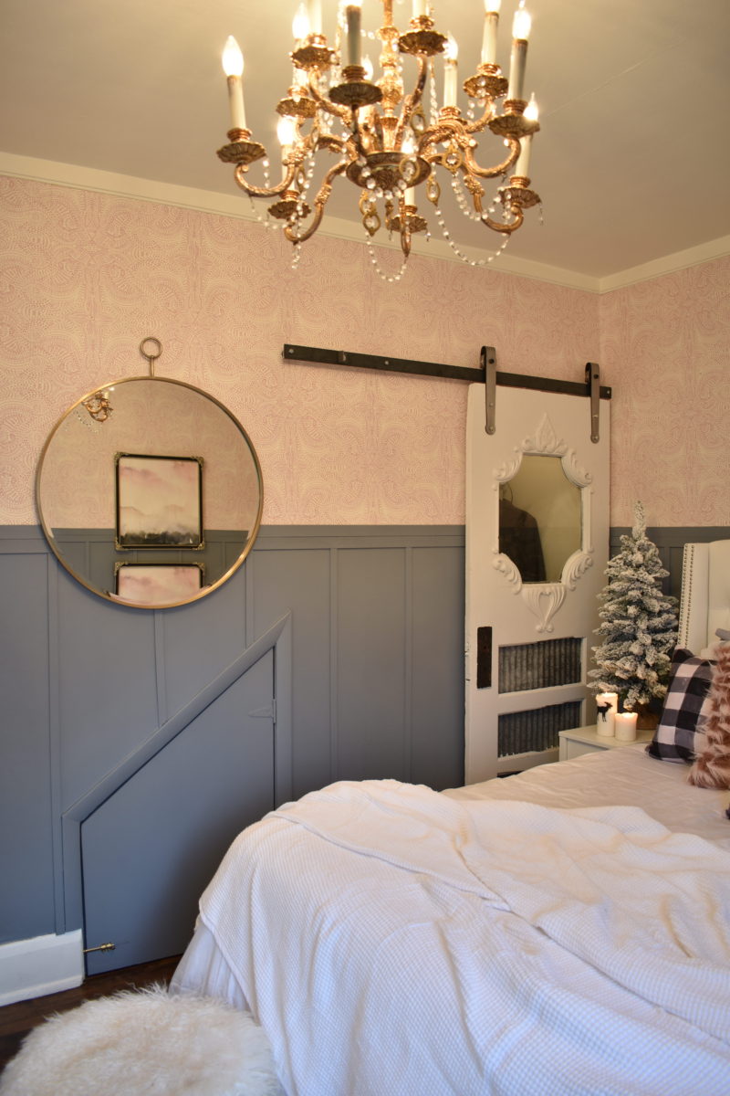
Now onto the decor! We partnered with Birchlane and picked out this amazing white tufted bed! Words can’t describe how much I love it! I love the brightness that it adds to our cozy room. Even though it’s a king, it doesn’t weigh down the room, instead it brightens it up, which I adore! 

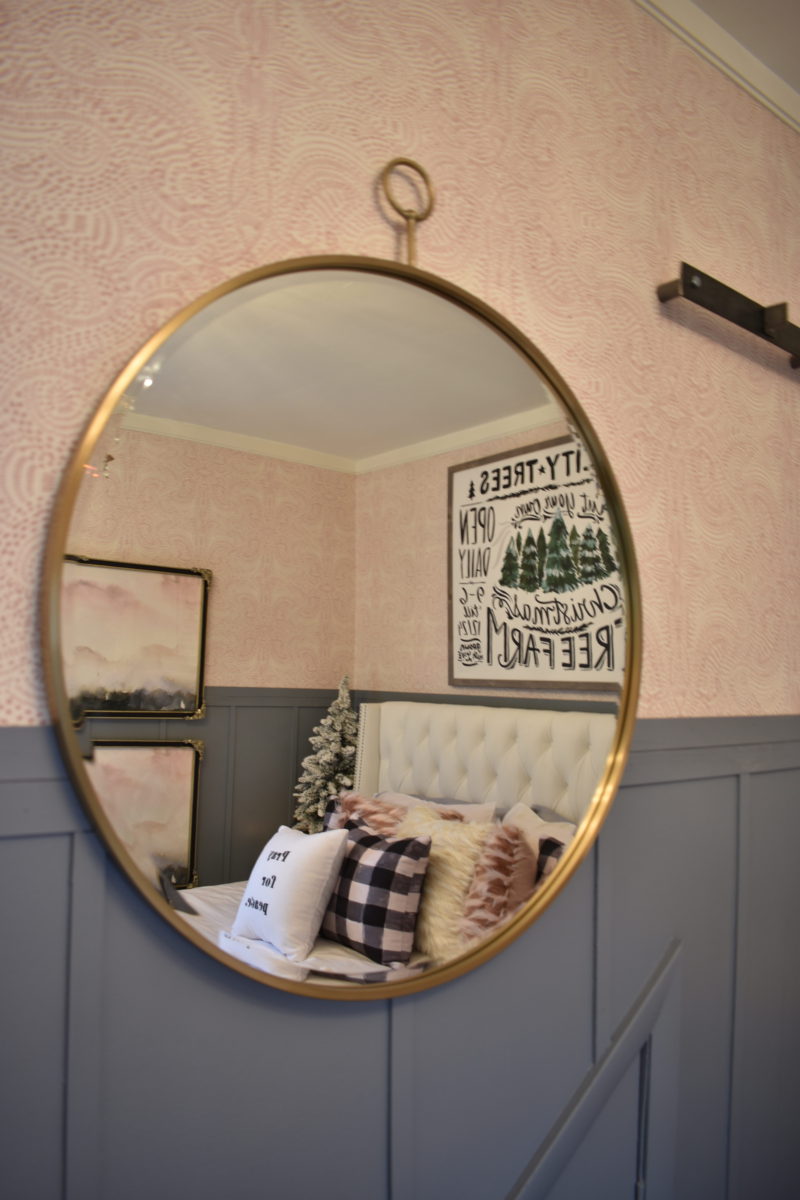
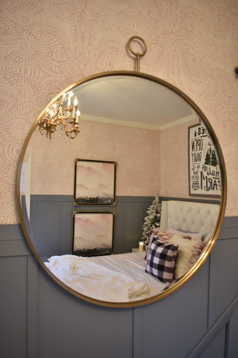
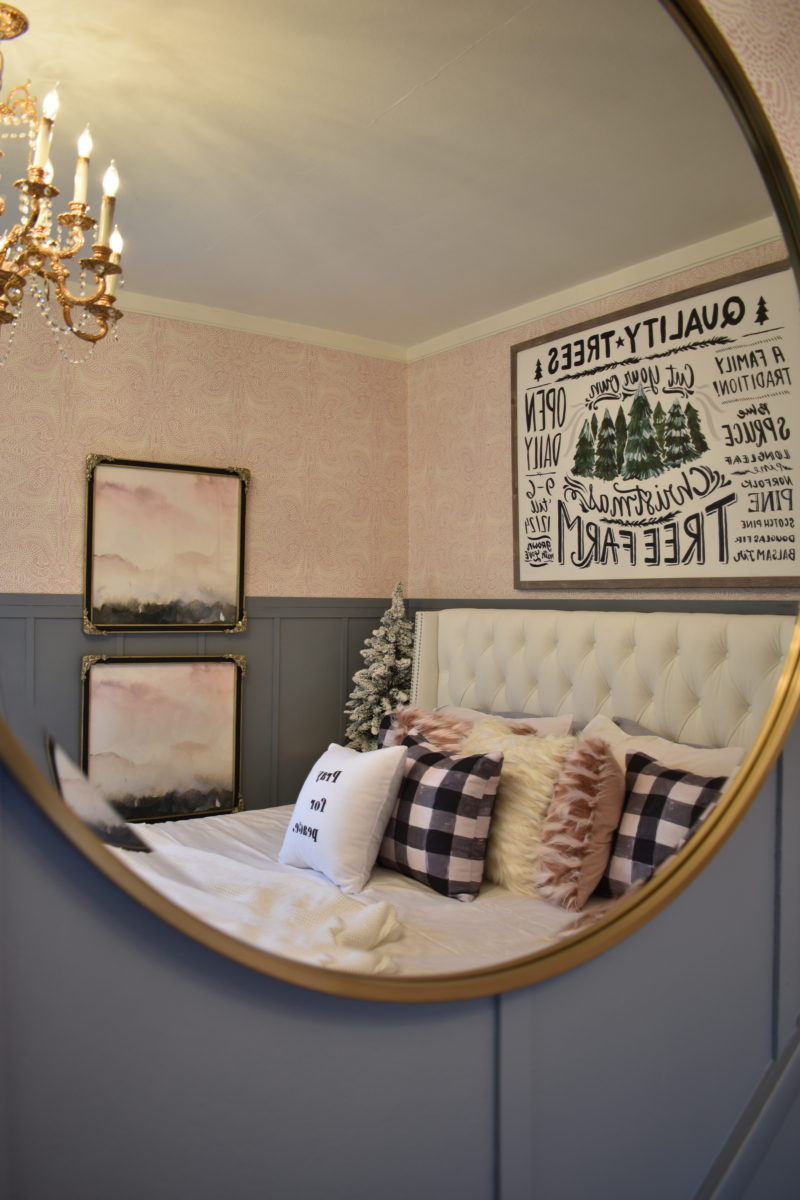
This is the Pierre Mirror by Grandin Road.  It is amazing!


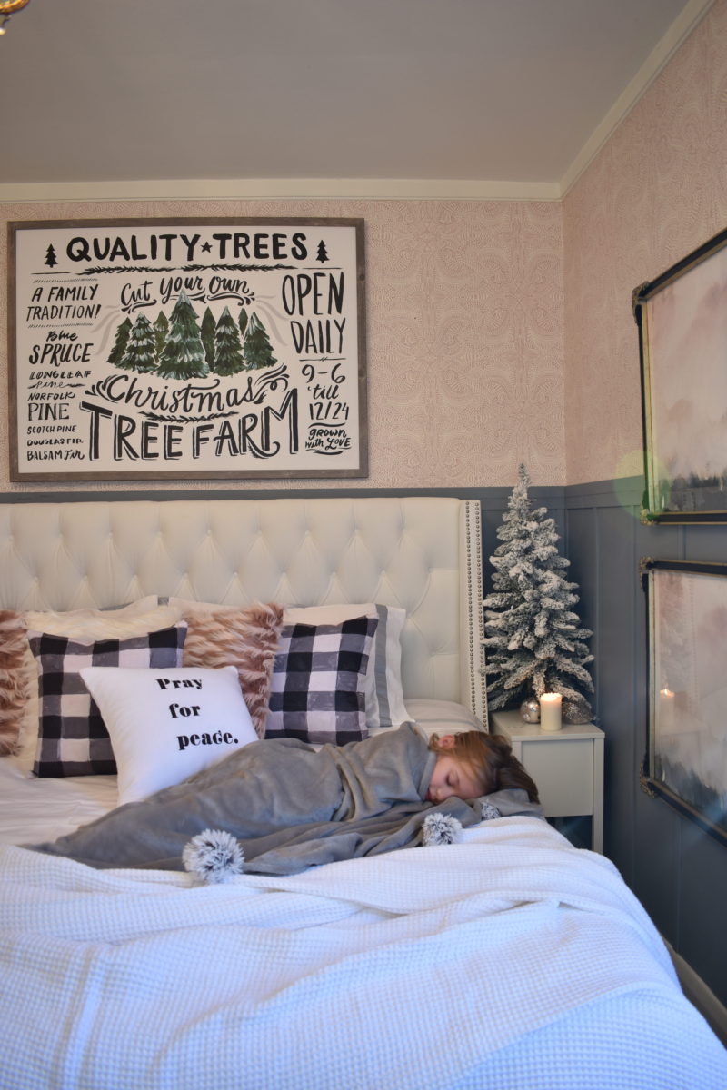
I added some touches of Christmas with new bedding, the check pillows, Christmas sign, reindeer and trees! I love the way our room feels like a winters wonderland now! I will be sharing a post in a few days with more detail about that! For now, here’s a look at it all dolled up for the Holidays! 


Wishing you a wonderful, Sunday!! Xoxo

Don’t forget to check out the other wonderful women on today’s tour! You’ll be happy you did!

Boll & Branch

Grandin Road

Lindsey Letters

Craftberry Bush | Shades of Blue Interiors | French Country Cottage

Rooms for Rent | Jeanne Oliver | Julie Blanner | Kindred Vintage

Love Grows Wild | My Sweet Savannah | City Farmhouse | Nesting with Grace

Jennifer Rizzo | Dear Lillie

Our Cozy Christmas Living Room

Good Morning!

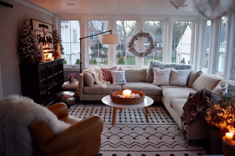
Thank you for joining us today as we share our holiday living room with Home Goods.  This season we were able to find so many unique pieces to match our home style and give it that unexpected, whimsical touch that I love!  So grab a cup of coffee and make yourself cozy and let the fun begin!

For me, the best part of walking into Home Goods is that each store’s merchandise is completely unique.  You never know what you’re about to find.  I went shopping with my youngest daughter and she immediately picked out this cozy pompom throw and carried it around with her the entire time.  I actually approved of her choice and bought two, one for each of the girls.  However, they are so cozy I think I might be borrowing them soon. 😉  I’m typing this post wrapped up in one.  Shh, don’t tell.

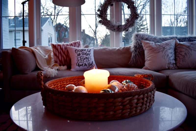
I love this snowy branch wreath.  I love that it is light an airy and doesn’t overpower the room.  Placed on the window sill with Command Strips, it contrasts the structured lines of the window frames and ceiling with naturally imperfect branches.  I like the softness it adds to the room.


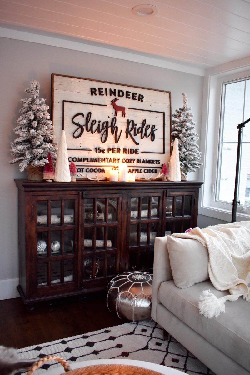
The small knits trees you see placed around the Sleigh Rides sign are from Home Goods as well.  They add cozy contrast to the room.  And on the floor in front of our cabinets we added a gold poof that the girls like to stand on to turn on the t.v.  (I’m going to let you in on a little secret.  The t.v. is hidden behind this lovely sign.  It’s the perfect disguise when you have guests over for the holidays).  We used a fox fur vanity stool with a marble dish on top as an end table.  I love the warmth it adds to the room.


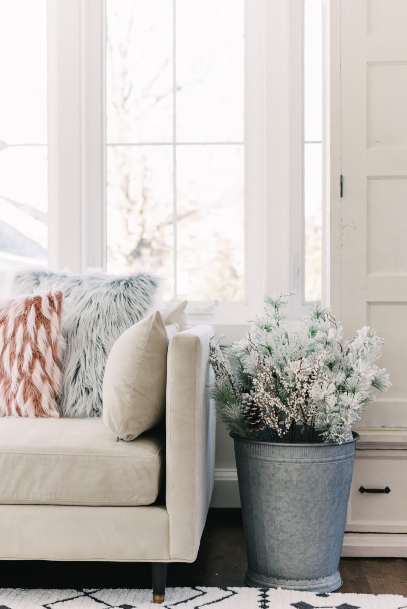
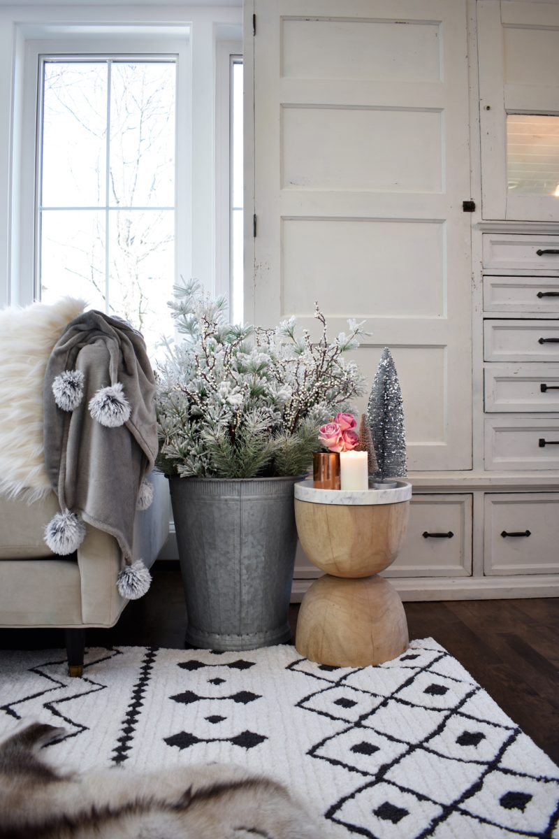
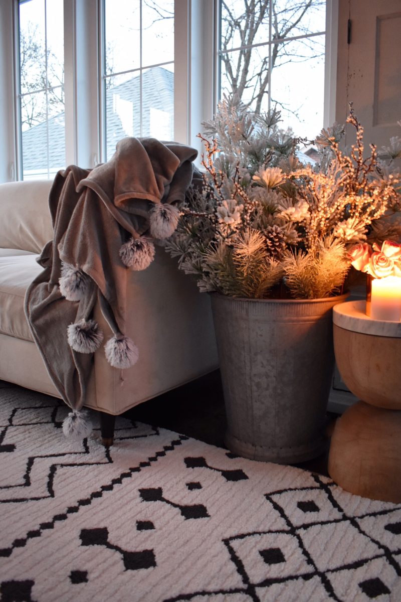
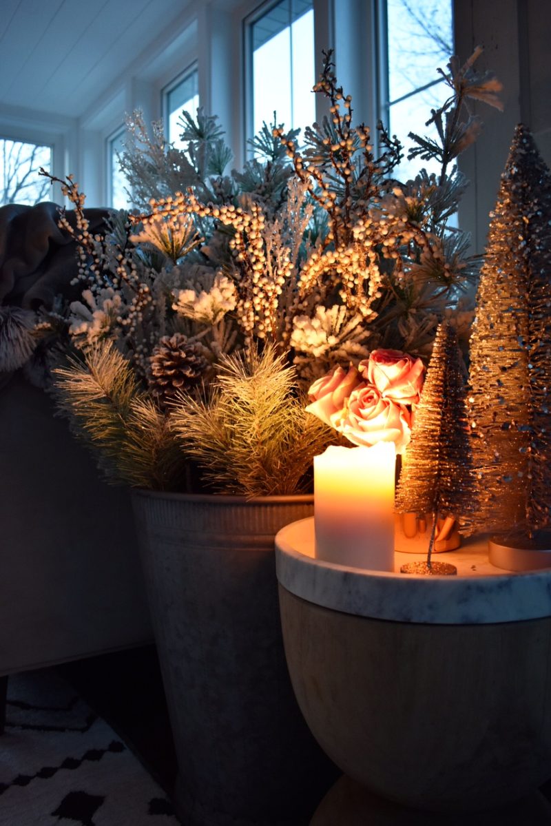
I fell in love with this over-sized tin bucket with holiday bushel and all of its whimsy.  I love how the greenery is more of a mint tone and the frosted branches add a light airiness to the setting.  It’s an awesome compliment to our flocked trees and gives the same cheer in those smaller nooks where full-sized trees won’t fit.  It’s by far one of my favorite finds this season.


Thank you to Home Goods and our host Ella Claire blog.

I’ll be sharing more about each of these products on Instagram but here is a quick list if you’d like to know right away.


Take a look at these other amazing women on today’s house tour!  Their work is simply stunning!!

Ella Claire | Rooms for Rent | Shades of Blue Interiors | Love Grows Wild

French Country Cottage | City Farmhouse | Kindred Vintage | Jeanne Oliver

Jennifer Rizzo | Craftberry Bush | Miss Mustard Seed | My Sweet Savannah

Nesting with Grace | Dear Lillie | Julie Blanner | Liz Marie Blog

And our featured guest, Thistlewood Farms

Home for Christmas

Hello Friends!

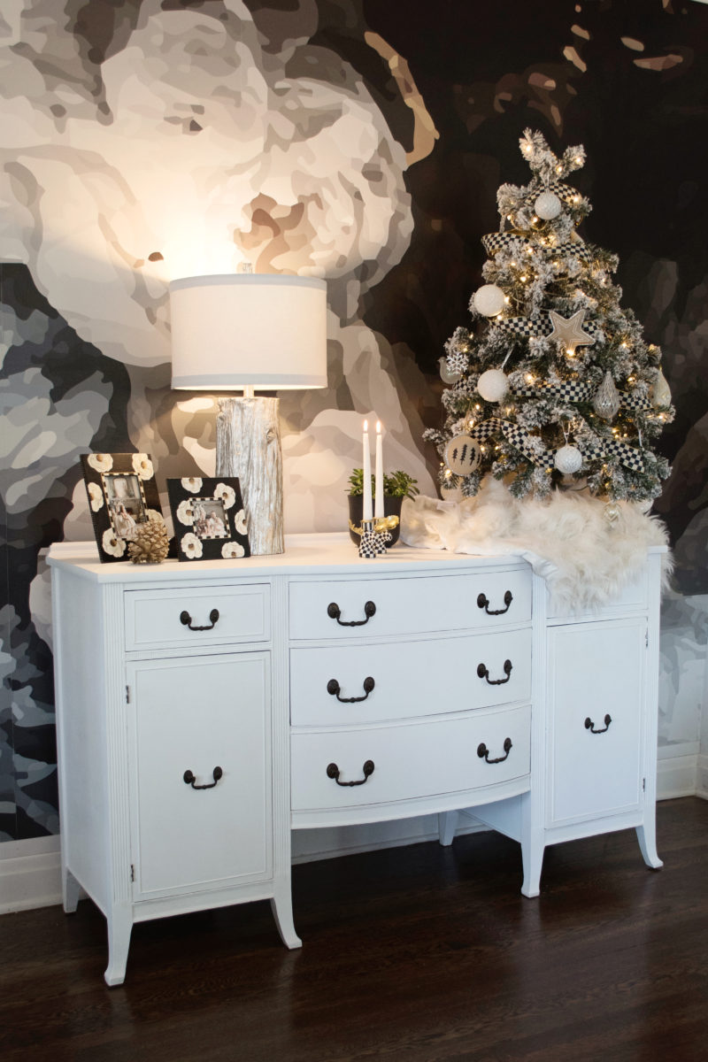
I am so excited to be have teamed up with the wonderful people over at MacKenzie-Childs to share our home this Christmas!

Over the summer I had the wonderful opportunity to visit the MacKenzie-Childs Farm and their properties and it was a dream! The experience is one I will cherish forever! I gained an entirely new appreciation for not only the brand itself but the artisans who work daily to handpaint each gorgeous peice. It’s truly an amazing brand and I can see why McKEnzie-Childs has so many passionate fans, including myself!

Sit back and see what I mean and I welcome you into our home! Thank you for coming over, I’m so glad to have you here!

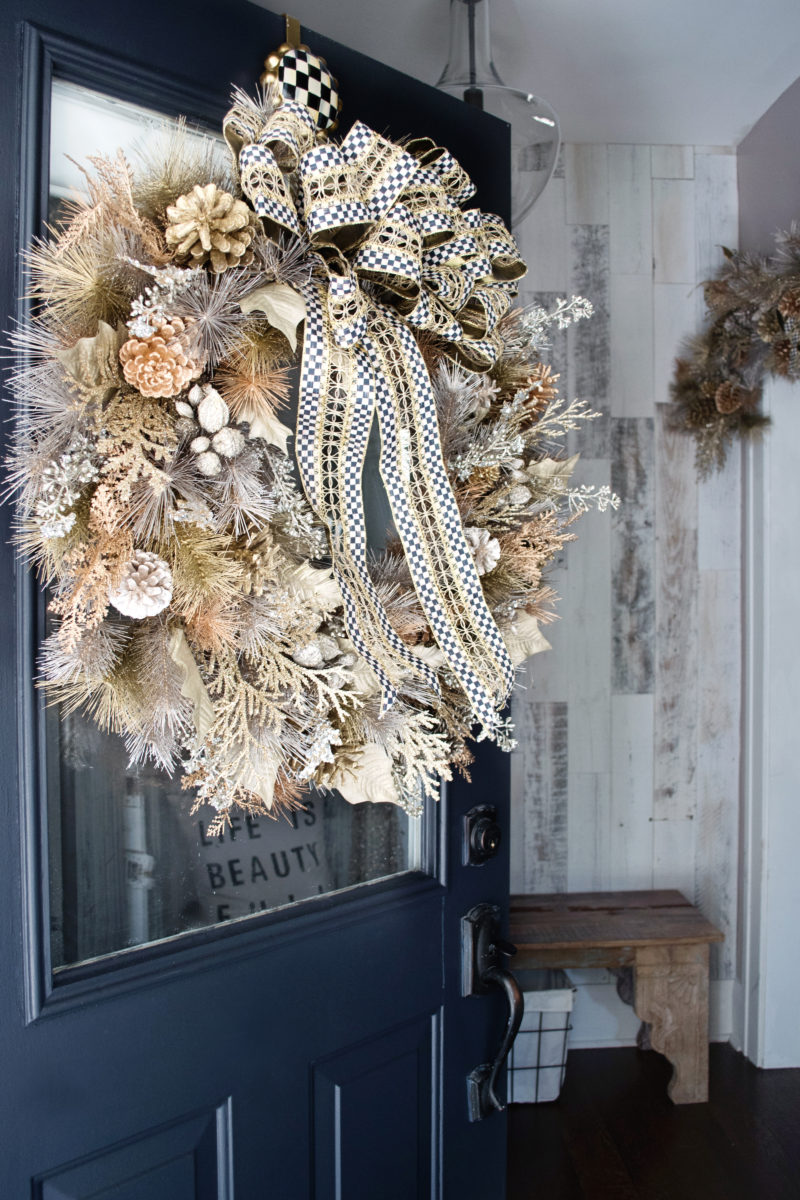
This magical wreath makes a gorgeous statement as you enter our home. I love the tones of all the precious metals and how they shimmer in the sun! The wreath hanger is also so stunning! And our garland as you enter the living room ties in with the wreath on the door.


These poppy frames are also MacKenzie-Childs.

I framed our holiday pictures from the year before and I love how they add an unexpected twist to traditional holiday decor.


This cozy throw is one of our favorite and most used MacKenzie-Childs item! We love it!

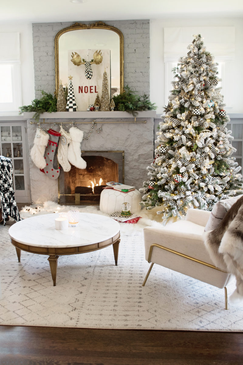
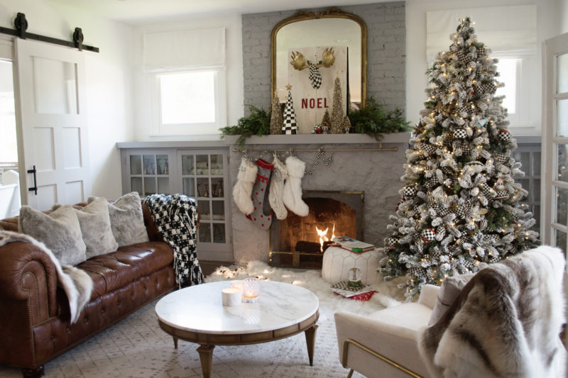
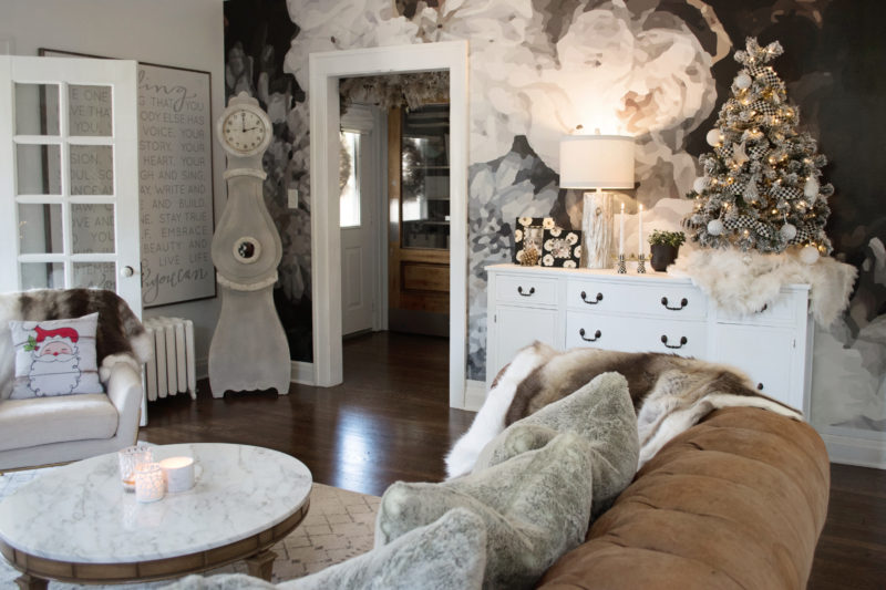
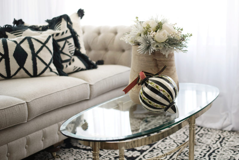
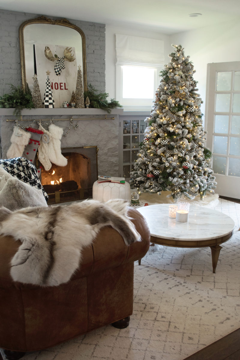
We decorated our entire tree with nothing but MacKenzie-Childs ribbon and ornaments. I love the whimsical feel it gives! A special tradition we have in our home and have done since our first daughter has been born is to wrap 25 Christmas books and place them under the tree. Every evening leading up to Christmas the girls unwrap a Christmas book and we read it together by the fire. I love watching their excitement and I can’t wait for Dec 1st to start up our tradition this year.


Speaking of traditions I cannot wait to see the excitement on their faces year after year when we pull out the Christmas decorations and the nostalgia their favorite pieces bring! I have a feeling this magical snow globe is going to be one of them!

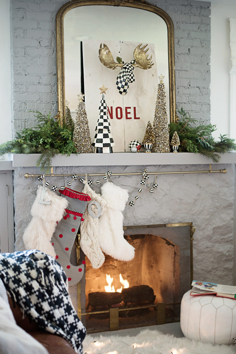
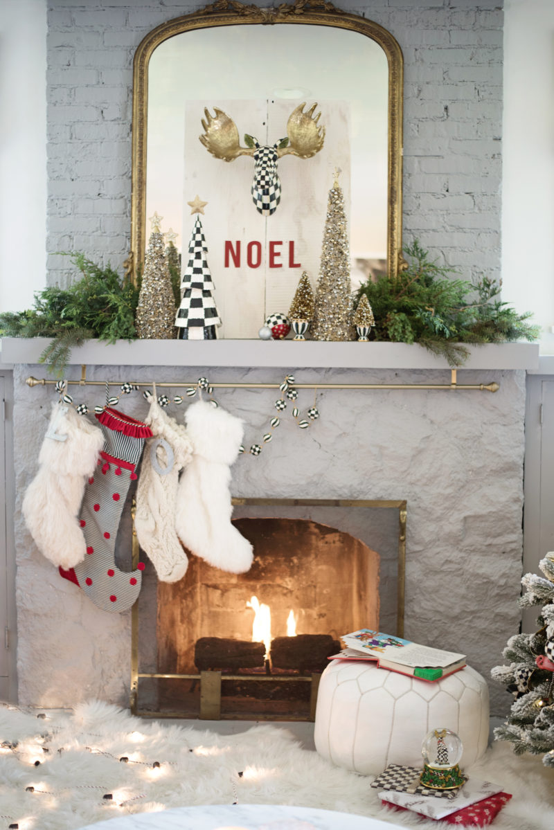
I adore these little moose candlestick holders that match the moosehead we placed on our mantel.

I knew I wanted to hang this guy above the fireplace but since there is a mirror there that doesn’t move I had to come up with a creative solution. I ended up nailing the moosehead to a wooden creation my husband put together. I simply glued letters below and I love the way it turned out.


The MacKenzie-Childs trees on the mantel are some of my favorites. I especially love the courtly check sequined one. And I love how the oversized polka dotted stocking adds an unexpected visual treat!


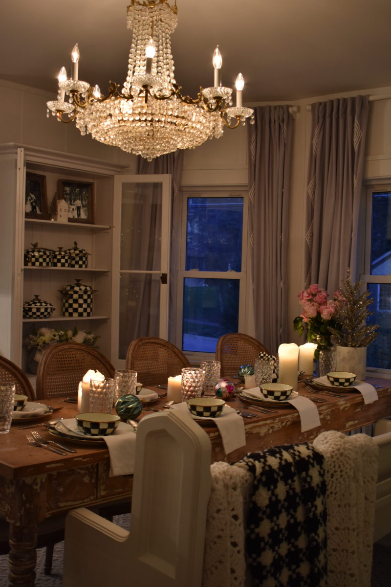
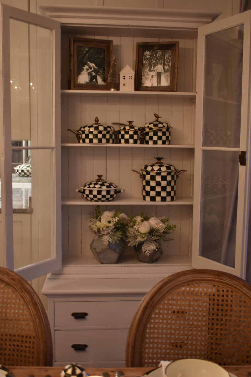
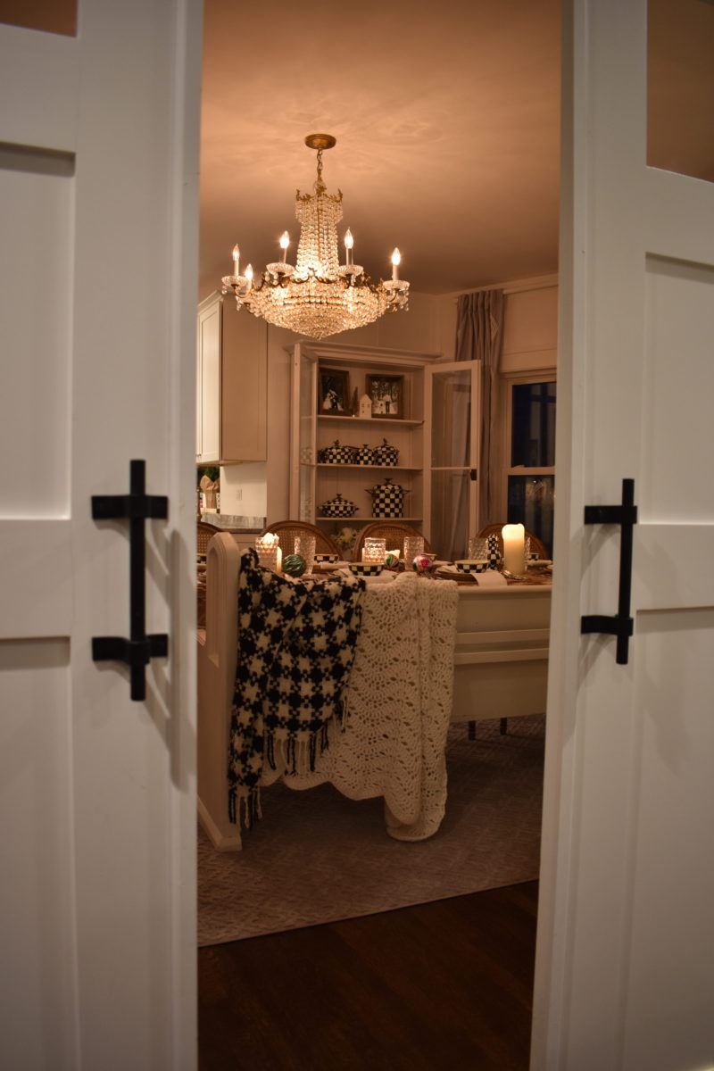
Since the dining room is right off the kitchen, we stocked the cabinet with courtly check pots and pans. Pretty and functional, I’ll take it!


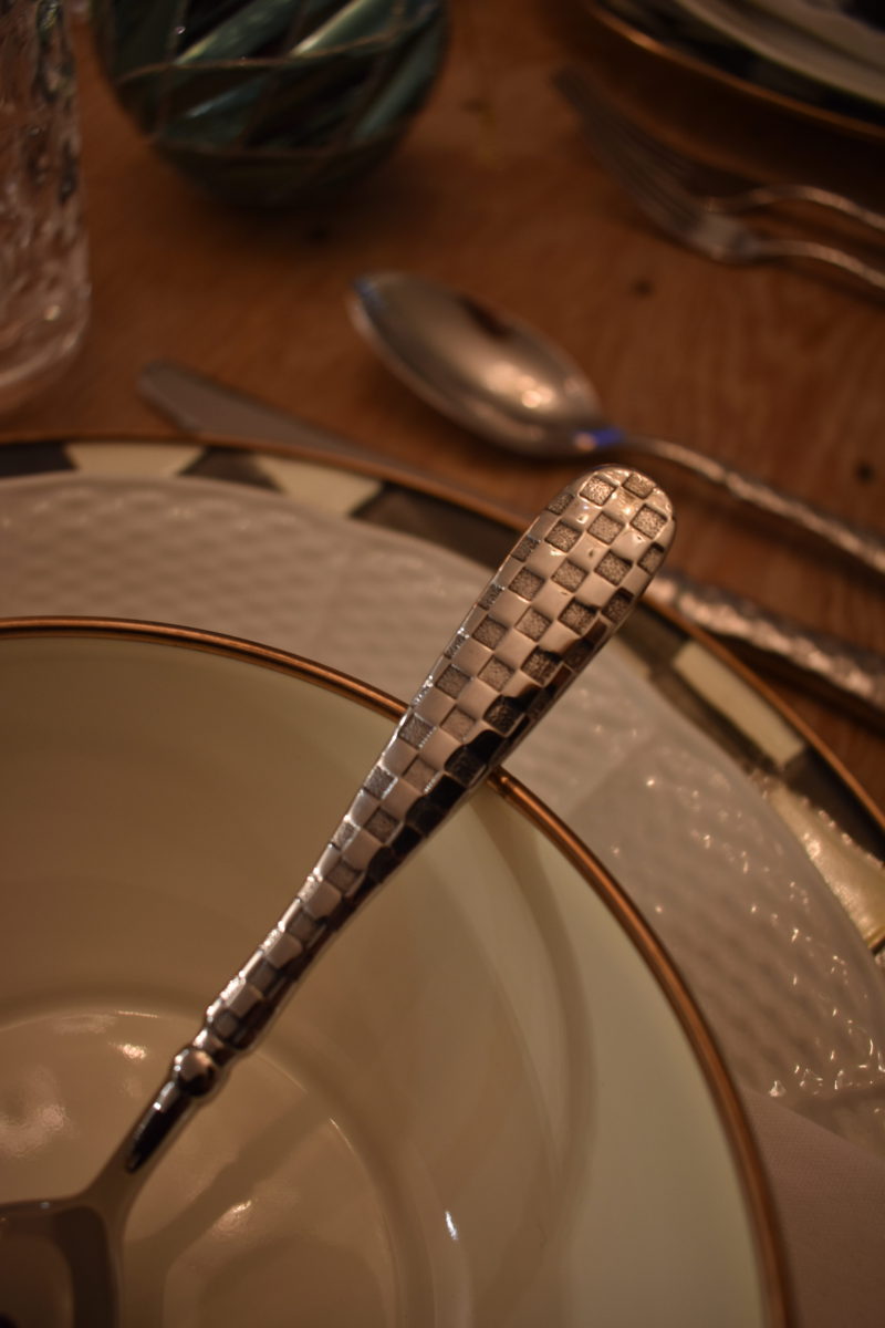
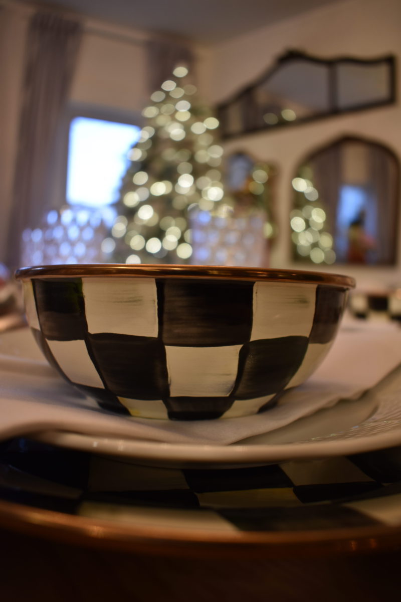
This year we brought our MacKenzie-Childs into the dining room as well. I love the warm all the items bring! We added courtly check plates, bowls, silverware, glasses, and salt and pepper shakers to the table. It’s a statement look I am in love with! Especially at Christmas time.

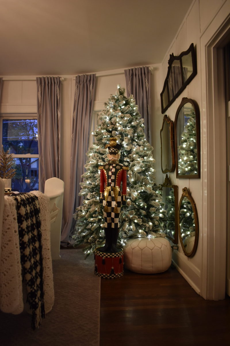
And I am sure you noticed him, my favorite item of all, the nutcracker! He is over five feet tall and is packed with all sorts of Christmas magic! The girls adore him, too!


Thank you for stopping by tonight! We loved having you!! Make sure to check out the other talented ladies on tonight’s tour. Trust me, you will be so happy you did!

A special thank you to MacKenzie-Childs and to our hosts, Ashley at House Of Five and Annie at Zevyjoy.


Remington Avenue | Kindred Vintage Co. | Craftberry Bush | Zevy Joy | House of Five


Highland Entrance Nutcracker
Mackenie-Childs cookware page
Courtly Check Small Moose