Our Bricked Fireplace: Part 1 The Fireplace

Hey world, Rob here.

Susan asked me to provide details on the DIY fireplace and the brick we had install on the chimney and adjacent walls.  Because we took a lot of pictures and the project was done in two steps I’ve decided to split up the post into two parts, the fireplace and the brick.  Hopefully this’ll help people see the benefits of both projects while giving the choice to focus on one or the other.

Firstly, the fireplace.  I’ll start by admitting that we hired our favorite handyman to frame it and install drywall.  Reason being, I wanted to be sure this was done quickly since we were on a tight timeline with SQ’s partnership with General Shale and Romabio upcoming.  I may be somewhat handy but I work very slowly and more often than not I have to fix my original, mis-measured attempt.  But if you don’t have to have the whole project done in one day or are pretty good with framing/drywall then building a DIY fireplace for an electric insert is absolutely doable.

The first step is to figure out is what fireplace you want.  The one we chose after doing a pretty exhaustive search was the PuraFlame 33 Inches Western Electric Fireplace Insert with Remote Control, 750/1500W, Black.  We went with this one simply based on looks alone, which coincidentally, is the same reason Susan chose to marry me.  The PuraFlame simply looked the most like a real fire.

Sizing of the fireplace itself should be based on the amount of space available.  Our wall was over 15 feet in length so being too big was not a concert.  In regards to depth that wasn’t an issue for us either.  Because the air ducts were 20 inches deep, the 9 inch depth of the insert was not a problem.  So with plenty of space for it and a conveniently placed outlet we were ready to go.

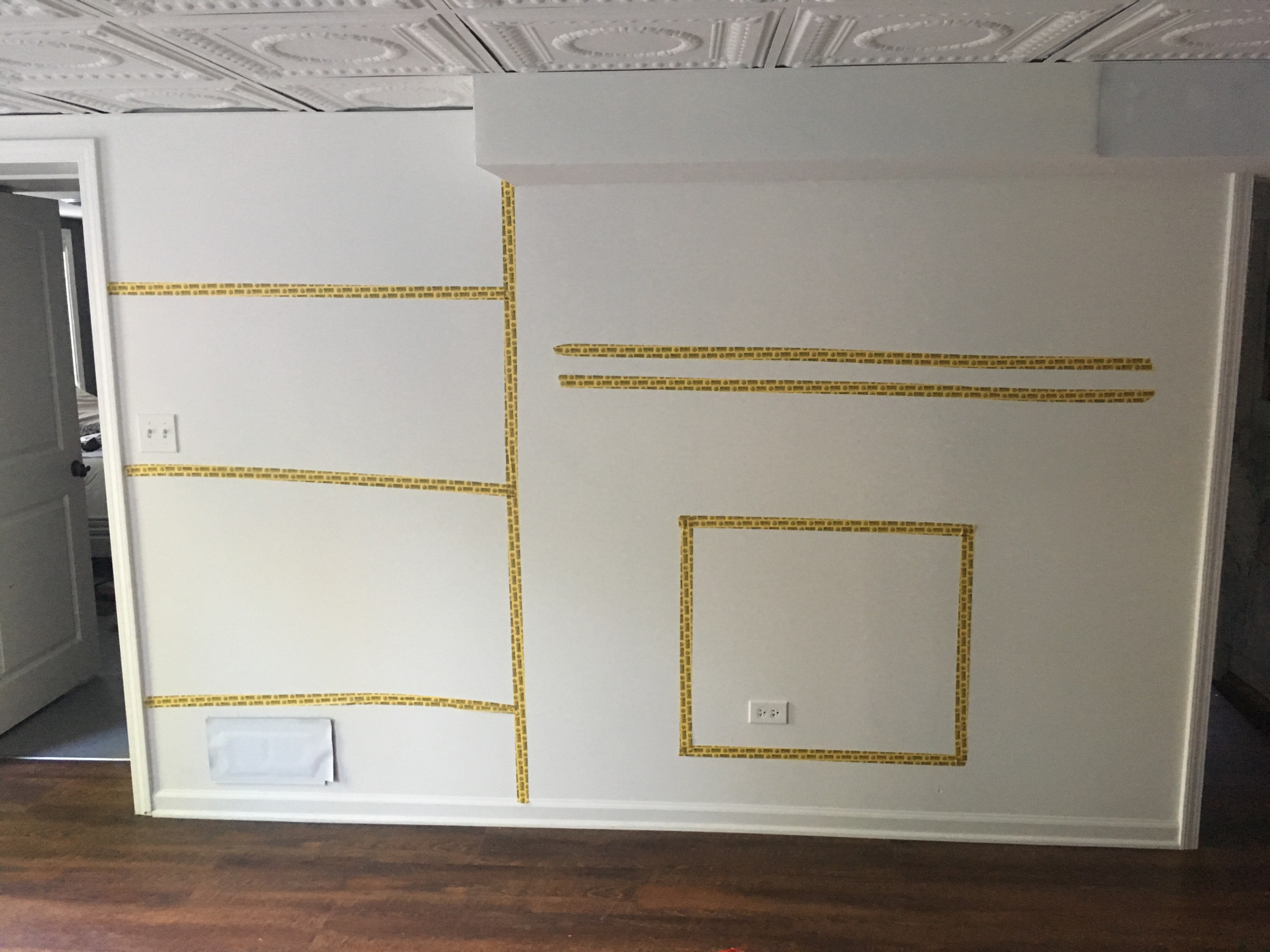
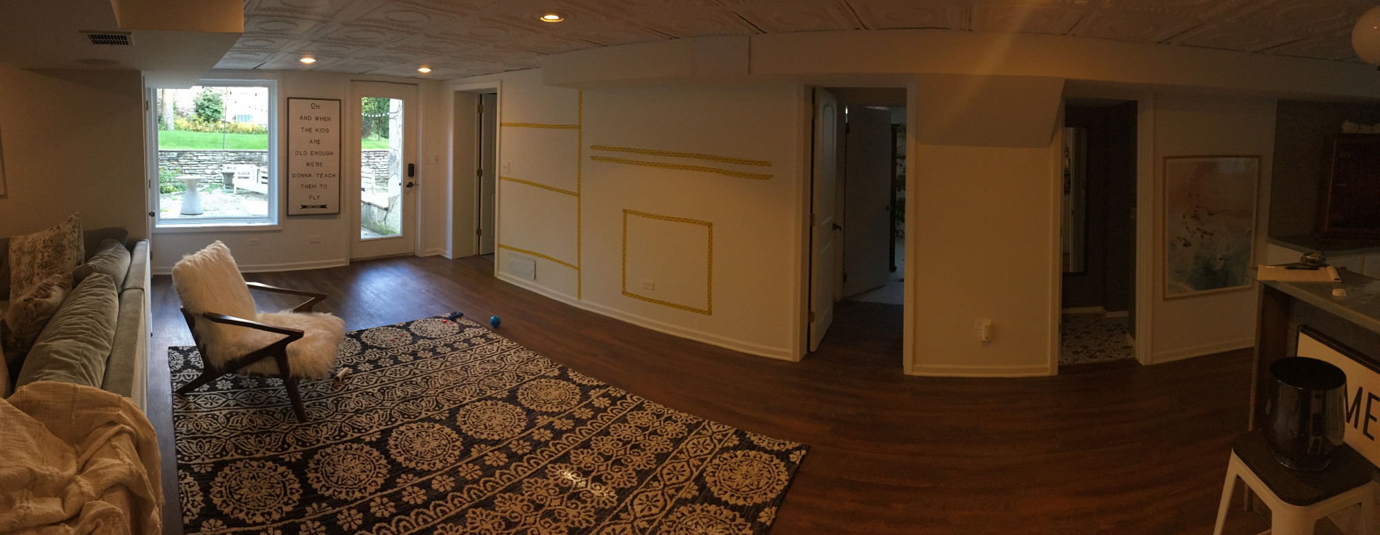
The next step is where Susan’s creativity came in to play.  We used painters tape to give her the visual of how big the fireplace was in relation to the wall.  We knew we wanted a mantel as well so with the typical size of those being around 5 feet wide she went to work.  Initially SQ was going to place the fireplace centered on the wall; however, because the wall itself was so big, that setup made the fireplace look minuscule.  So we moved the tape so the left side of the fireplace (from the perspective of looking at the thing) was on the center line of the wall.  This worked because it allowed the mantle to be centered on the duct work, from where it ends on the left and to the doorway on the right.  Lastly, to balance the sides, SQ added “shelves” on the left.
Here’s a larger panorama of the room with the outline up.  You can see how putting the fireplace in the middle of the wall would make it look really small.
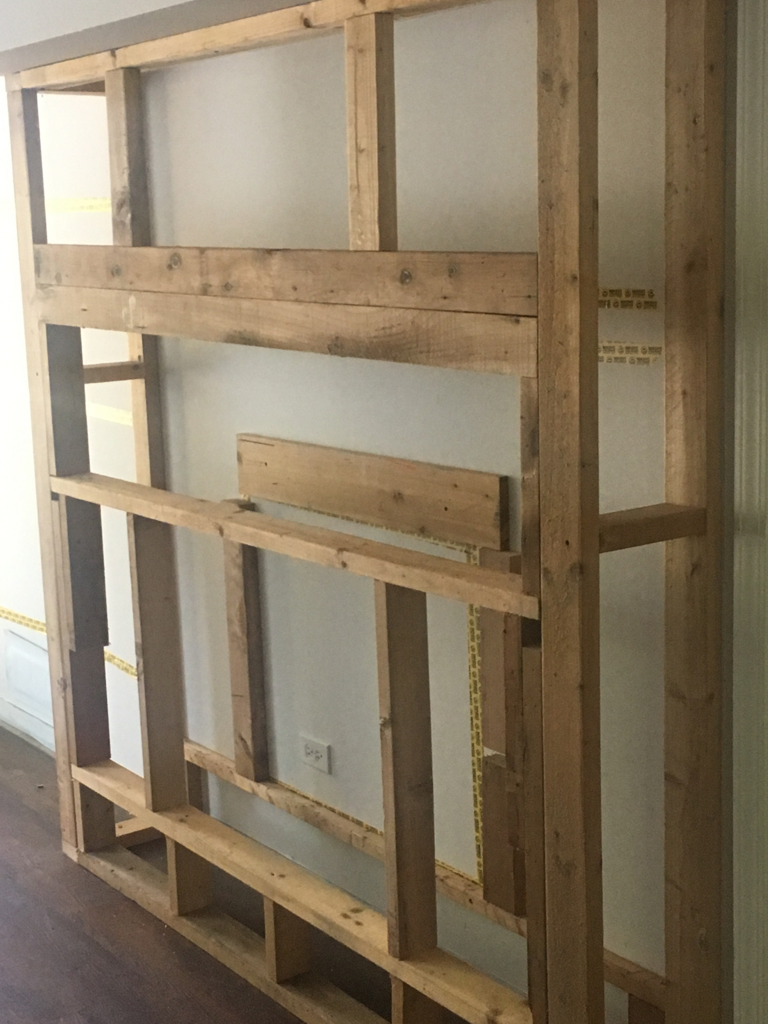
And with those pieces outlined, Gordon went to work!  Look at this stud.
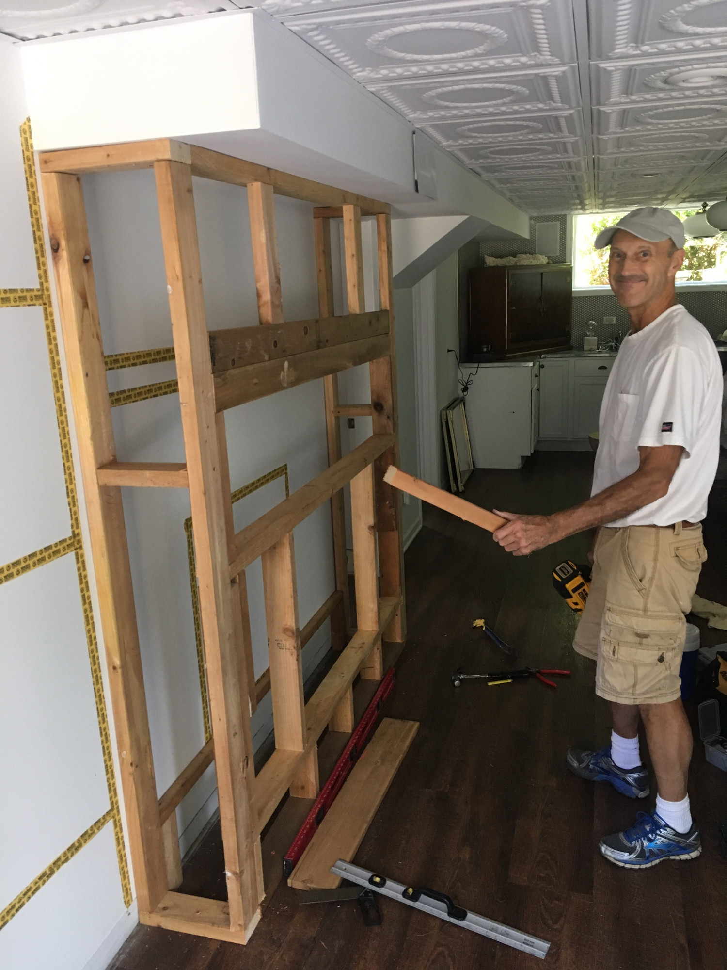
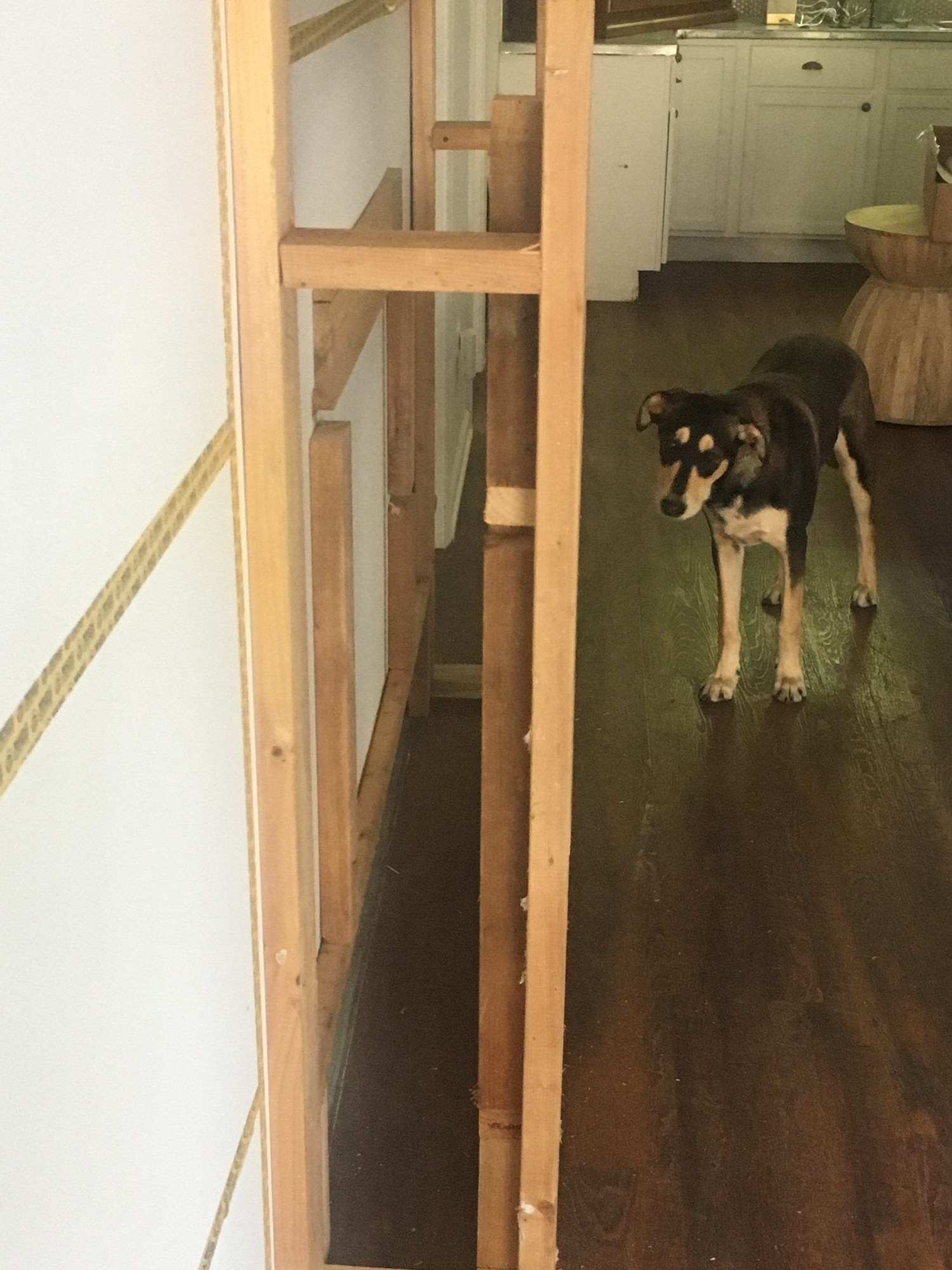
Framing is relatively simple.  The part that Gordon spent the most time on was the base.  He had to ensure that was level and then he had to bolt it into our concrete foundation.  Badassly, he had a tool that was essentially a gun that shot the anchors through the wood and concrete.  Most people won’t have this tool handy so careful measurements and pre-drills are required.

Specific questions I had before this project began were in regard to the weight and the heat given off.  The fireplace weighs maybe 25 pounds so there isn’t any special reinforcement needed to support it.  Further, the unit does not have any screws to hold it in place.  It’s just placed in its opening and sits there.  Additionally, the unit itself doesn’t get hot.  The back and front glass are room temperature and the heat that’s given off shoots forward out the top grill that runs along the top face of the unit.  That’s just hot air that is maybe 90 degrees.

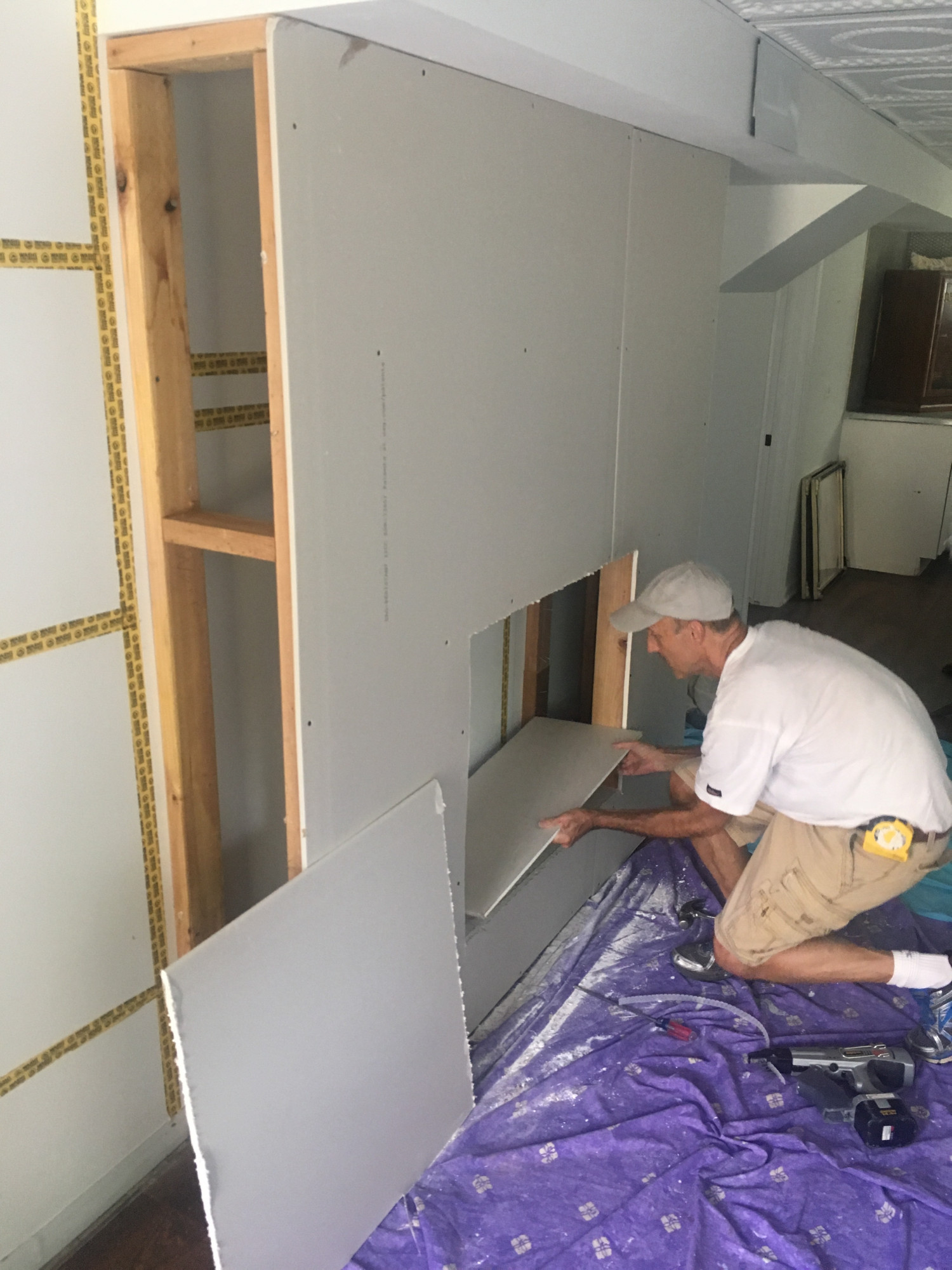
One lesson we learned though is that initially we didn’t outline the back end of the fireplace opening.  On the below image you’ll see that we only had the tape up and a 1*1 board.  This meant Gordon didn’t have anything to hammer the drywall into for the opening.  But he’s a beefcake and quickly solved that.
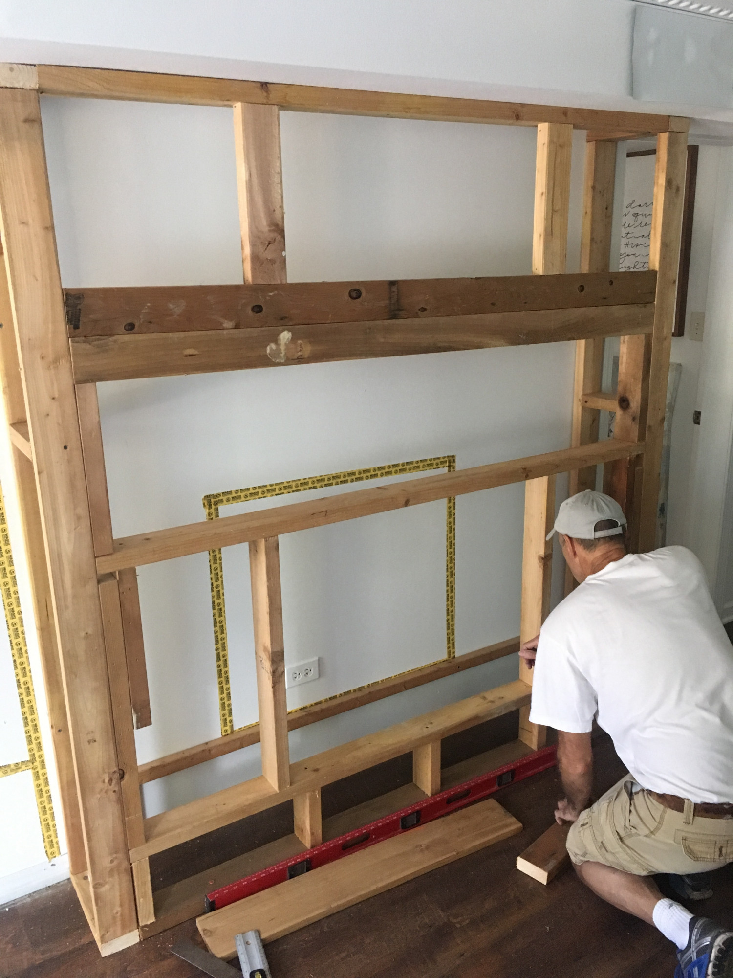
Notice the boards now on the wall itself.
Another beekcake came to help too.

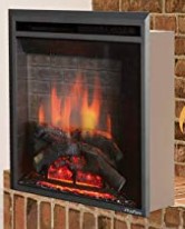
The fireplace opening is a foot off the floor.  The unit’s face has a lip that extends 1 inch on the bottom and sides, and two inches off the top.  From this stock image you can see how the box sits on the bricks and the facade extends outward.  So again, that means the fireplace insert just sits in the opening, no screwing in required.  It’s back heavy too so it won’t tilt forward unless pulled pretty hard.
The mantle is 4’8” off the floor.  Susan wasn’t entirely sure how high to put it and wanted to see after the fireplace could be inserted into its opening so Gordon doubled up the 2*4’s where we knew the approximate location of where it was going to be installed.  This gave up some wiggle room to make minor adjustments.
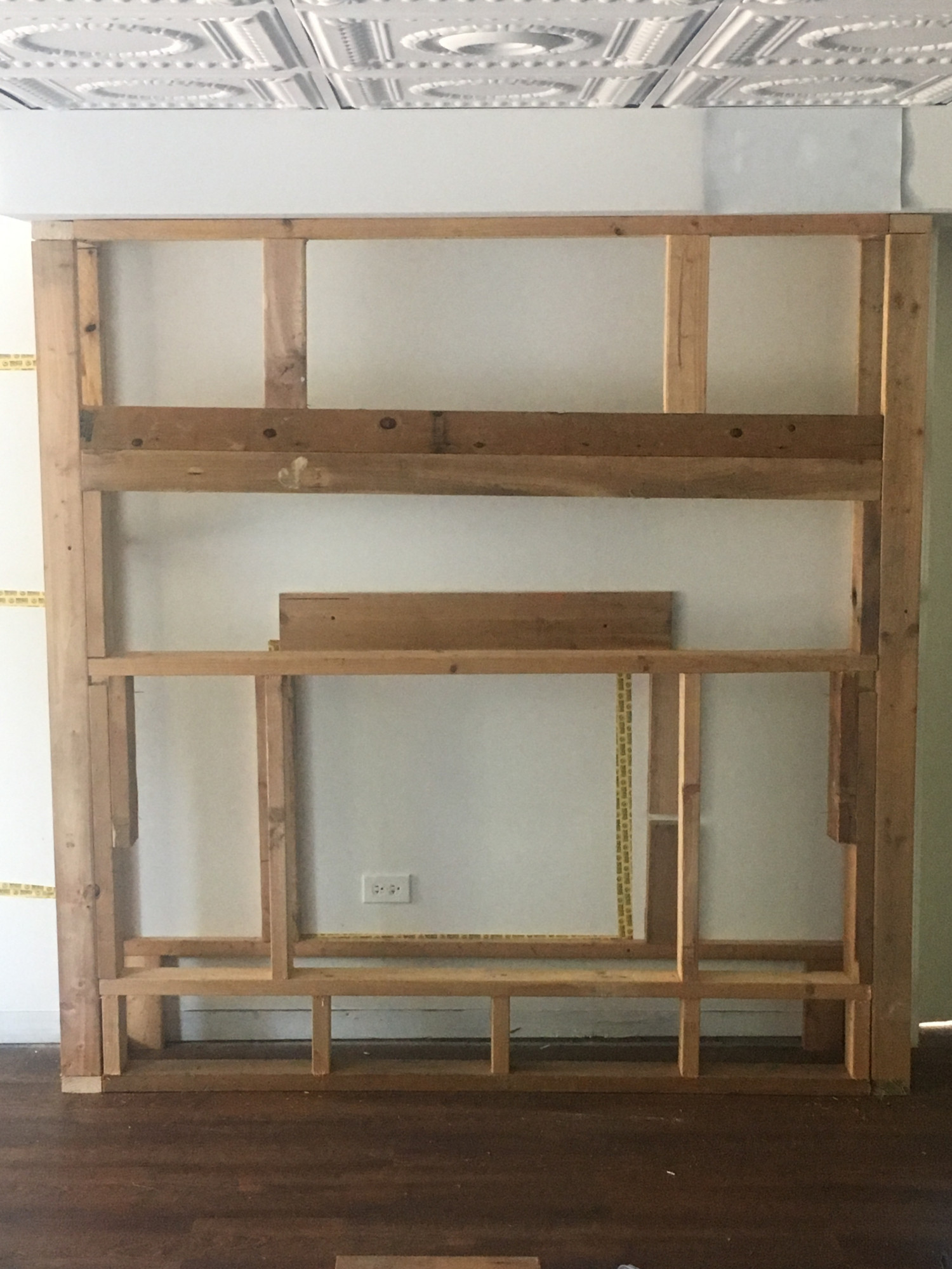
The frame is level, the camera wasn’t

Lastly the drywall.  Because we knew we were going to brick over the frame Gordon didn’t have to be perfect.  This made the job much easier.  And by the way, since the insert doesn’t get hot, you are free to use drywall, wood, or any other combustible material.  Just use whatever you think looks best – which will probably be General Shale’s thin masonry.  🙂
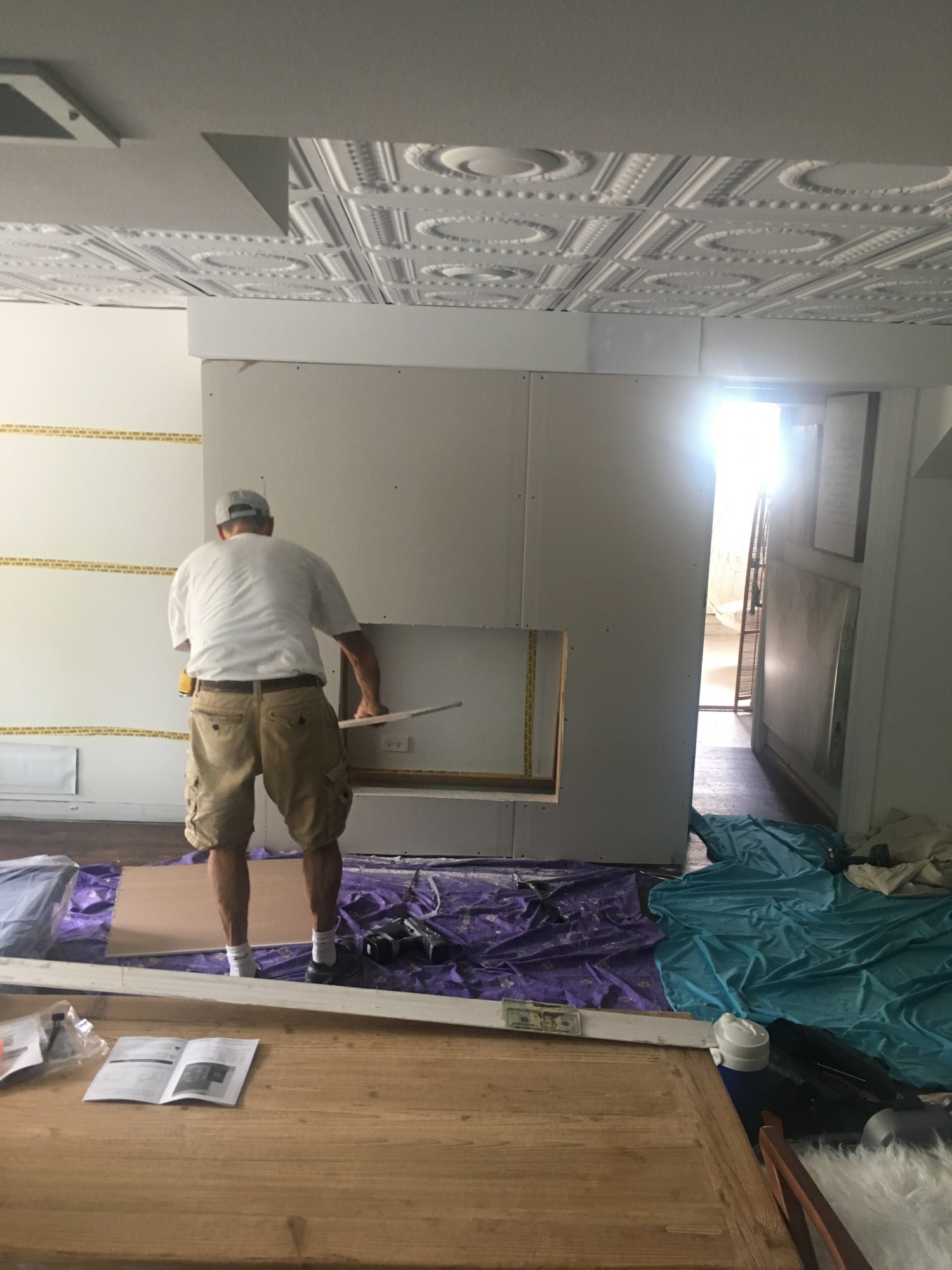
Yea, we casually have $20’s just left out.

Lastly, Gordon installed the mantel.  We used this one.

Joel’s Antiques & Reclaimed Decor 3″ x 7″ Rustic, Mountable Floating Mantel Shelf (Unfinished, 60″)

It doesn’t look as if Joel is selling the unfinished version at the moment so here’s a close substitute.

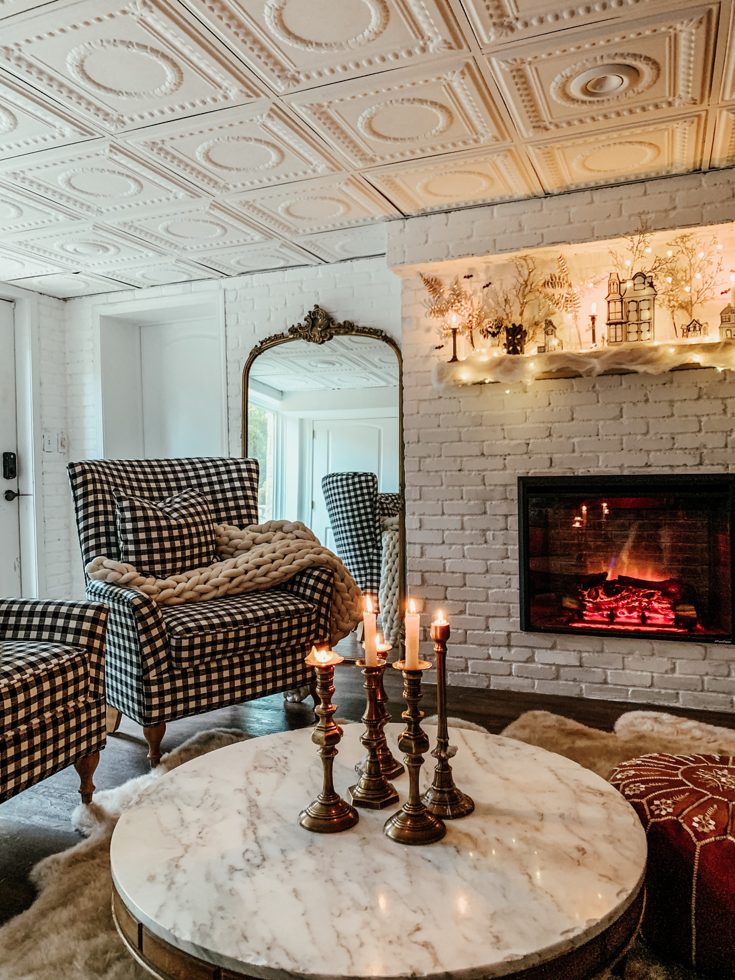
That’s our D.I.Y. (with Gordon) project.  What do y’all think?  Up next in Part II The Brick, we’ll show how we finished off this project with General Shale and Romabio Limewash!   For now here’s a sneak peek!
Products Used:

PuraFlame Fireplace

Joel’s Antique Mantle

Our Bricked Fireplace: Part 2 The Brick

Hey world,

Rob here again to complete the story behind our bricked fireplace.  As you hopefully read in our last post we recently added an electric fireplace to our basement.  We did this for a few reasons.  Firstly, the original wall was long and plain.  Plus, because the basement itself is open, furniture layout was difficult.  The couch had to face the wall opposite the fireplace because that is where the TV is.  Changing that wouldn’t make sense since that was the only space it would fit.  Essentially, that left a room-wide “hallway” that simply served as a corridor to the other rooms and the outside.

Here is a picture of how Susan has decorated the space previously.  I think she did a wonderful job (love you babe), but you can tell the space is very wide and we if could have turned the couch around without having the T.V. cut off from the rest of the room then we would.

Secondly, being as this house is from 1856, the basement was always cold, even in the summer (especially in the summer).  The space was 5-8 degrees below the rest of the house.  The fireplace we added is enough to add that few extra degrees of warmth to make the space enjoyable.

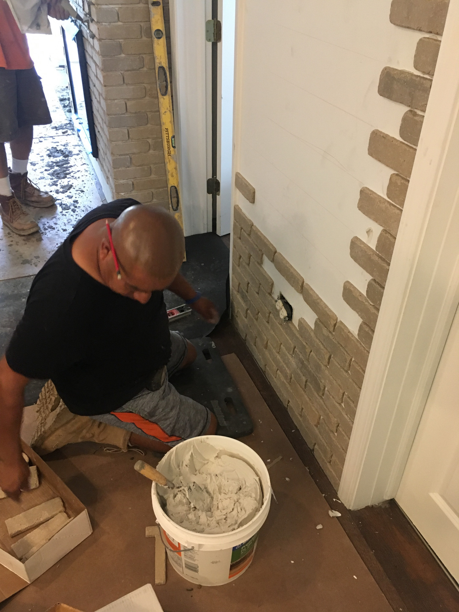
To expand on that idea of warmth, SQ really wanted to make the space “feel” warmer in terms of visual coziness.  In our opinion the best way to do that is to add brick.  That’s where we are so happy that we partnered with General Shale.  This company is awesome.  The guys who worked on our house were just the best.  Fast, efficient, detailed, and above and beyond friendly.  They even put up with me asking a ton of questions.  Who knew that applying brick required extensive math solving capabilities?  But it does and these guys were masonry prodigies.  And best of all these maestros get to use this ingenious brick that is thin and lightweight so it’s perfect for indoor makeovers.

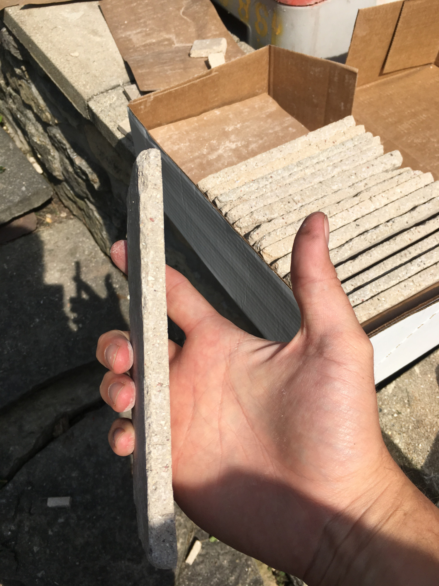
The problems with normal thickness bricks are many.  It’s expensive first and foremost.  Second, if we installed it we’d lose several square feet of living space.  Lastly, it’s heavy.  That may prohibit its use in upstairs rooms that may not be built to handle the cumulative weight, or in our case, the weight could have prevented us from covering the duct work.  The thin bricks that General Shale offers provide the look of “normal” bricks without these negative attributes.  And they look awesome!  Take a look at these bricks that follow old color schemes used at the turn of the century.  In a word, awesome.

They pretty much chose the perfect name for this thin brick
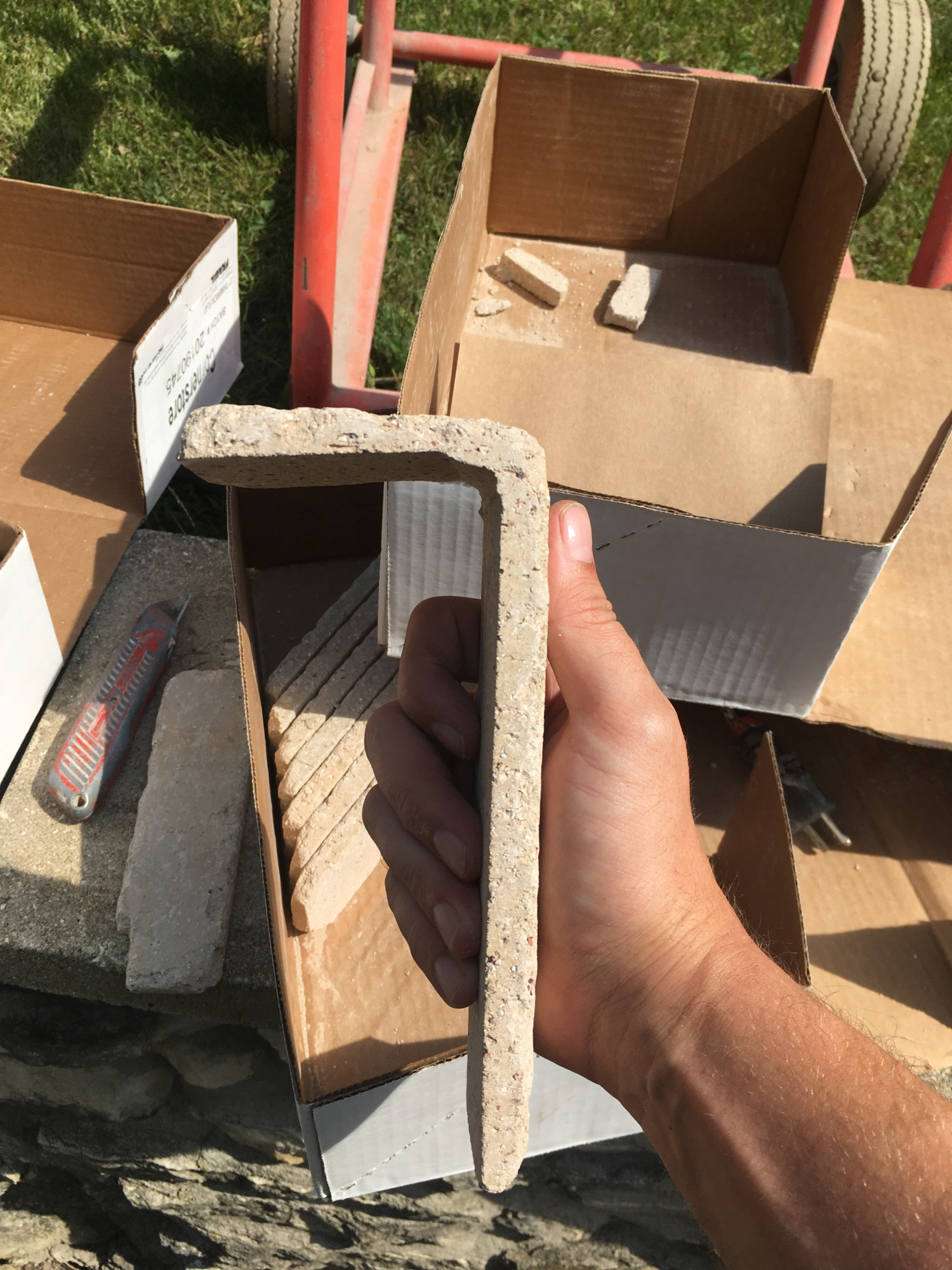
Here’s how they handle corners.

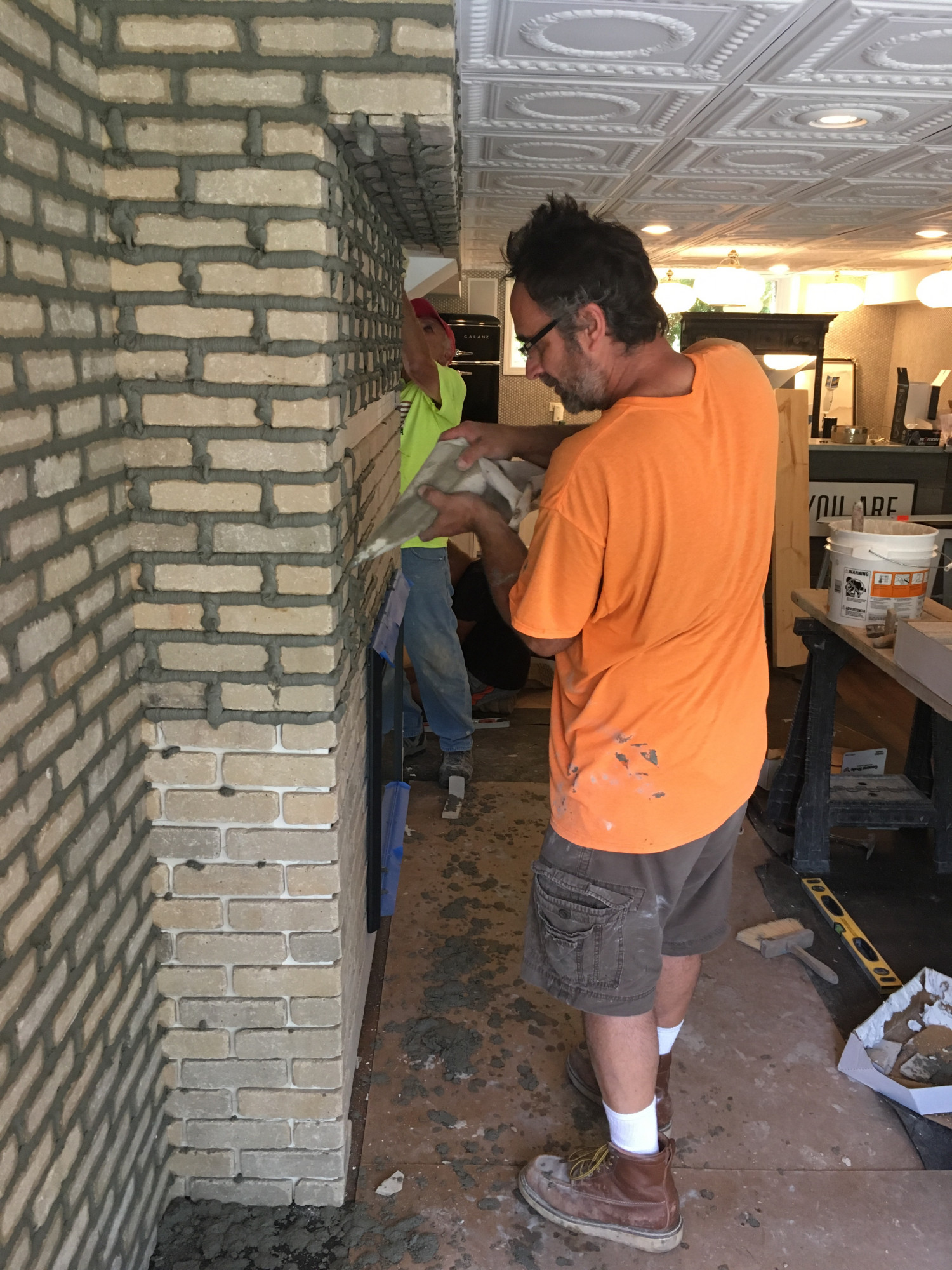
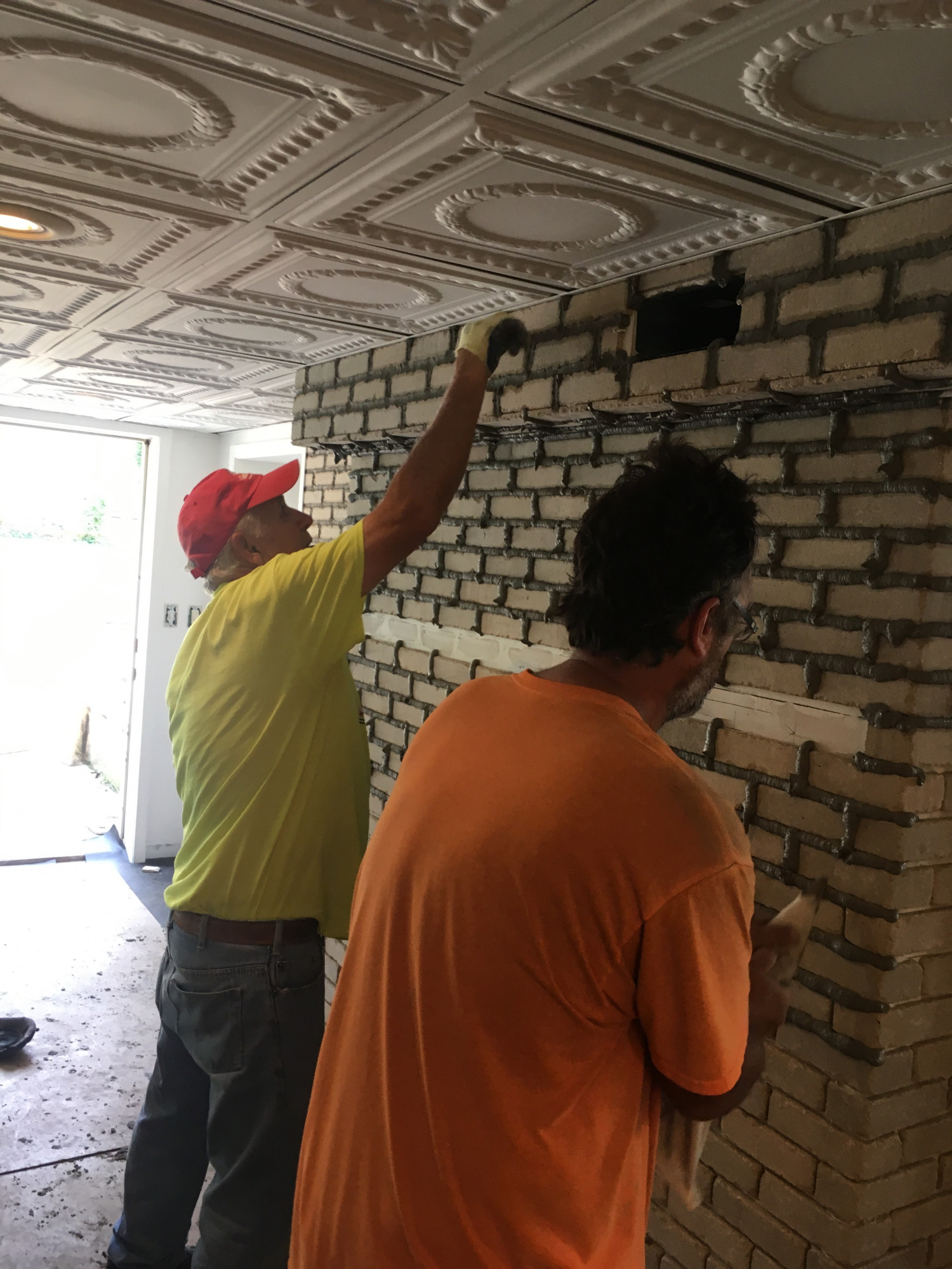
General Shale came in and installed the brick wall like clockwork.  It was amazing to see the guys handle our wavy walls and sharp corners as if it was just the simplest thing in the world.

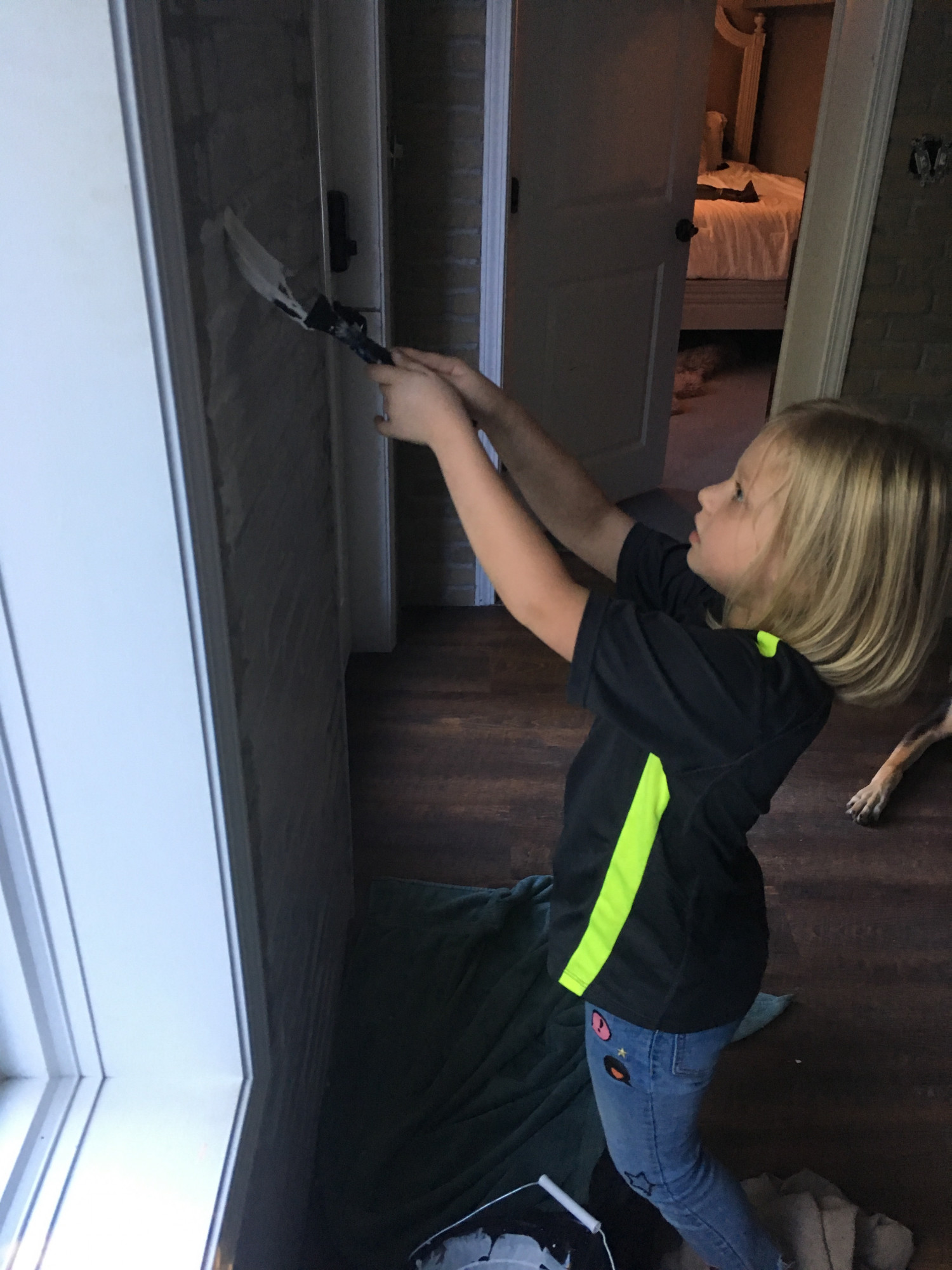
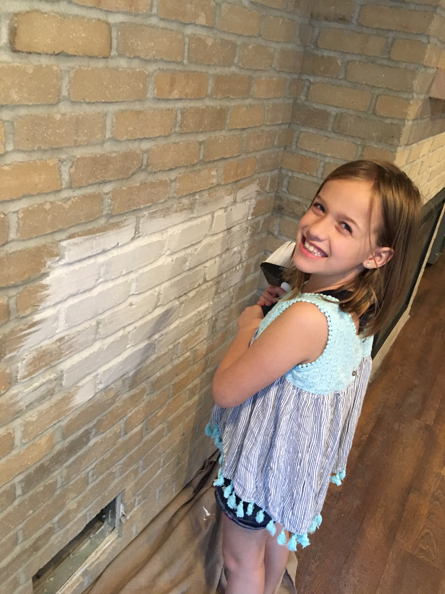
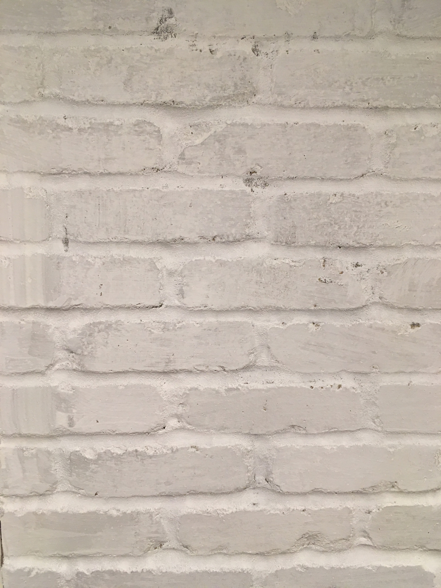
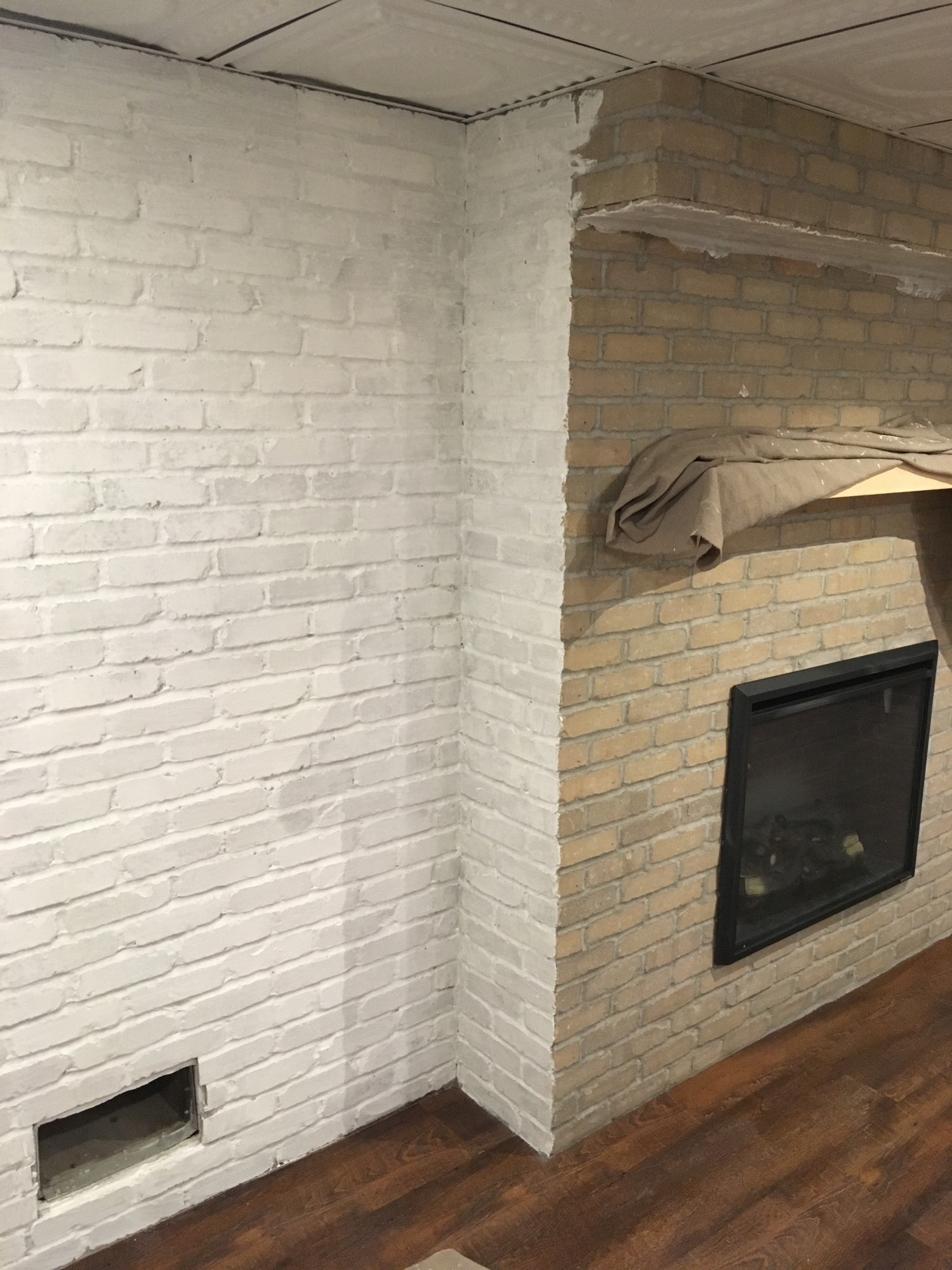
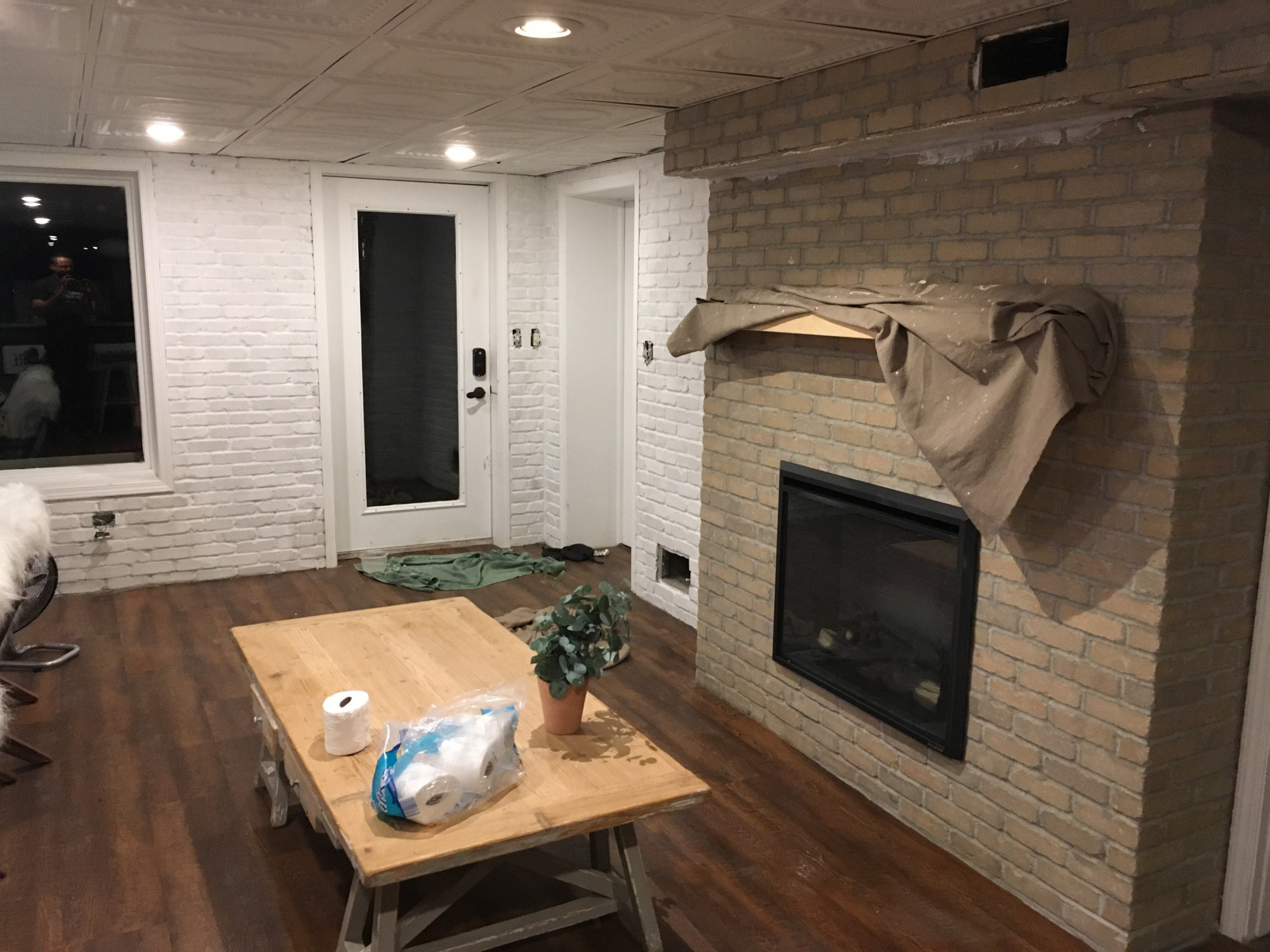
Originally we were going to leave the brick its natural color; however, our basement is dark.  And even though we chose a lighter colored brick, anything besides white just darkens the whole space.  So we used a thin layer of lime wash to lighten them.  And then we used a thick layer because that still wasn’t quite right.  Needless to write, I was painting for a while.

SQ was off on a business trip so I recruited some really cute helpers to paint the walls while she was away.

Susan would have closed the door

Here is the view with only a layer or two of limewash.  Awesome still, but our space needed a few more layers to counter the shadows.

Ignore the TP

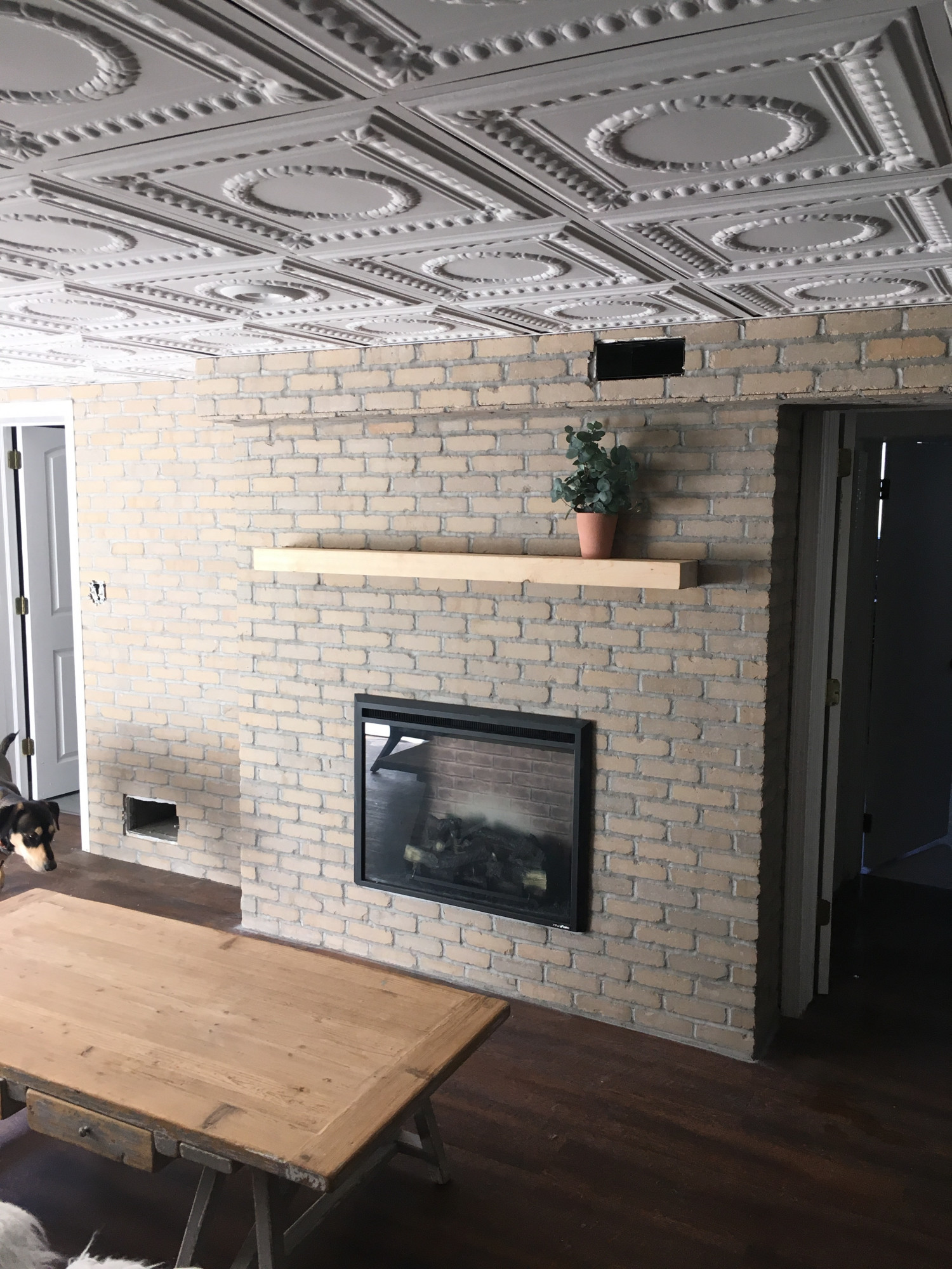
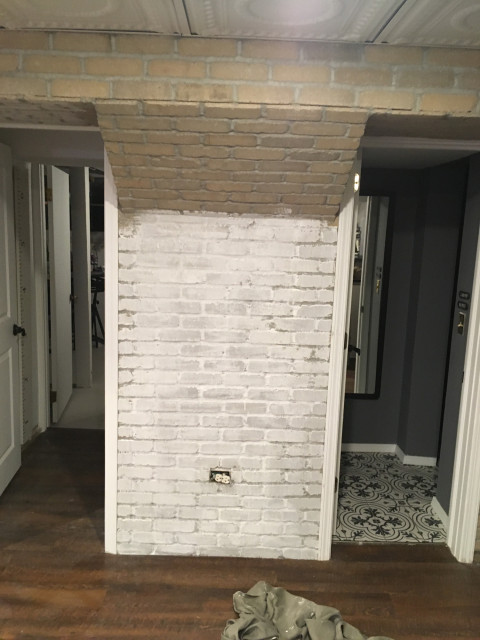
For comparison here is a side by side image of the same space.  Apologies for the blurry image.  I’m not a good photographer. 🙂  You can see that the original wall was just kind of utilitarian.  Then you can compare that to the unpainted brick, which is very cool, and lastly what one layer of Romabio limewash looks like.  Also, very cool.

And here’s the final product.  Susan will definitely be taking a ton more pictures so stay tuned for decor updates to this space!

Kindred Vintage American Standard Pretty Girls Bathroom

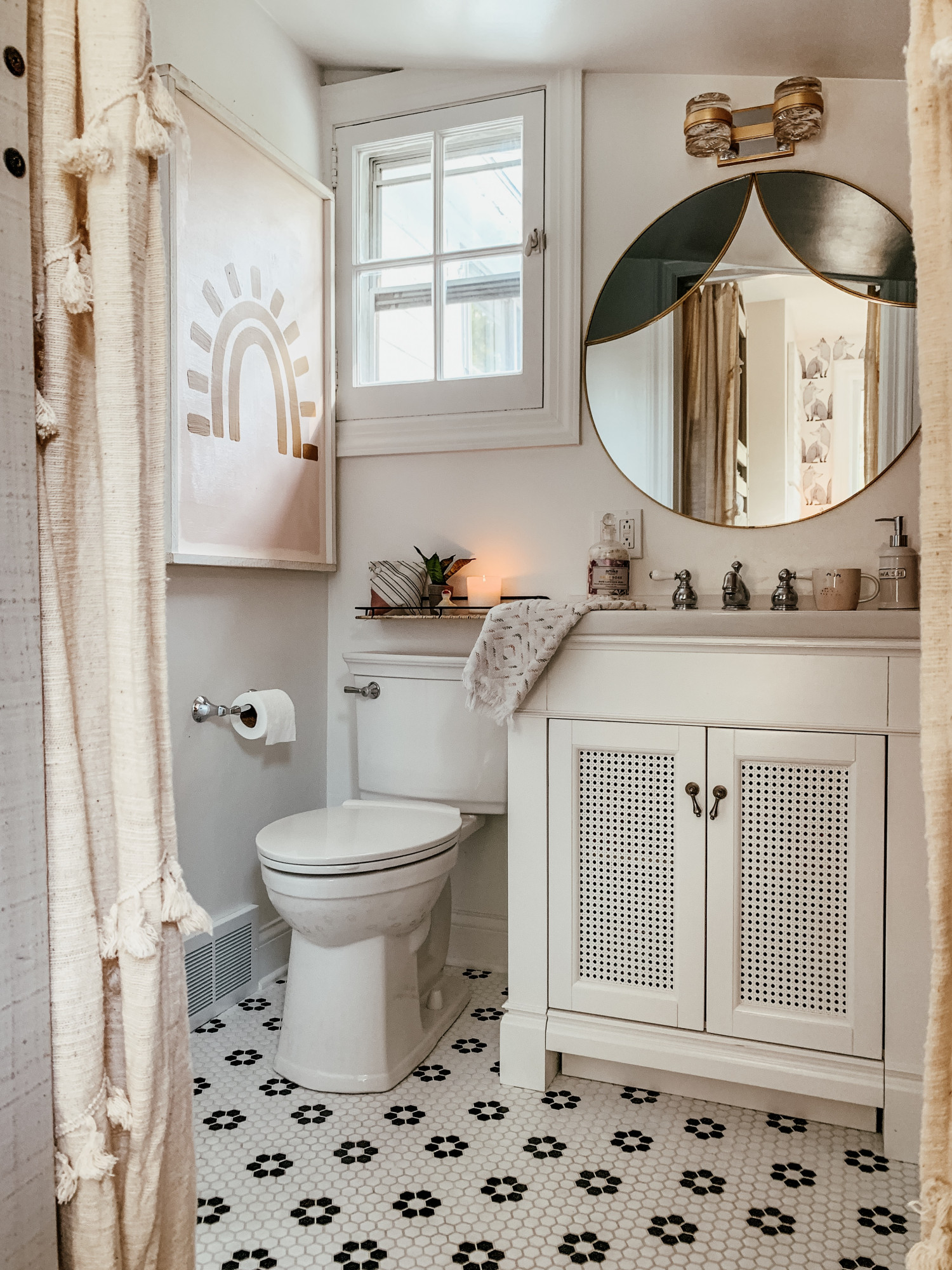
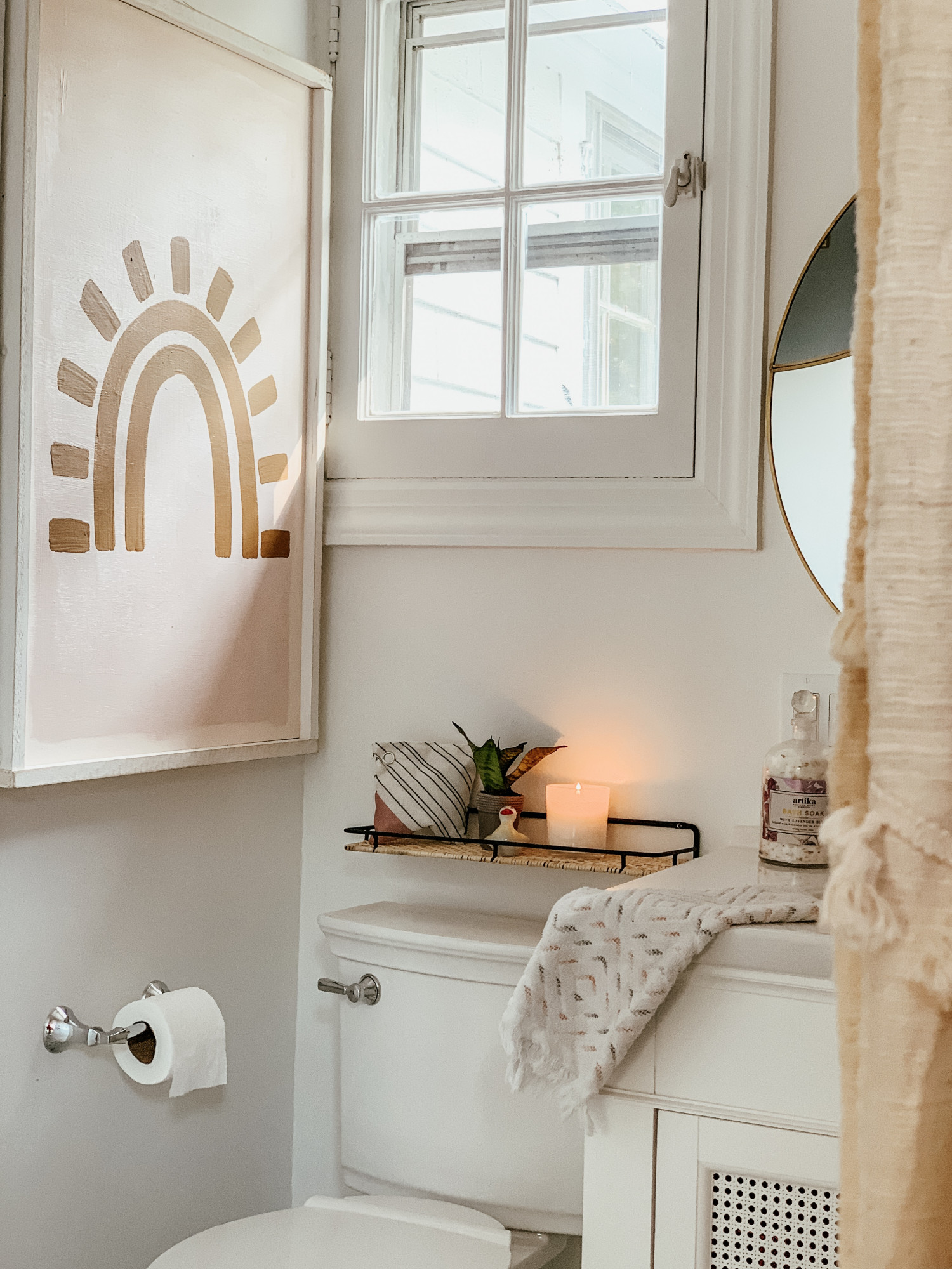
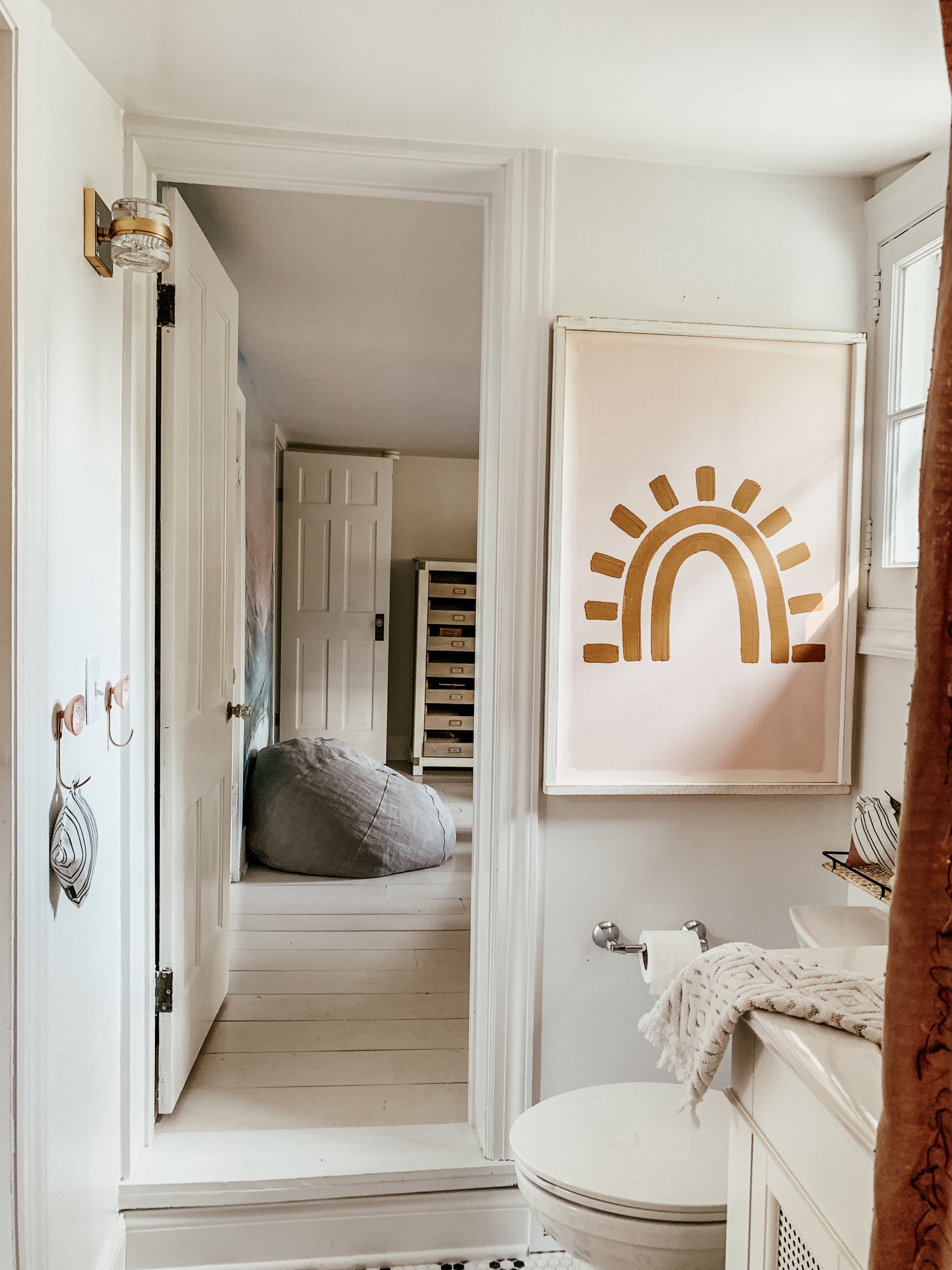
How to transform a dated, extra small bathroom into a little girls dream.

#Brand_Partner, #sponsored, #ad

This post brought to you by a Kindred Vintage and American Standard collaboration!!

When Rob and I were looking for our dream home in our dream city I knew we were going to have to find a “labor of love” house.  Our little corner of the world is beautifully surrounded by farmhouses and Victorians from the 1800s. Our neighborhood is lovely and just a walk to downtown! There is easy access to public transport, which is perfect for my husband, and great schools which is a must for my girls. Our neighborhood is very sought after and many people want to live here, and I knew that meant we couldn’t afford a perfect, move-in ready turnkey.

Slightly different huh? 😉

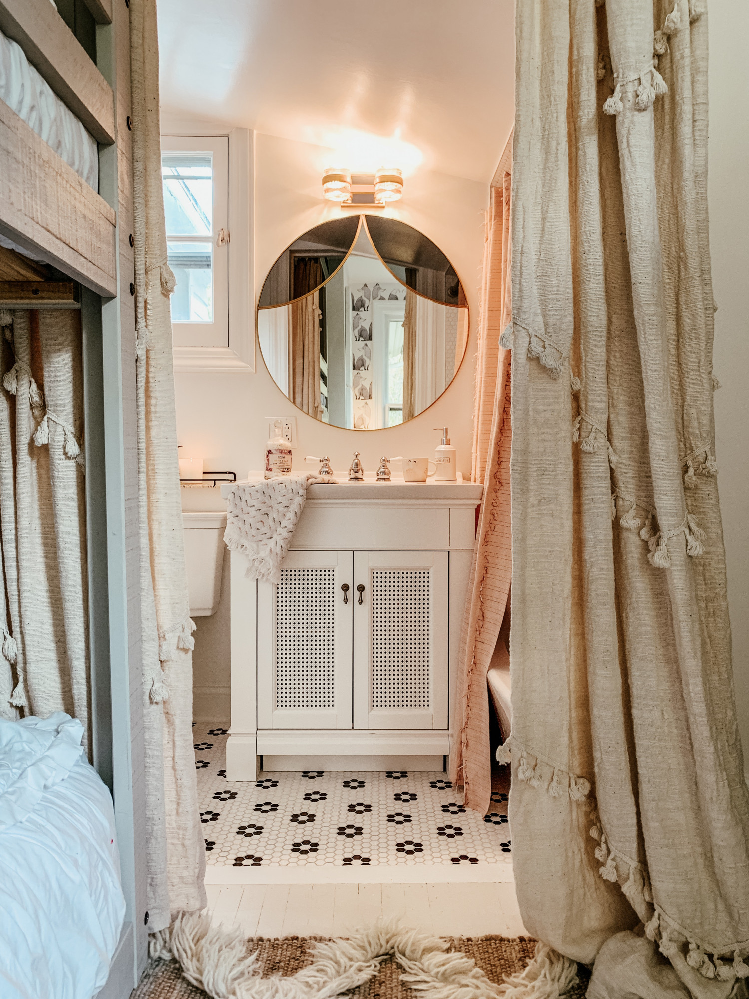
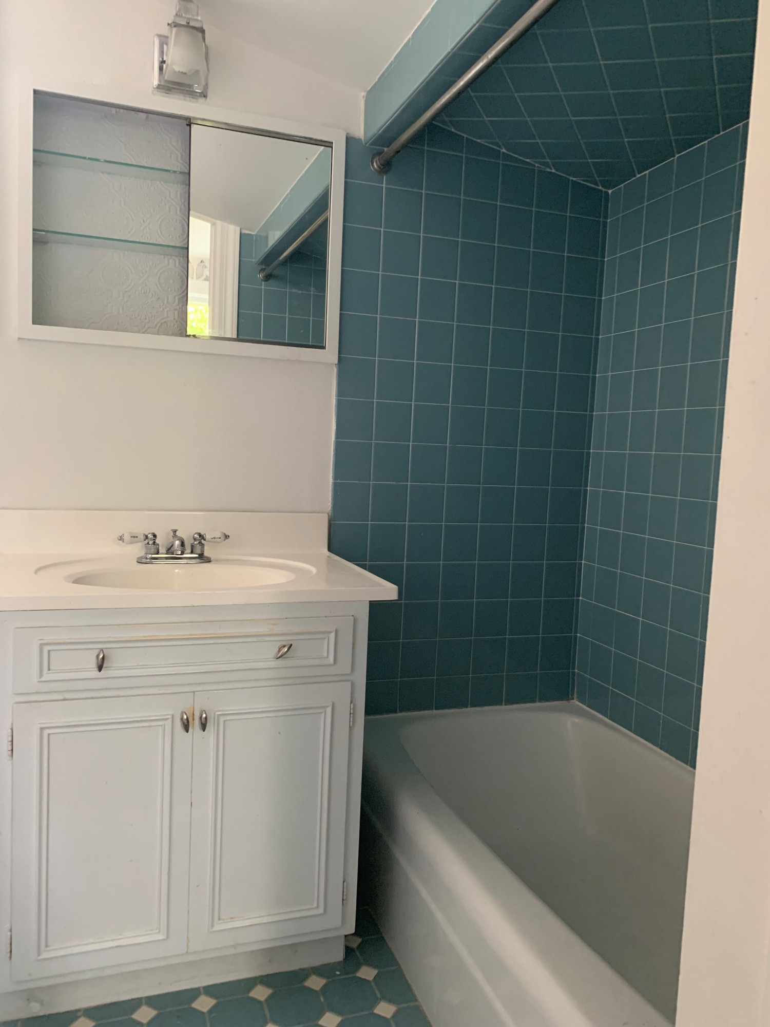
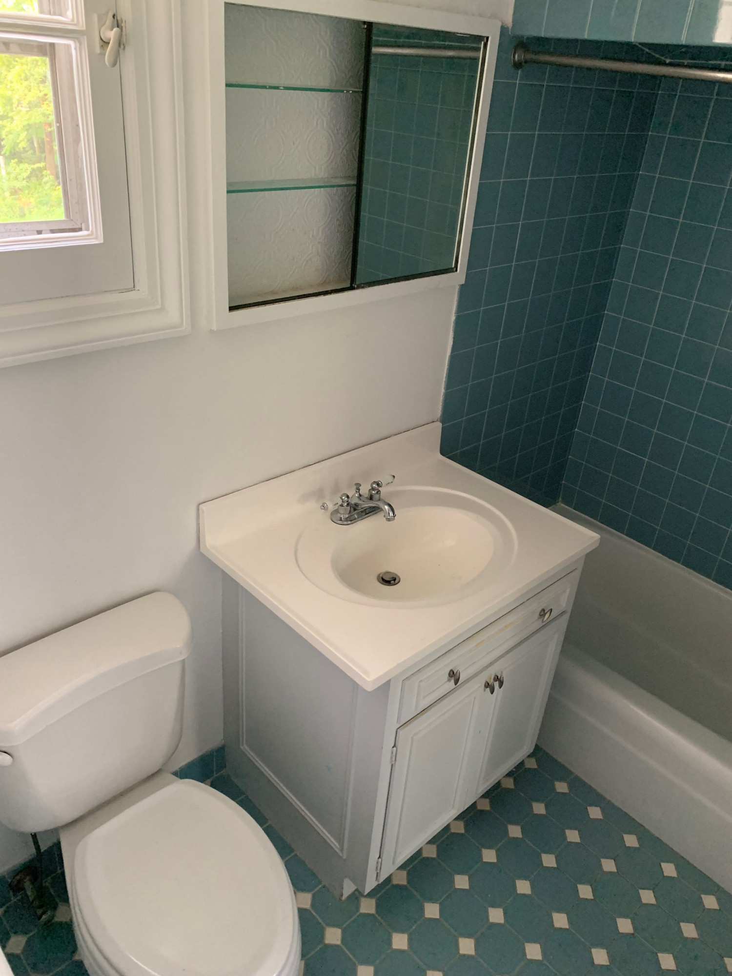
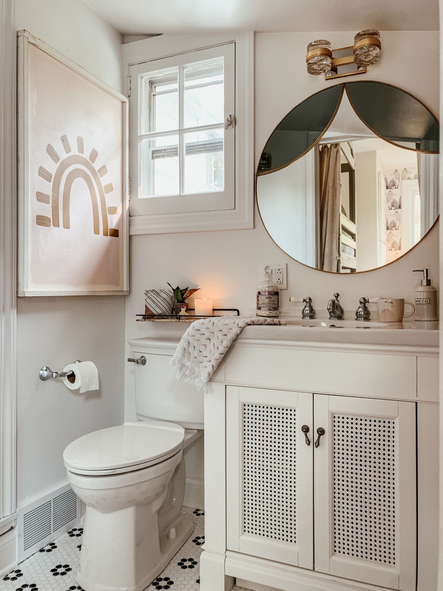
Now, don’t get me wrong.  The house we were lucky enough to purchase was already stunning.  The prior owners had done a lot of work to update the décor, but one area that they didn’t get around to was the upstairs Jack and Jill bathroom. This has become our girls’ bathroom, linking their bedroom and playroom. I’m certain the prior owners mainly used their master bath, sharing their tub with their little babe.

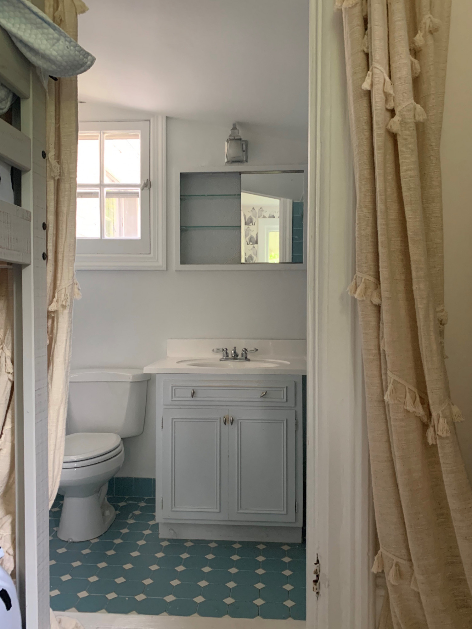
Kind of has a 60’s thing going…

The space itself is one of those quirky shaped rooms that seem to only exist in very old houses.  It’s on the southwest corner of our home and seems to be squeezed into the space.  It wasn’t originally a bathroom since in the 1850s there wasn’t even indoor plumbing!  My guess is that it was a storage closet considering how low the ceiling was. They even had to lower the floor to make the room usable! Now there’s a step down into the bathroom, which is a quirk that I love!

Last “before” pic I promise!

Regarding the look of the room, I’m not kidding, the bathroom was sky blue throughout including the tile, the floor, and the walls!  Even more so than the color, the floor tile was loose and often stuck to your foot as you walked through!  The room had one of those 1960’s built-in medicine cabinets, that for some reason, the builders put a light inside.  This was quite inconvenient since there was no easy way to turn on the light from outside the medicine cabinet.

Thank goodness American Standard came to the rescue with many great bathroom decor ideas!  Rob and I cannot say how happy we are with this partnership.  American Standard is just a wonderful company to work with in terms of customer service and making the remodeling process easy.

Bathroom pieces are pretty standard: tub, faucet hardware, vanity, and toilet.  Let me tell you though that updating one can still get overwhelming! The number of choices are daunting so the first thing I had to do was narrow down the number of options.  I did this by trying to be practical.  Like I wrote earlier, the bathroom is small, so I measured the pieces that were currently installed and filtered my web search to show only what fits.  This step is important to do regardless of whether or not the space is large or small.  If the new pieces don’t fit with the in-place water pipes or electric, then project costs can grow pretty significantly.
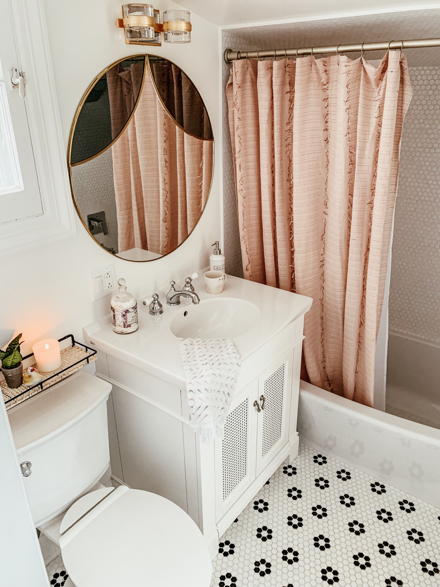
After narrowing our choices we had several options. The best and most adorable of those was American Standard’s Passage Shower Collection& Grohe products (all the links are below!)  It had the best options in terms of accessories and provided the “look” that best suited a pretty girls bathroom.

Next, I knew I wanted to decorate using white.  To me, that’s the perfect color for a whimsical, feminine bathroom for my daughters.  White is clean and flowy, and the perfect palette to add touches of color and unique decorative charm.

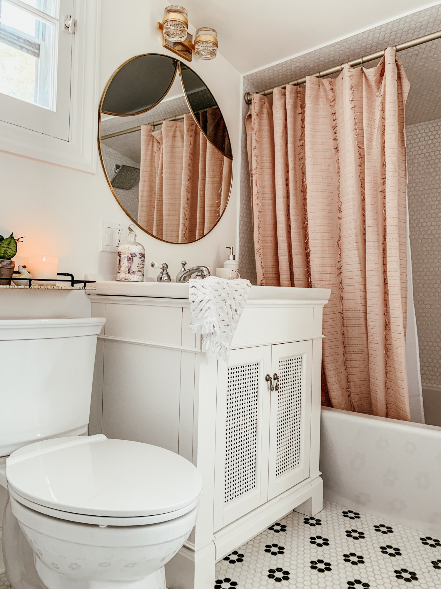
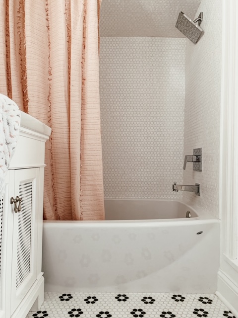
With these two filters alone, size and color, the options became much more realistic. By shopping online through Home Depot’s website, I was able to pick out my dream girls bathroom efficiency and in peace and quiet. Rob and I looked through the list, picked out what would coordinate, and voila! The perfect ensemble was chosen.  Specifically, this options chosen came down to simple design preference.  We like the smooth curve of the American Standard Ovation Bathtub in arctic white so that it gave a bit more room when the girls were in the tub.  Also, we liked the GROHE Tallinn Single-Handle 1-Spray Bathtub and Shower Faucet because it tempered the feminine overall look of the bathroom with a small, masculine-esq square shaped shower head.  But no matter what American Standard offers options that will work with any style.

American Standard shipped these pieces to us and we stored them in our garage until our favorite contractor became available. By the way, he loved how our bathroom was planned in advance.  He kept saying that having everything in order before he started made his job so much more efficient. Seriously, he was able to do the work so much quicker because of this.  Day 1 was demo day and days 2 – 5 he worked!  That was it!  How many of you have ever had a bathroom remodel go so quickly?  Personally, when a part of my home is in disarray the rest seems to go downhill quickly as well.  I was thrilled American Standard made it so easy to complete the job so quickly!

Tub: Ovation 5 ft. Right Drain Bathtub in Arctic White
Tub / Shower Combo Hardware: Tallinn Single-Handle 1-Spray Bathtub and Shower Faucet in Starlight Chrome (Valve Included)

Toilet: VorMax Plus Tall Height 2-Piece 1.28 GPF Single Flush Elongated Toilet in White with Slow Close Seat

Sink: Portsmouth 31 in. Vanity Top in White with Integral Bowl

Vanity: Portsmouth 30 in. Vanity Cabinet in White

Faucet: Hampton 8 in. Widespread 2-Handle Low-Arc Bathroom Faucet in Chrome with Porcelain Levers

Here are a few options we loved but didn’t end up going with.  These would definitely be good options to use if you would like to create your own personal design!

Walls: Passage 32 in. x 60 in. 4-Piece Glue-Up Alcove Bath Wall in Platinum Marble

Doors: Passage 60 in. x 72 in. Frameless Sliding Shower Door in Clear Glass

Finishing Touches:

Anthropologie

Tile:

Bedrosians

@americanstandardplumbing

@american_standard

@amstandard

@amstandard

@americanstandard01

A Much Needed Getaway

Hi Friends!

Susan here to talk to you about what every mama here knows so badly – we need a vacation. Let me tell you about one of the best local spots I have come across.


Lake Geneva is a beautiful vacation destination spot located only an hour away from both Chicago and Milwaukee. The town developed around the turn of the century and let me tell you, the houses look like it. They are just so beautiful and ornate and I just absolutely love their charm and character. The downtown is super cute and being as it’s a resort town there are tons of charming restaurants, coffee shops, boutiques, and all of this is right next to a picture-perfect lake dotted with stunning mansions.

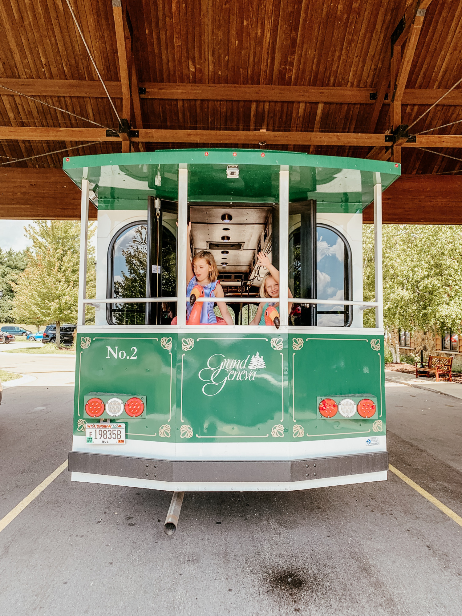
Over Labor Day our family had the opportunity to vacation in this adorable town. We stayed at the Grand Geneva Resort which is located on a beautiful, tree-filled expanse of pristine Wisconsin terrain. Seriously, look at this Google map and see how close it is to town, the lake, and how it’s nearly it’s surrounded by woods.  We spent time wandering around the resort’s property and saw they offered so many amazing options for their guests. They had horseback riding, restaurants, bonfires, pools, hot tubs, and so much more.

For those of you who love sports, there is an 18-hole golf course on their stunning property. They also have The Mountain Top ski and snowboard hill if you’re into that! Personally, I would’ve loved to use their WELL Spa + Salon, but maybe I’ll just save that for next time and sneak in a little private momma time. Something our girls loved was the Moose Mountain indoor water park at Timber Ridge Lodge. We shuttled there from our room and the girls thought it was the best. To add to the list of our injured family, Lorelei was still in her boot, but she was able to enjoy the lazy river and all things relaxing.

The first night at the Grand Geneva we wanted to keep it low key. We knew the next day was going to be hectic with swimming and site seeing, so we enjoyed a delicious dinner and drinks at Brissago. Brissago is an Italian restaurant right inside the main building and 200 feet away from our room. Rob and I splurged and bought ourselves steak dinners. Let me tell you, Rob was in nearly crying tears of joy the food was so amazing. He kept saying he could cut his steak with his fork. It was that good. Later we relaxed in the jacuzzi chatting away while my sister and brother-in-law played Marco Polo with the girls. Rob was sad to not swim with the girls but secretly happy he was only capable of sitting in the hot tub because of his limited mobility due to his recent shoulder surgery.

The next day we were up early as the girls were amped for swimming again.  (Thank goodness there was a Starbucks right in the main building! You mommas know the need for morning coffee!) After an hour or so of pool time, we were hungry and decided to try one of Lake Geneva’s cute little cafes. We took the resort’s free shuttle downtown and found Avant which is this charming bicycle-oriented café with amazing food, and yes, more coffee. Afterward, the girls and I had some girl time with my mom and sister walking around the town to see the sights and boutiques. We found plenty of adorable shops with cozy sweaters, Halloween decor, and all things fall as the season was just turning. We capped the afternoon with a glass of rose in a beer garden covered with beautiful ivy.

That evening we went for one last swim and the girls were just exhausted. After we tucked them into bed we all hung out a bit longer with the intentions of staying up late and enjoying a bottle of wine, but after 20 minutes we all decided to call it a night.

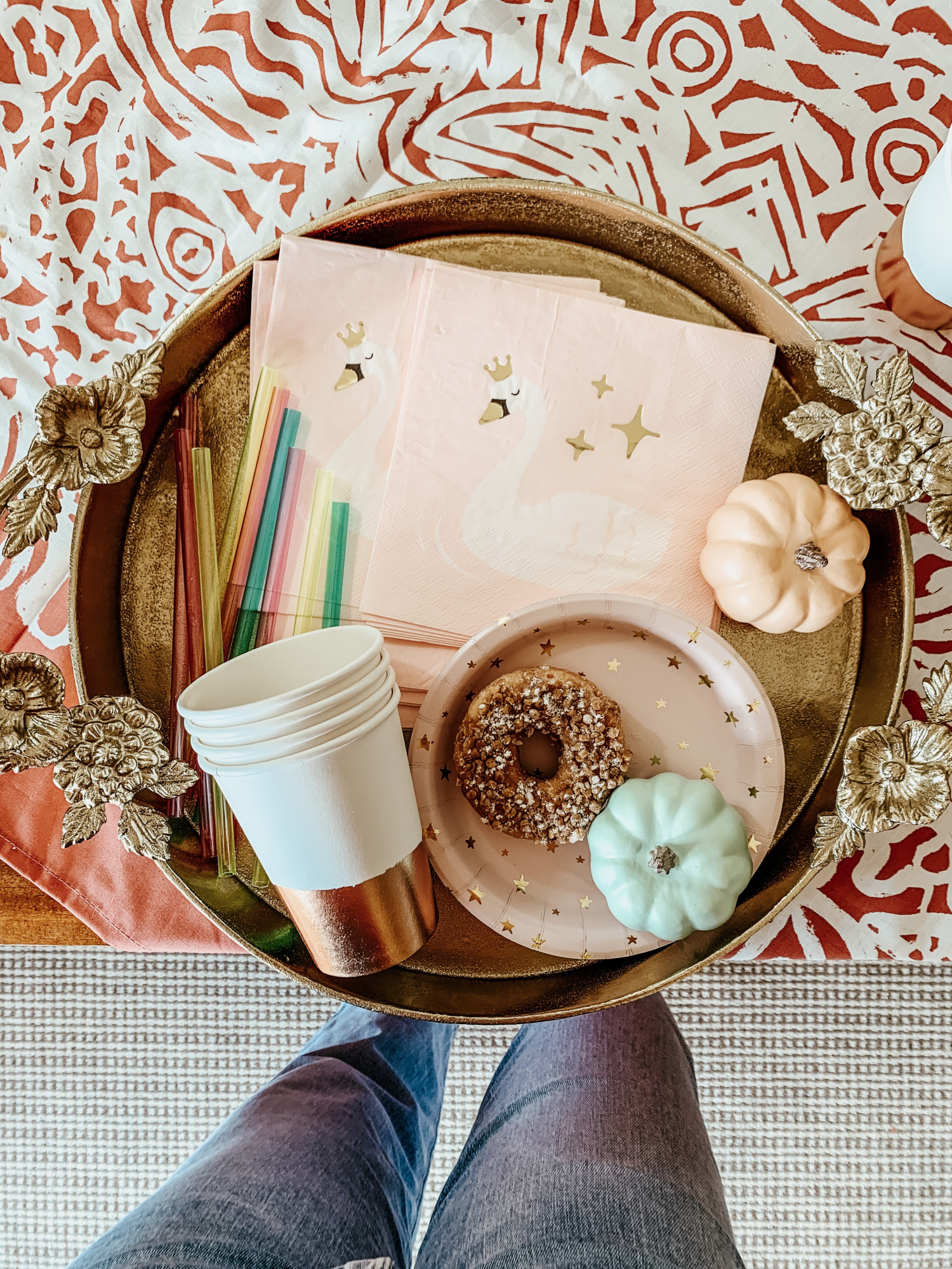
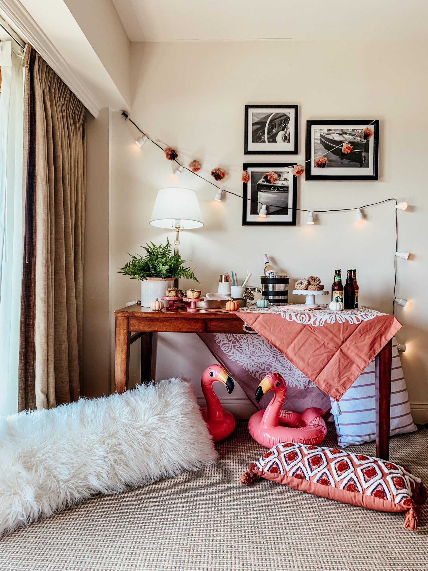
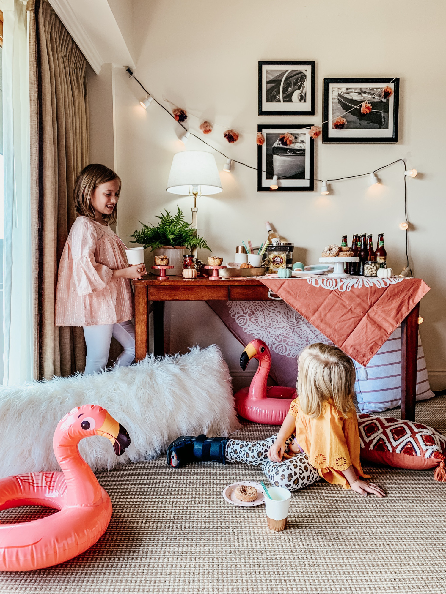
For our last day at the Grand Geneva, we had the idea to set up a little surprise for the girls and decorated the hotel room with a little Kindred Vintage flare (it’s a vacation after all)! This mid-morning celebration was filled with doughnuts, gluten-free cinnamon rolls, wine, local beer, and a few poolside toys! We couldn’t have been happier with our local weekend away!

Bell’Arte Masterpieces

Bell'arte Kindred Vintagephoto by Sharon Hughes Photography

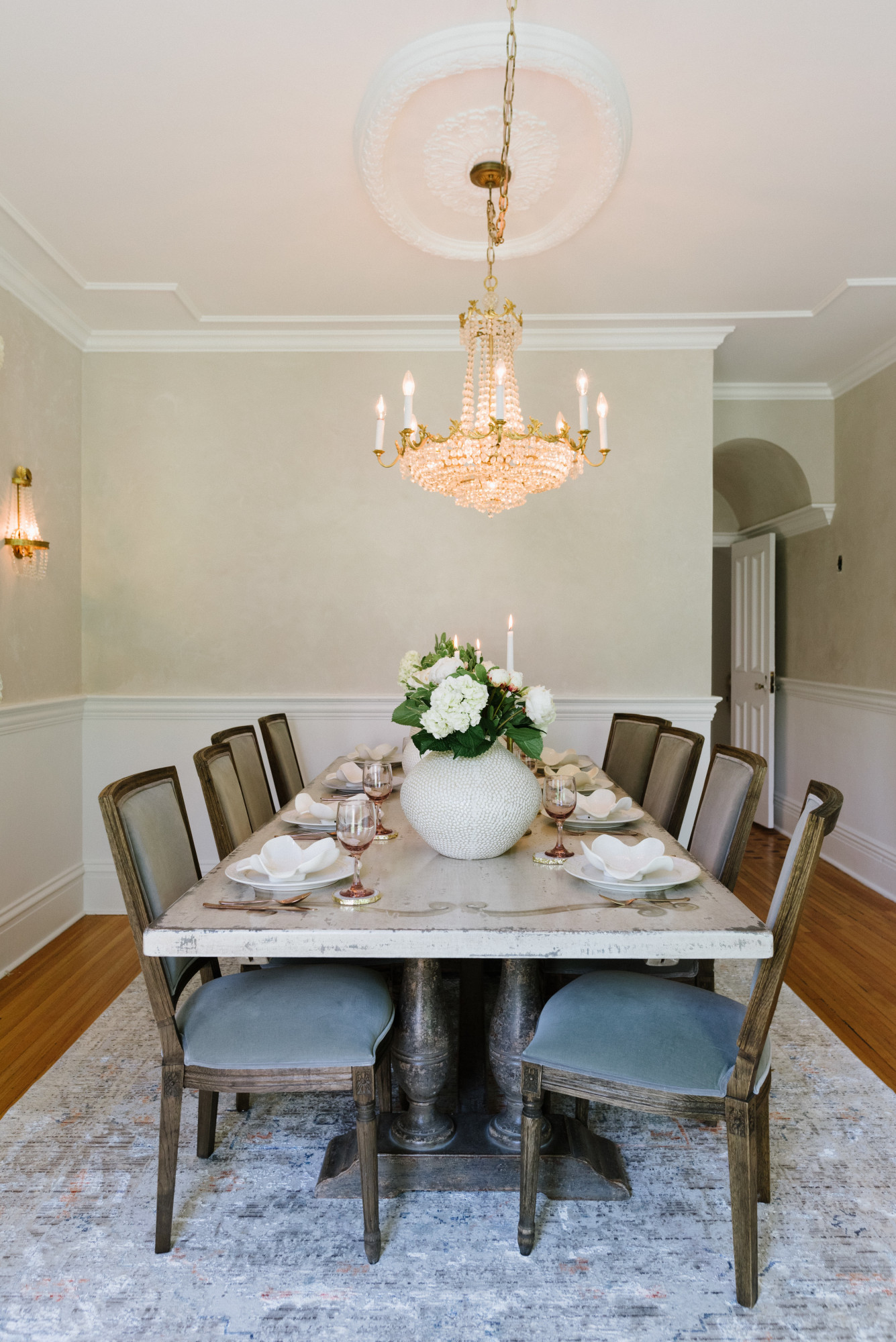
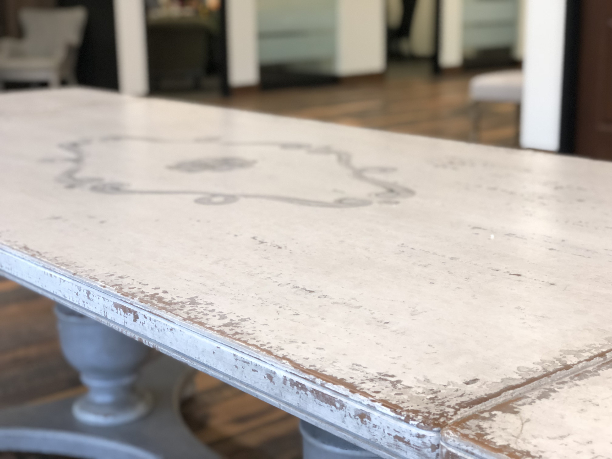
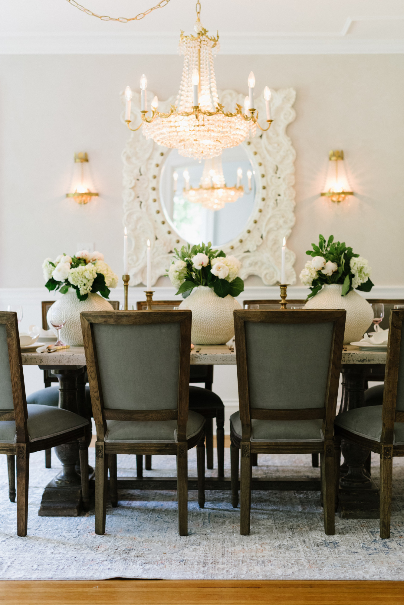
Dining Table Bell'artephoto by Sharon Hughes Photography

When I think of furniture I look past the simple functionality of it. I look to see the life allowed by each piece and the emotions that I get from enjoying having it in my home. This is a concept that I’ve struggled to put into words but here is how I can best describe it: 

Functionally, a chair is only a place to sit, a table place to eat, and a desk is where one works. But to me, a chair is where I snuggle with my girls. A table is shared meals with friends and family. And a desk is where ideas come to life. So when I think of how my family, my home, and myself will be affected by the furniture I bring into my “space”, I realize how important build quality, artistic meaning, and how well a piece integrates itself with other décor are when deciding whether or not to purchase. 

photo by Sharon Hughes Photography
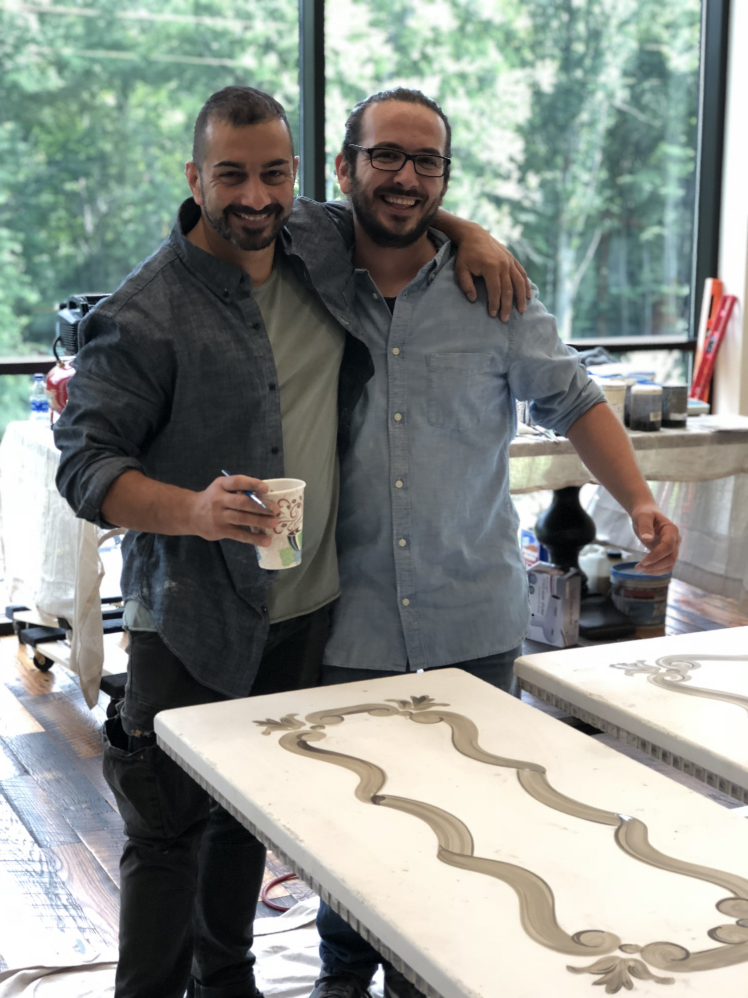
When we traveled to Arhaus in Cleveland my husband and I got to experience something one of a kind. Arhaus was hosting the master craftsmen from the Italian family behind the Bell’arte collection. Yes, you read that right. The Bell’Arte collection is made by one Italian family who leads a workshop of master craftsmen, and craftswomen (his two daughters work in the studio) to handcraft furniture masterpieces.

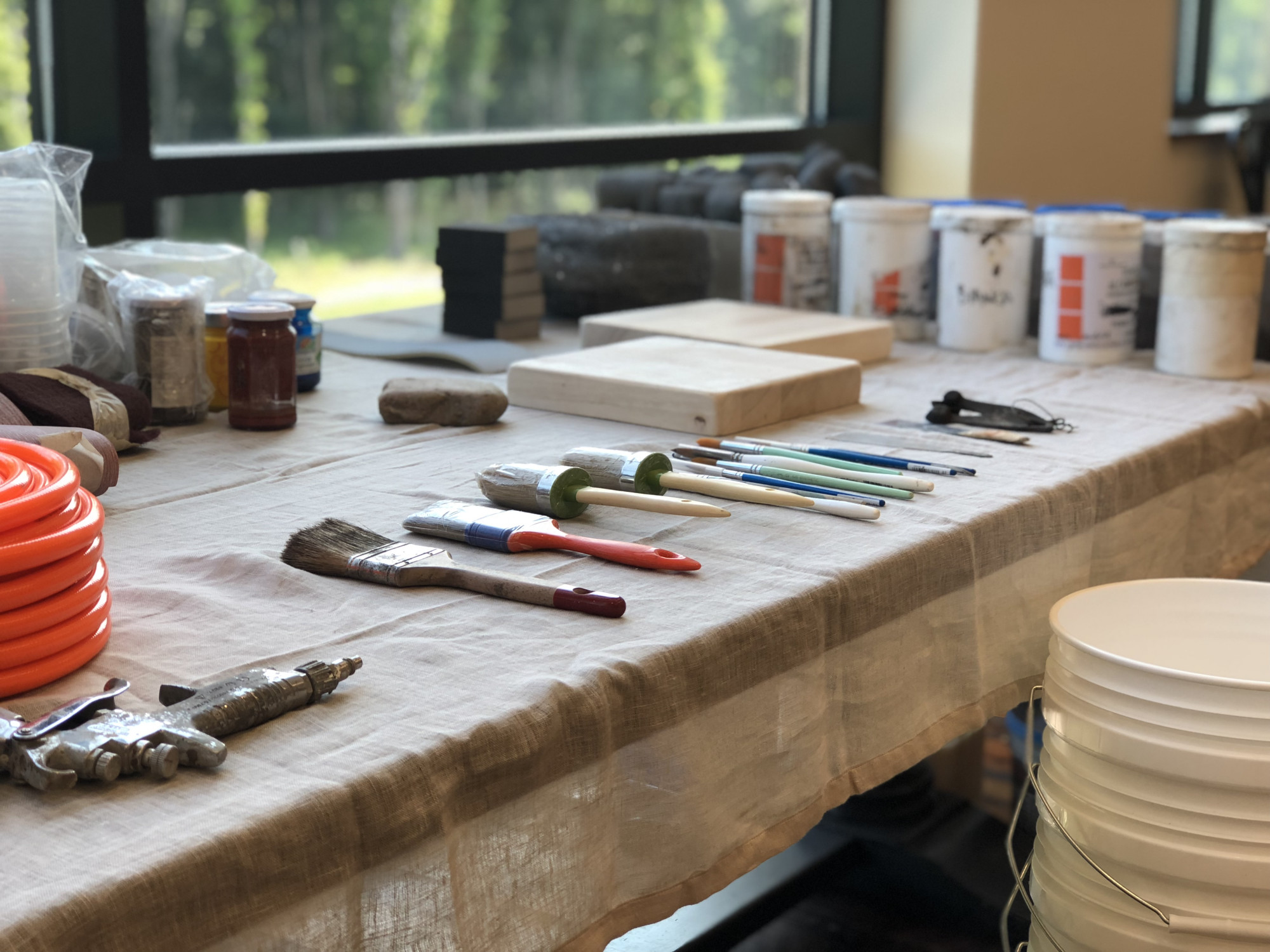
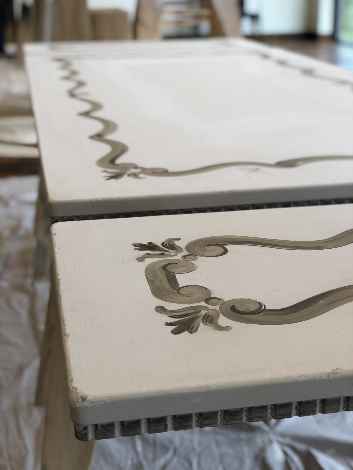
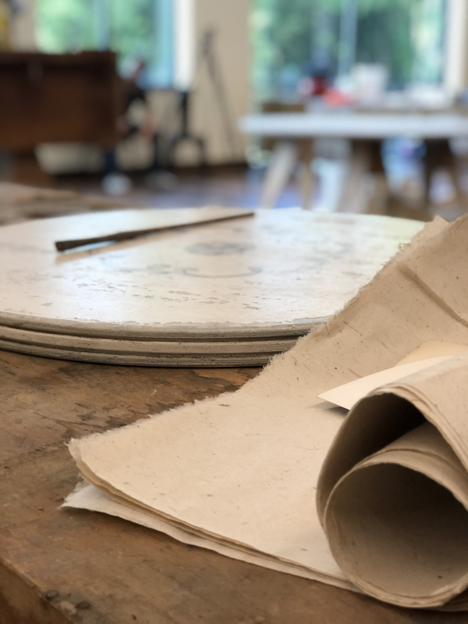
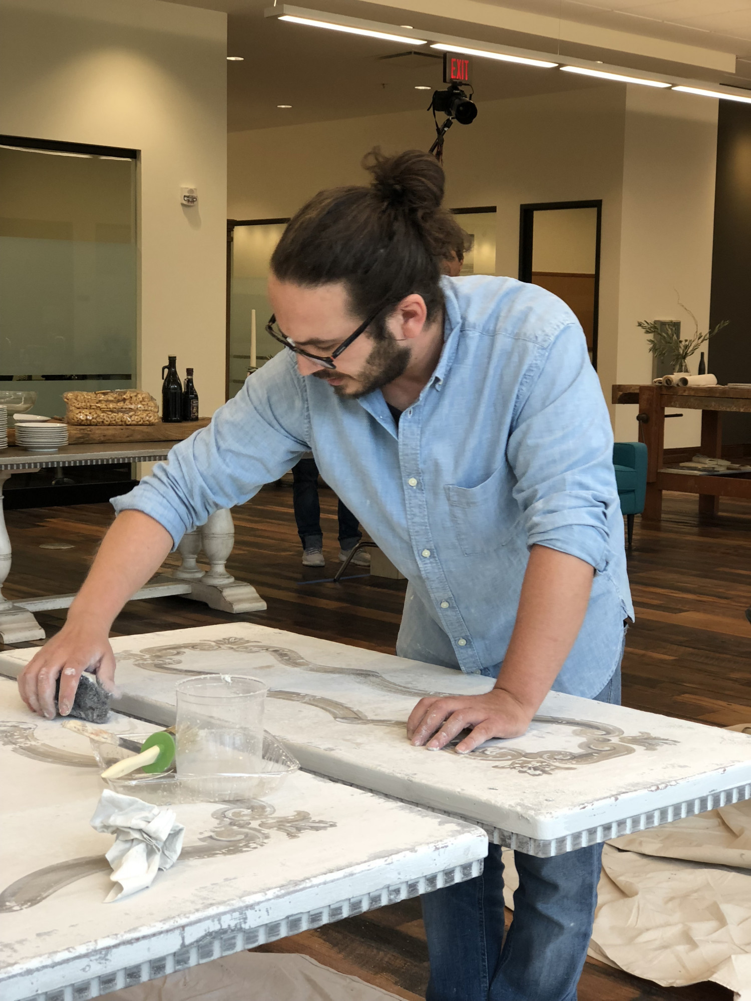
While there Rob and I got to watch several of the artisans build, paint, and distress a wide variety of furniture pieces. You can see how these Italian maestros gracefully paint the tabletops, distress them with rocks, and proudly sign each piece. It was just truly incredible! To achieve their truly remarkable furniture, the artisans utilize a 24 step process which is all done by hand alone. So impressive to witness!

The craftsmanship of the artists was amazing to watch.  From start to finish, watching their talent unfold was beyond magical.  I was giddy with excitement getting to see firsthand all the love and attention that went in to our dining table.

The fact that through my partnership with Arhaus I’ve been able to bring one of these masterpieces into my home is just beyond words. I am so honored that I get to have the Savona Bell’arte dining table in my home. That I can share meals with my husband and girls there, host friends, and enjoy special occasions on what is essentially artwork is beyond words. It is so beautiful, well-constructed, damage resistant, (my girls put that to the test the first night) and is a forever piece that will stay in the family for generations. 

photo by Sharon Hughes Photography
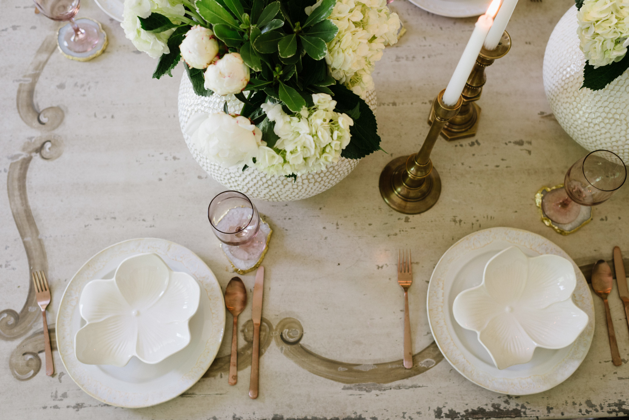
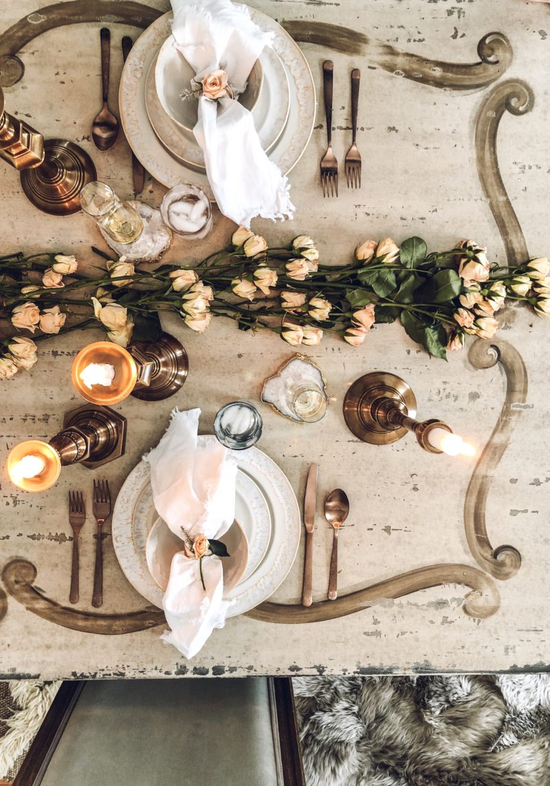
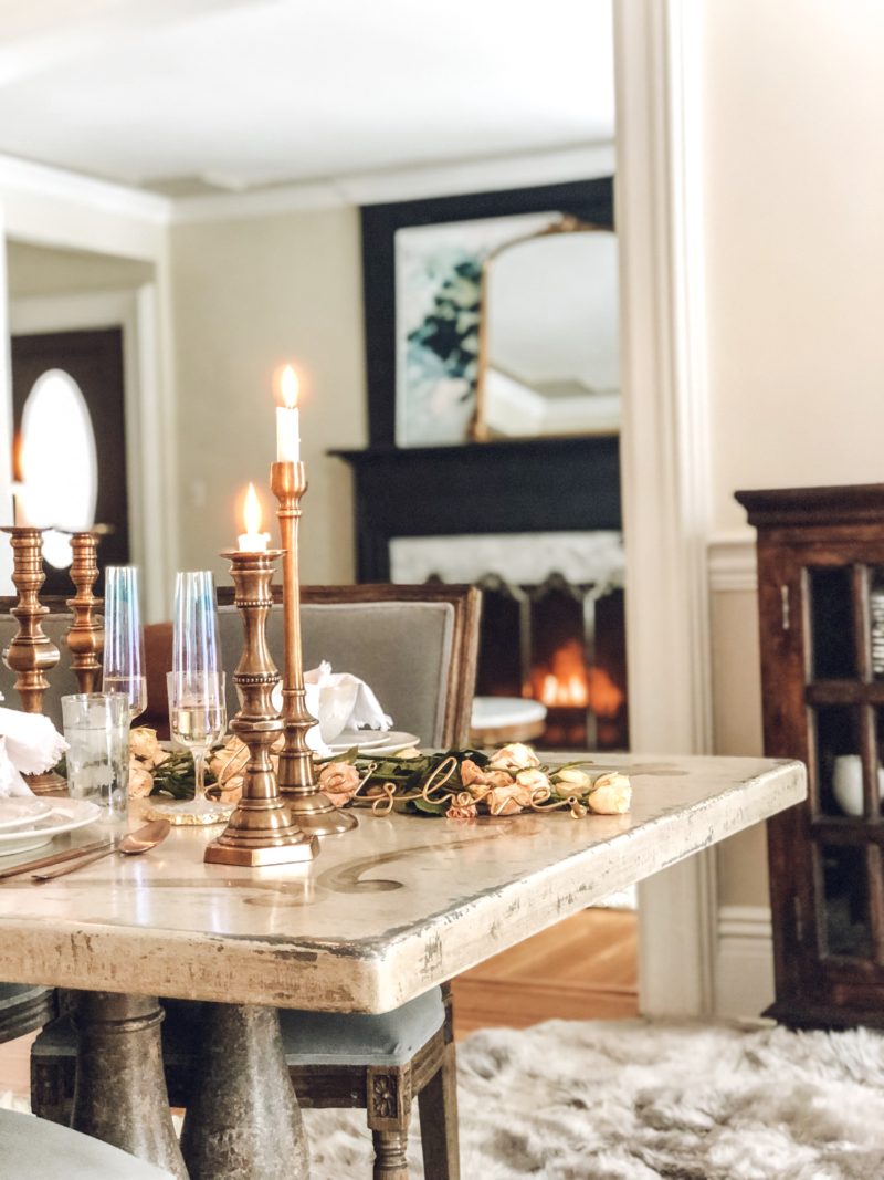
Overhead View of Warm and Romantic Arhaus Tablescape

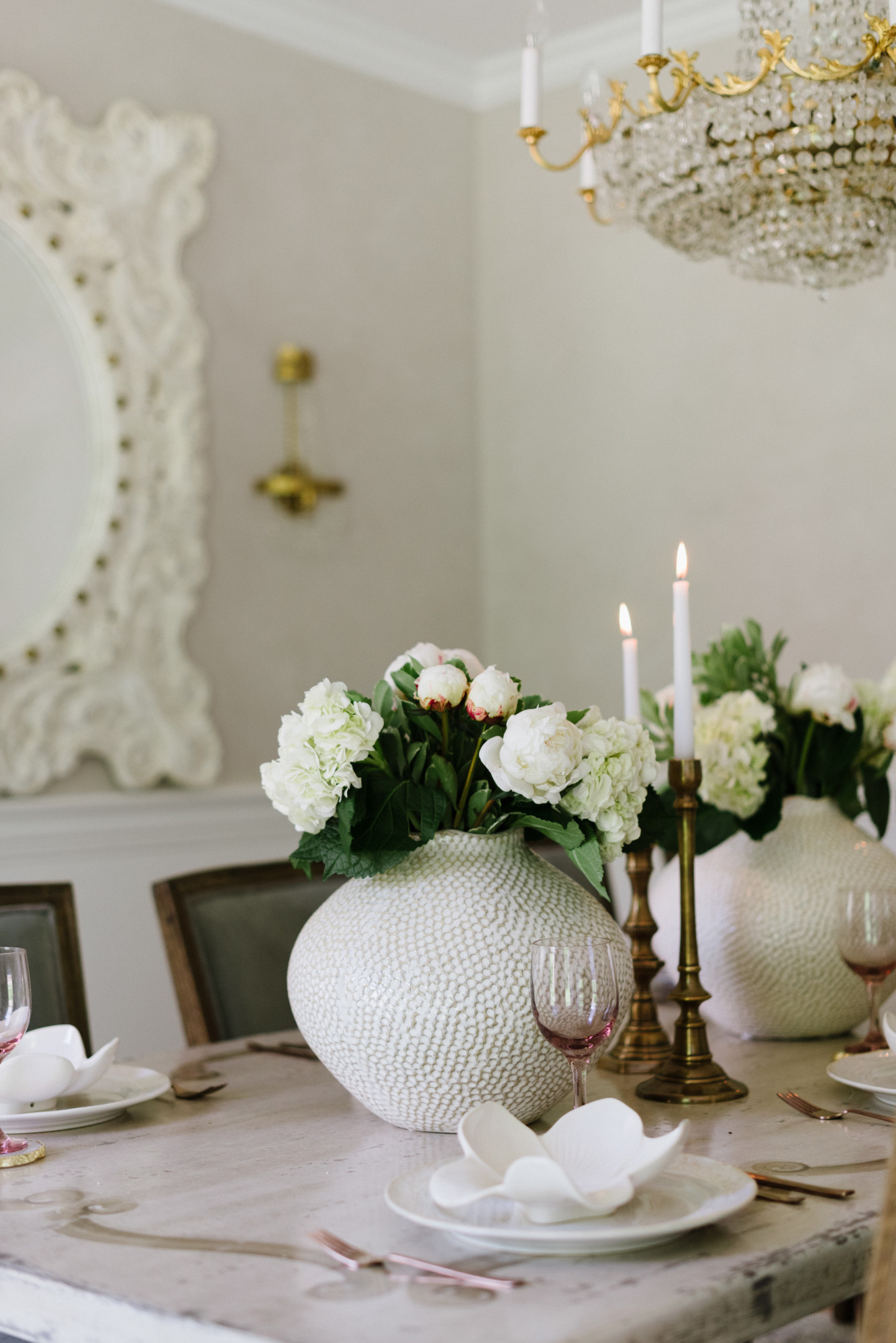
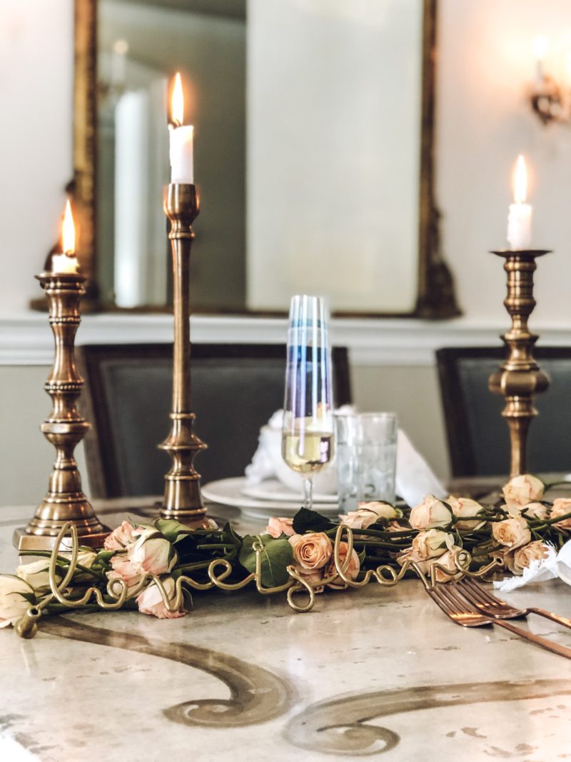
Close up of Warm and Romantic Arhaus Tablescape

Close up of Enchanting Cozy Arhaus Tablescape

By the way,

October is Dining month at Arhaus, which amazingly ties in with our Bell’arte feature!! What does that mean for you?  If you purchase a dining table, like this one :), you can get 50% off any regular priced dining chairs. Amazing right? You know what else is amazing? Arhaus is also donating 10% of all custom dining purchases to the Small World (a girls orphanage Arhaus helped build in Nepal)! And this Bell’arte collection is included in this giving promotion. I love a company that gives back!

While you’re shopping around keep in mind there is also 20% off all tabletop and off lighting! So much to look forward to!

You can check out the Bell’Arte collection here, it is truly a work of art and I adore having such a statement piece in our home to cherish always!


Our Halloween mantel

Hello friends!

Thank you for popping over to check out our spin on Halloween decor! I never really decorate for Halloween per se I mostly tend to focus on fall so it was a lot of fun creating this space!

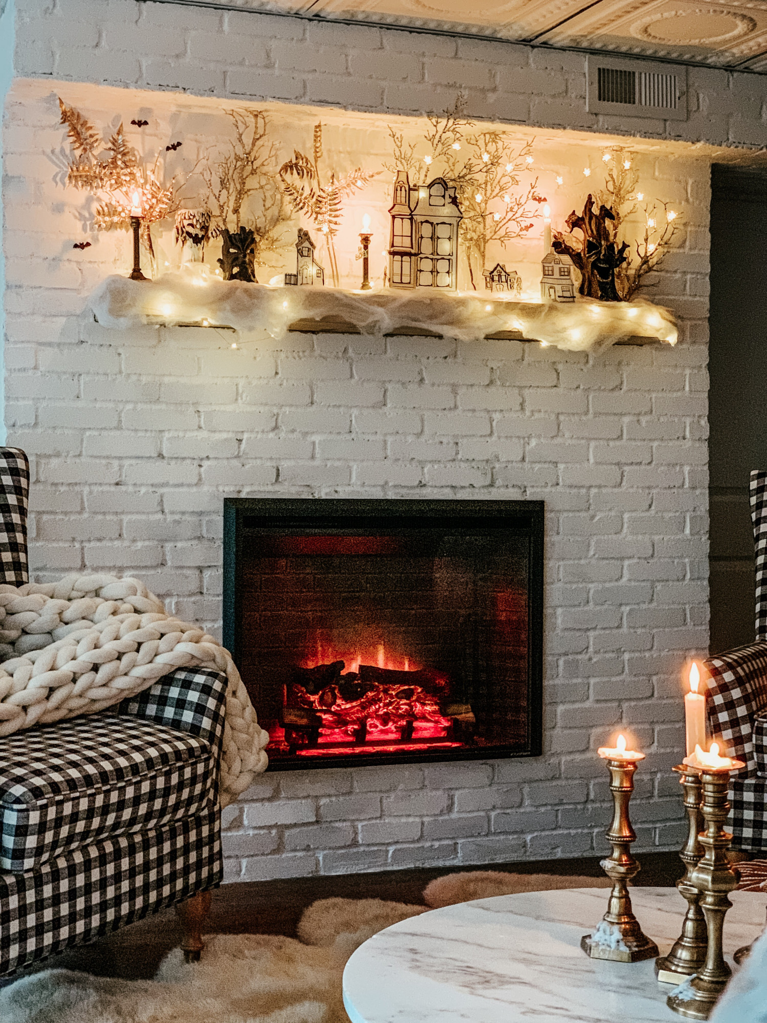
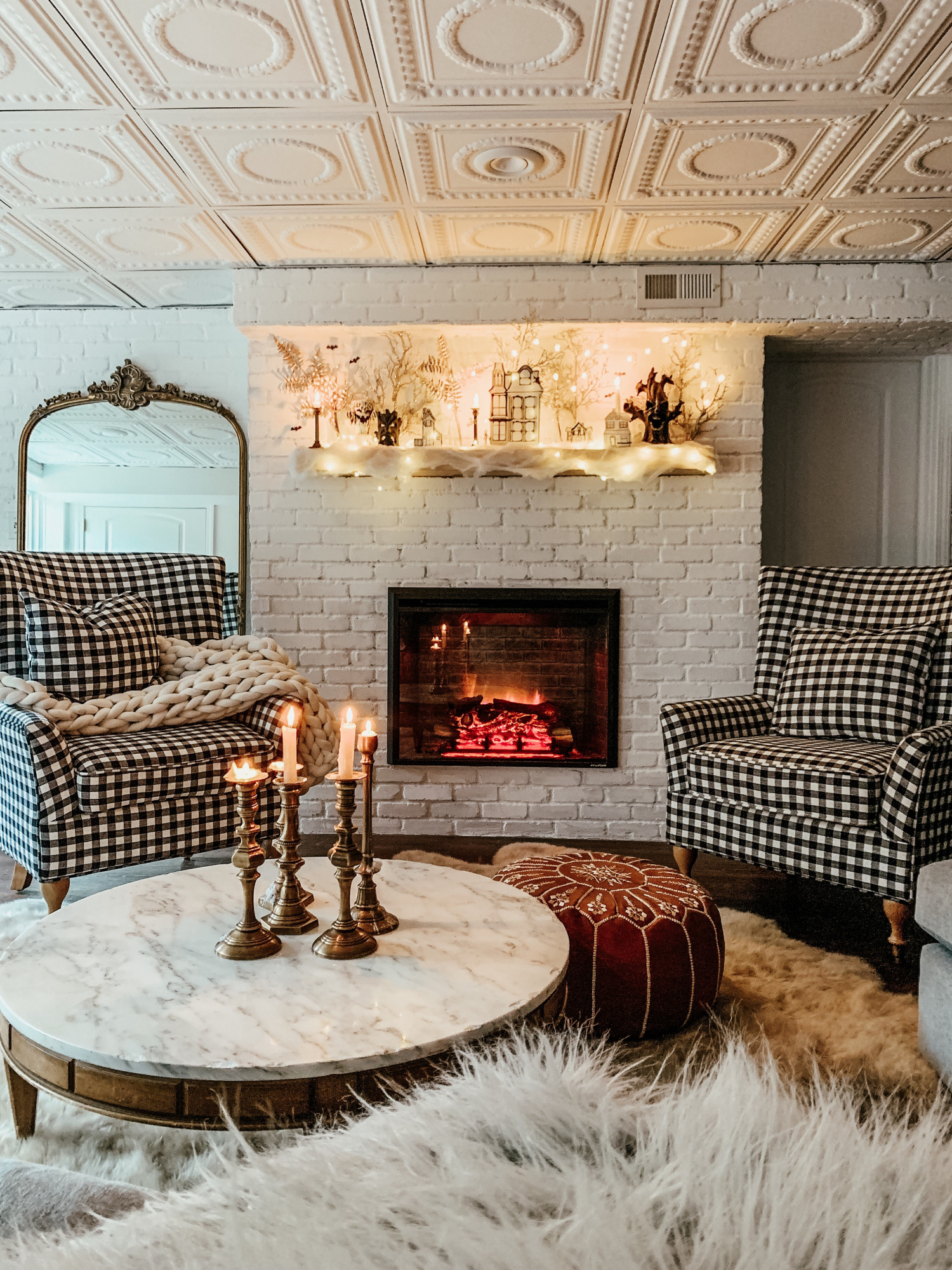
I knew I wanted to create a not too spooky scene for the girls here at home and what better place to do it then our new fireplace and mantel?! (More on this fireplace to come!)

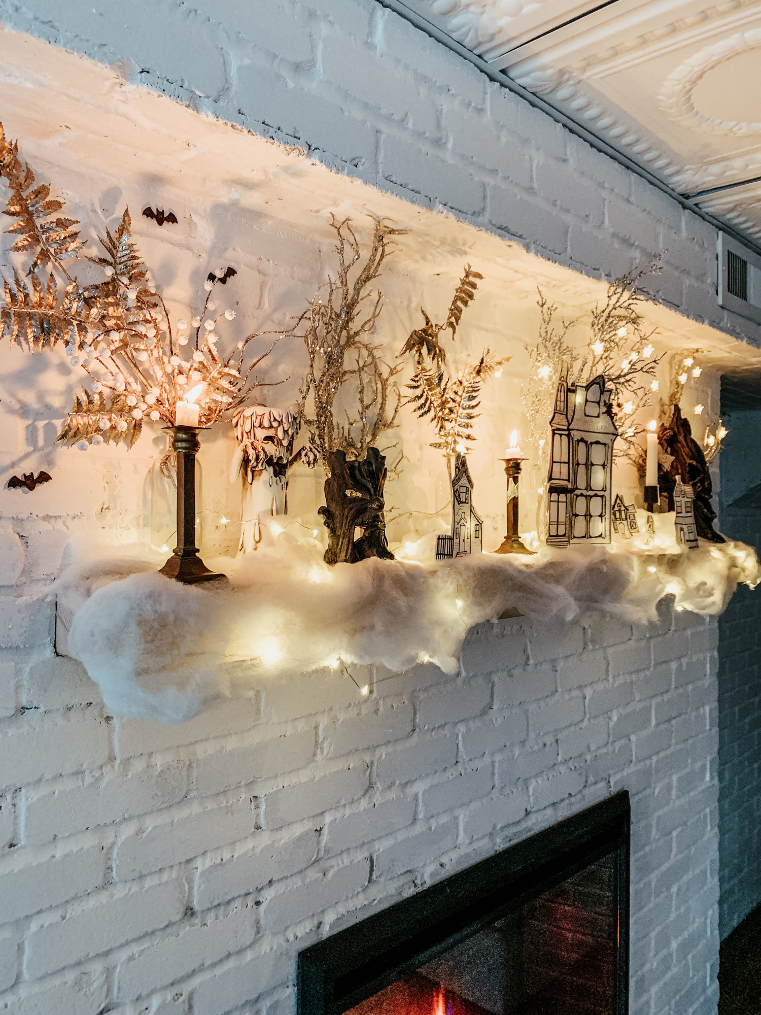
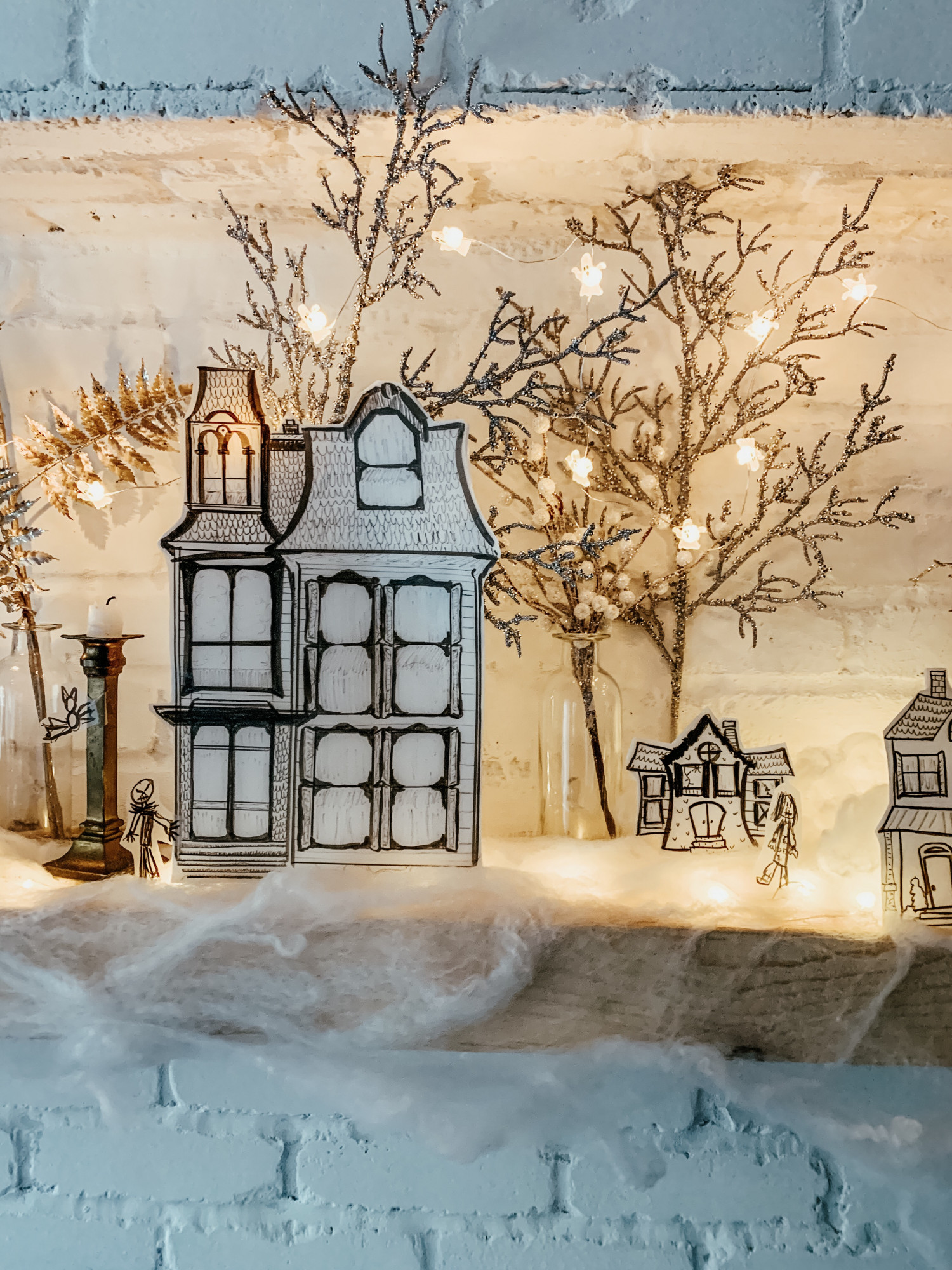
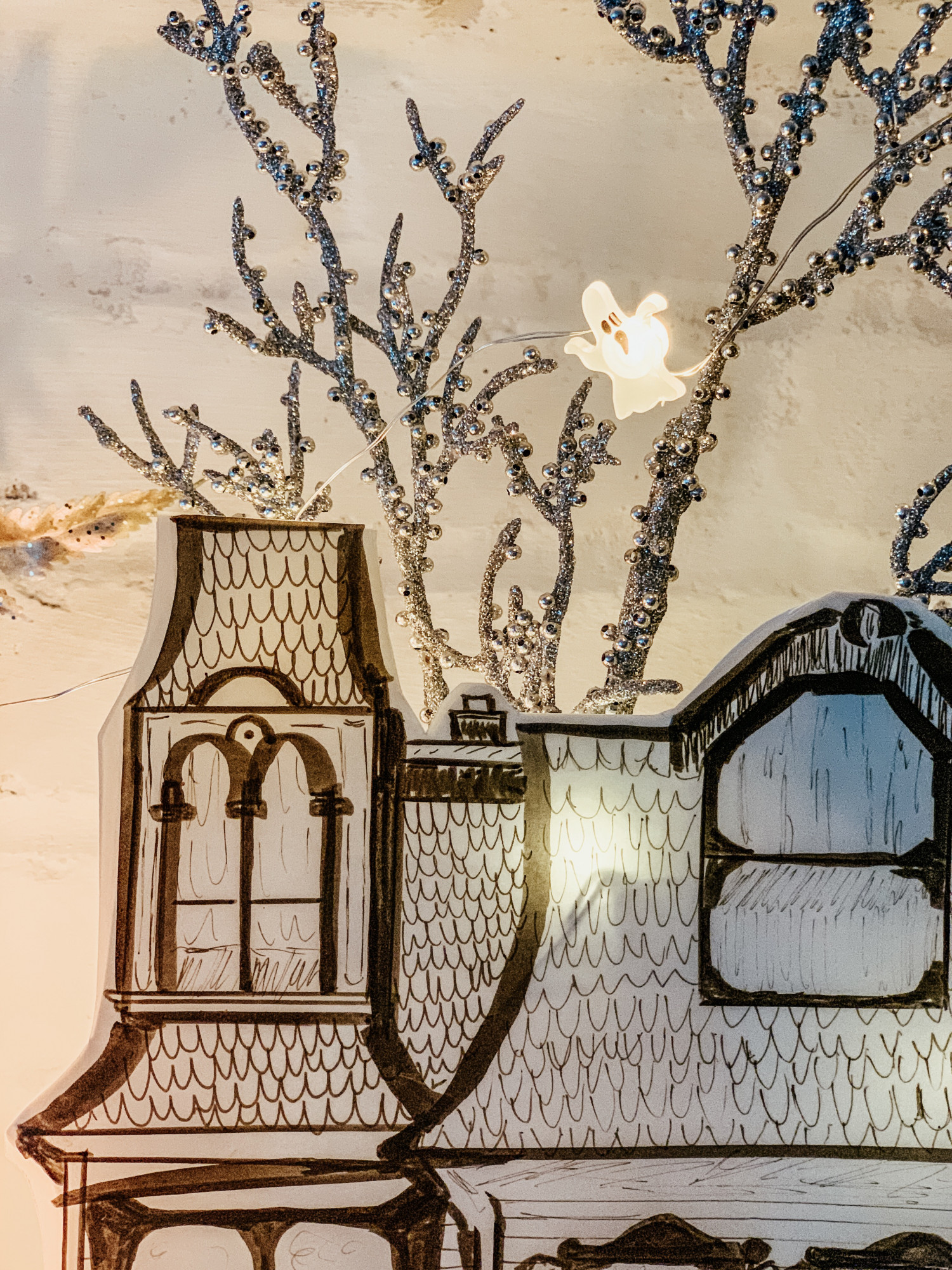
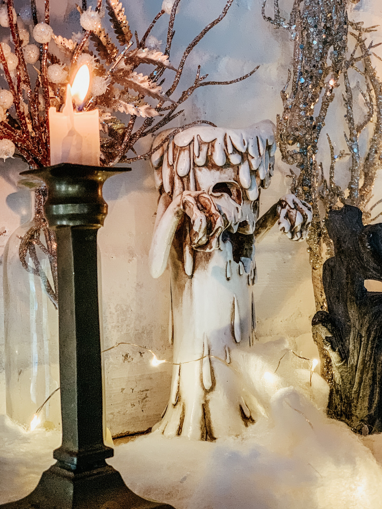
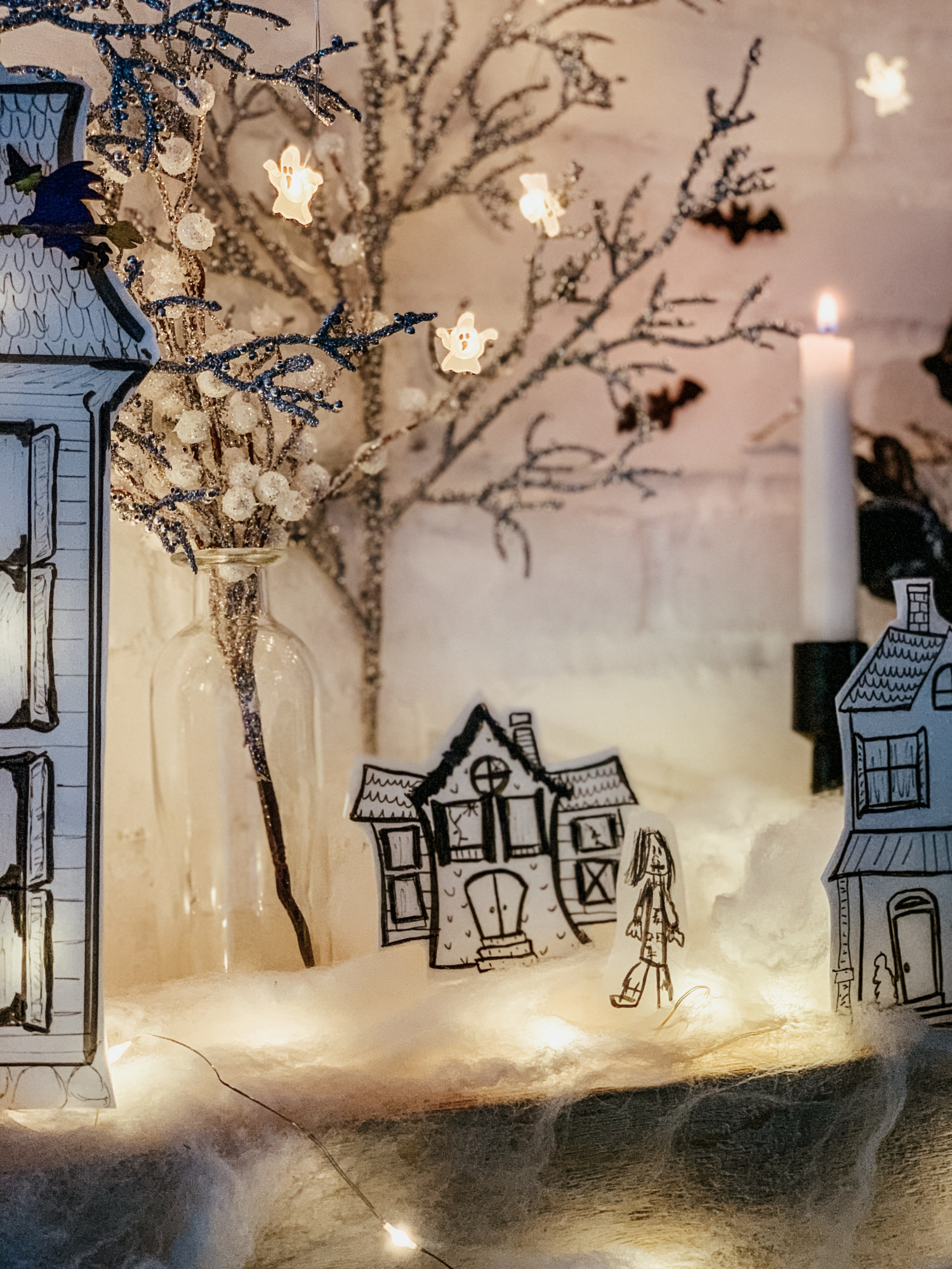
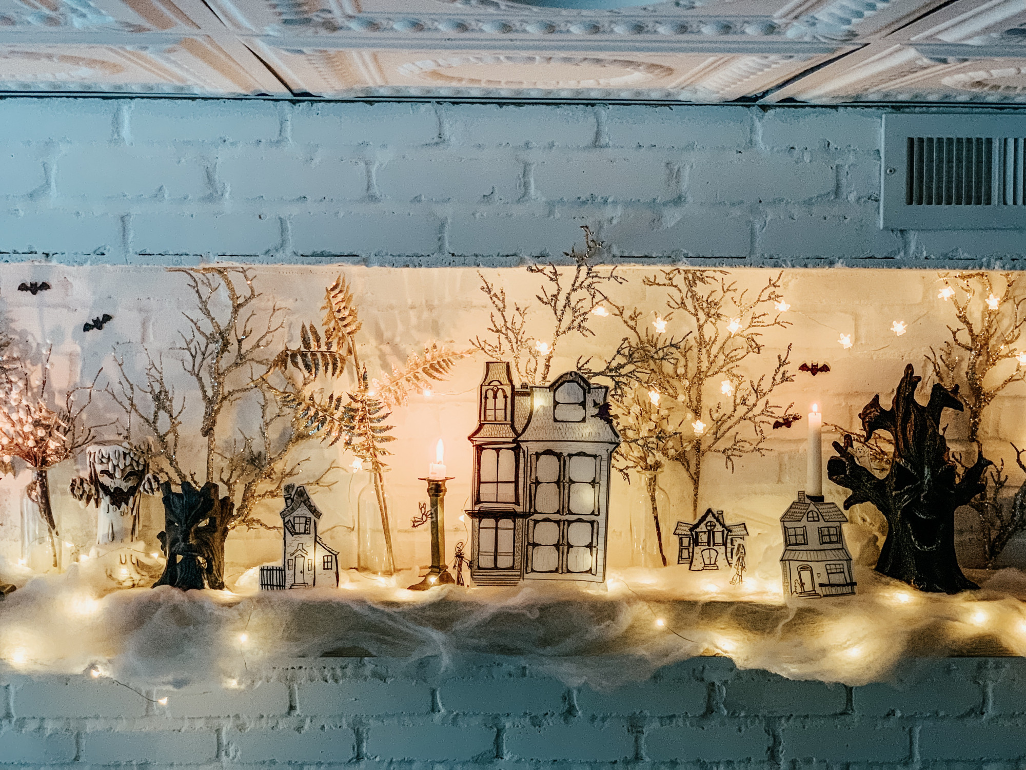
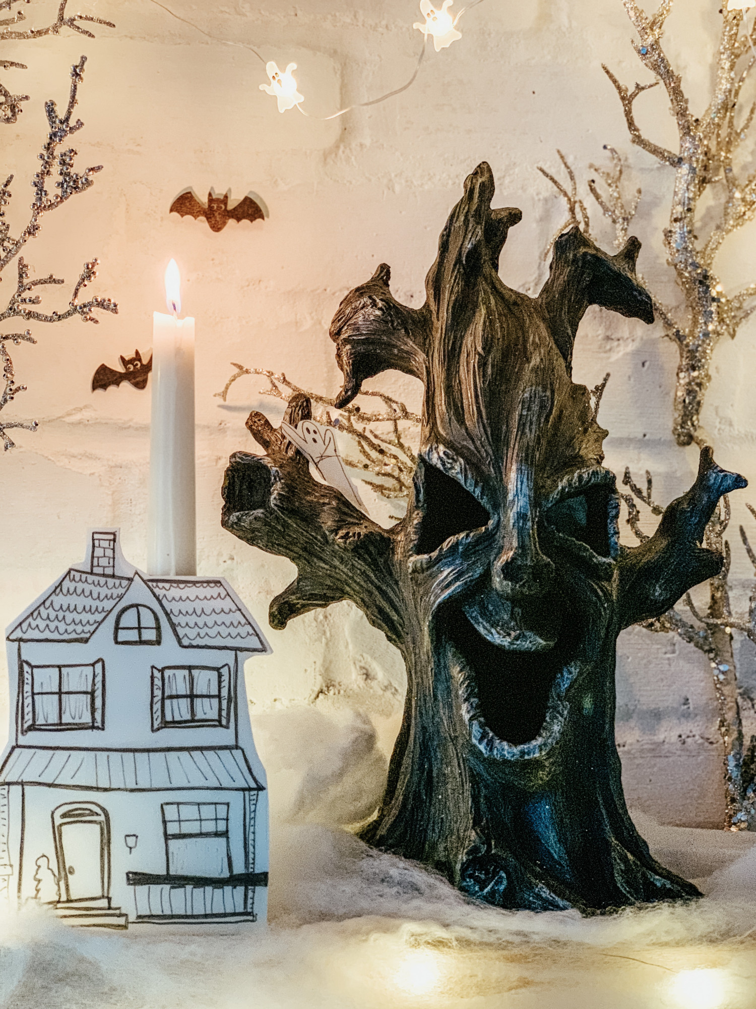
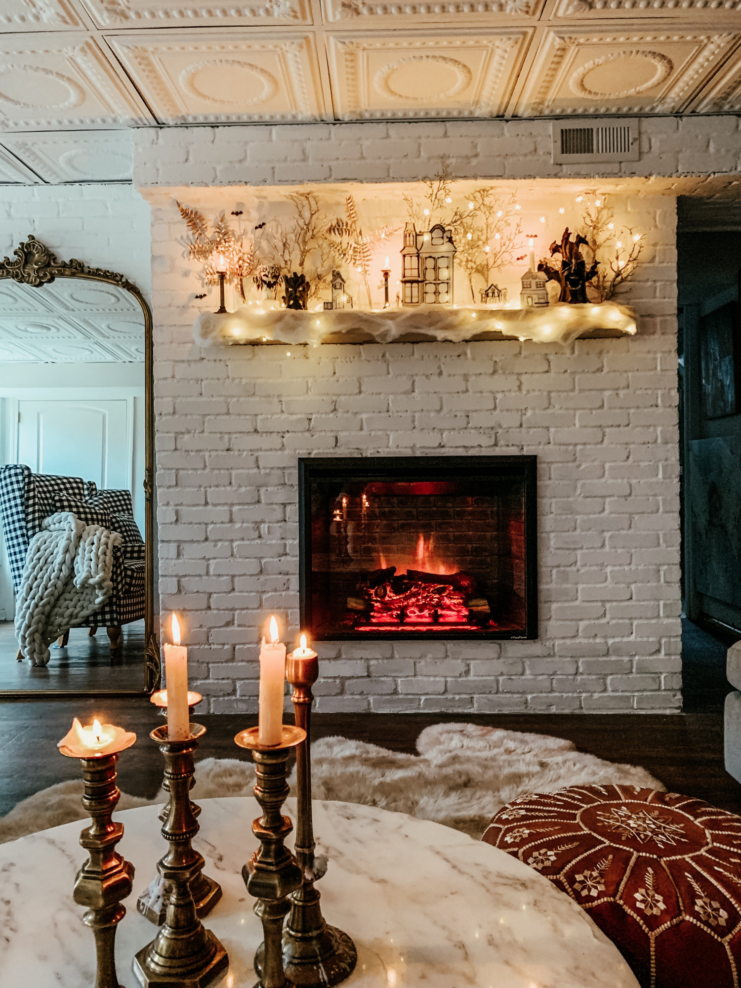
I went shopping and found some spooky trees, spiderweb material and wooden Halloween shapes. I then came across these glitter florals that reminded me so much of spooky trees. Since I was unable to find houses that I loved I decided to make them myself!

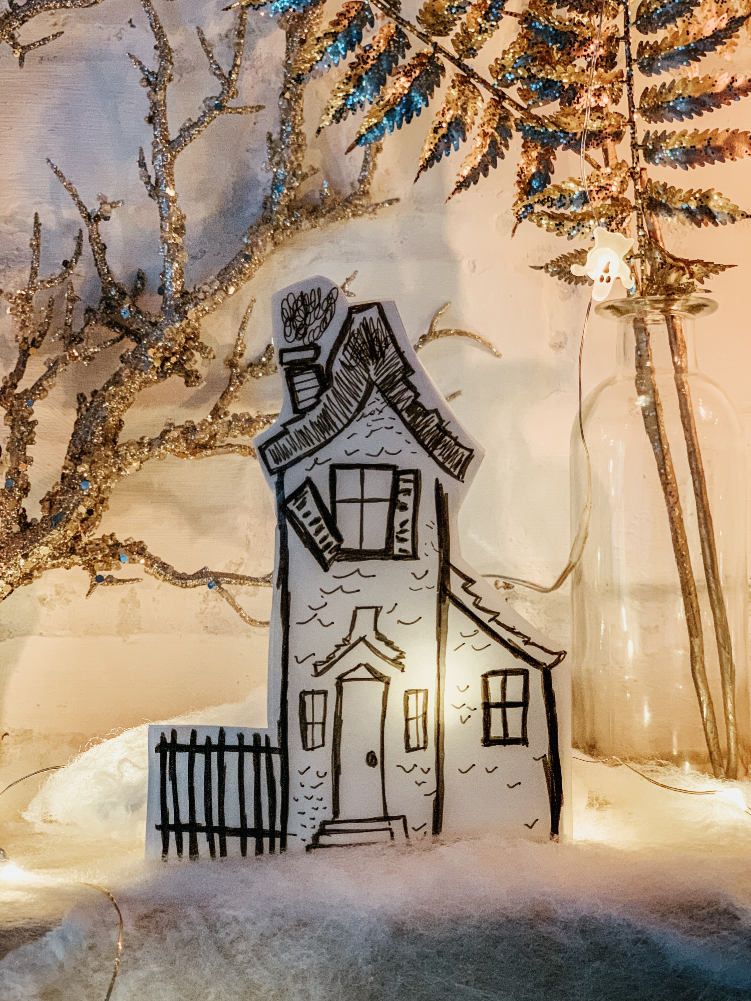
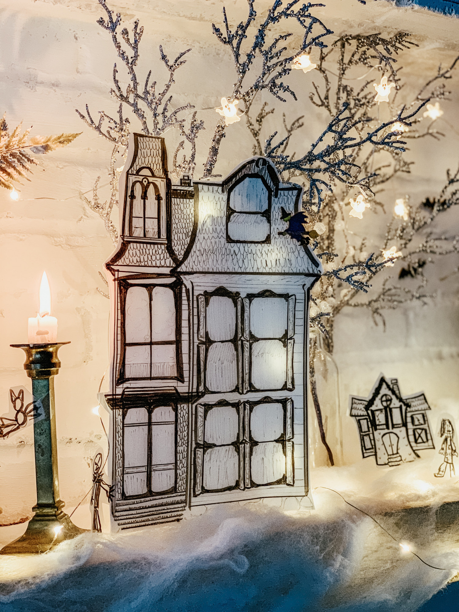
Here is your warning, I am not an artist. Ha! I do love enjoy doodling and sketching when I’m bored on the children’s menu at a restaurant but that’s about it. 😉 That said, i had so much fun dreaming up this space. I grabbed a Halloween book of ours and got to work. I like to look at an image and then recreate and dream it up my own way on paper, I find it easier to focus that way!

About an hour later I had a big haunted mansion and these smaller haunted houses. Our girls drew little spooky characters and bats besides me and our haunted scene was ready!

I laid out some string lights and the paper creations started to glow! I loved this little eerie surprise. The way it all came together was great!

Creating a Halloween scene doesn’t have to be gory or overly scary. Just do whatever it is that fits your family and home! I had no clue how this would turn out but I am happy with the playful and mysterious scene we get have on display for the month! But what I love even more than that was the fact that I got to create this with my daughters. It also helps that it wasn’t outrageously expensive!

Make sure to check out these fabulous ladies below for some more Halloween inspiration and ideas! Thank you Kristen, for inviting me to join in on today’s tour! Happy haunting!

Ella Claire & Co. | So Much Better With Age | Taryn Whiteaker | Live Laugh Rowe | Kindred Vintage

Nest of Posies | Twelve On Main | Nick + Alicia | Paint Me Pink | Town and Country Living

Zevy Joy | My Sweet Savannah | Kelly Elko | The Wicker House | Sagehill Cottage

A Blue Nest | Happy Happy Nester | The Tattered Pew

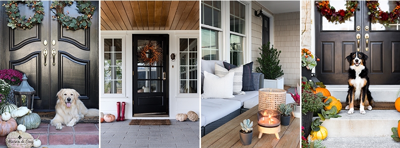
Kindred Vintage Fall Porch 2019

Hi Guys! First and foremost thank you for joining us over here on our newly renovated website! As you may know, decorating for the seasons is one of my very favorite things to do. I’m so excited to kick off this season with a few of my talented friends in the Seasons of Home Holiday Tour. Thank you to our host, Kristen over at Ella Claire & Co. for organizing this festive tour. If you’re not already, you need to hop on over to Kristen’s blog. I promise you’ll be inspired!

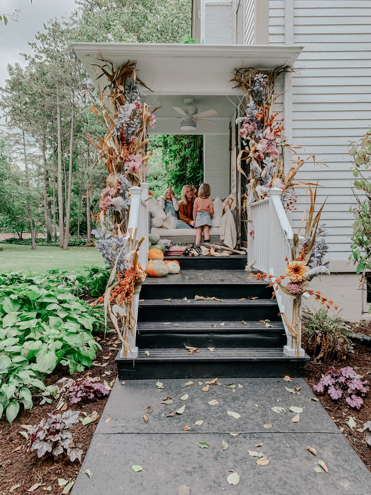
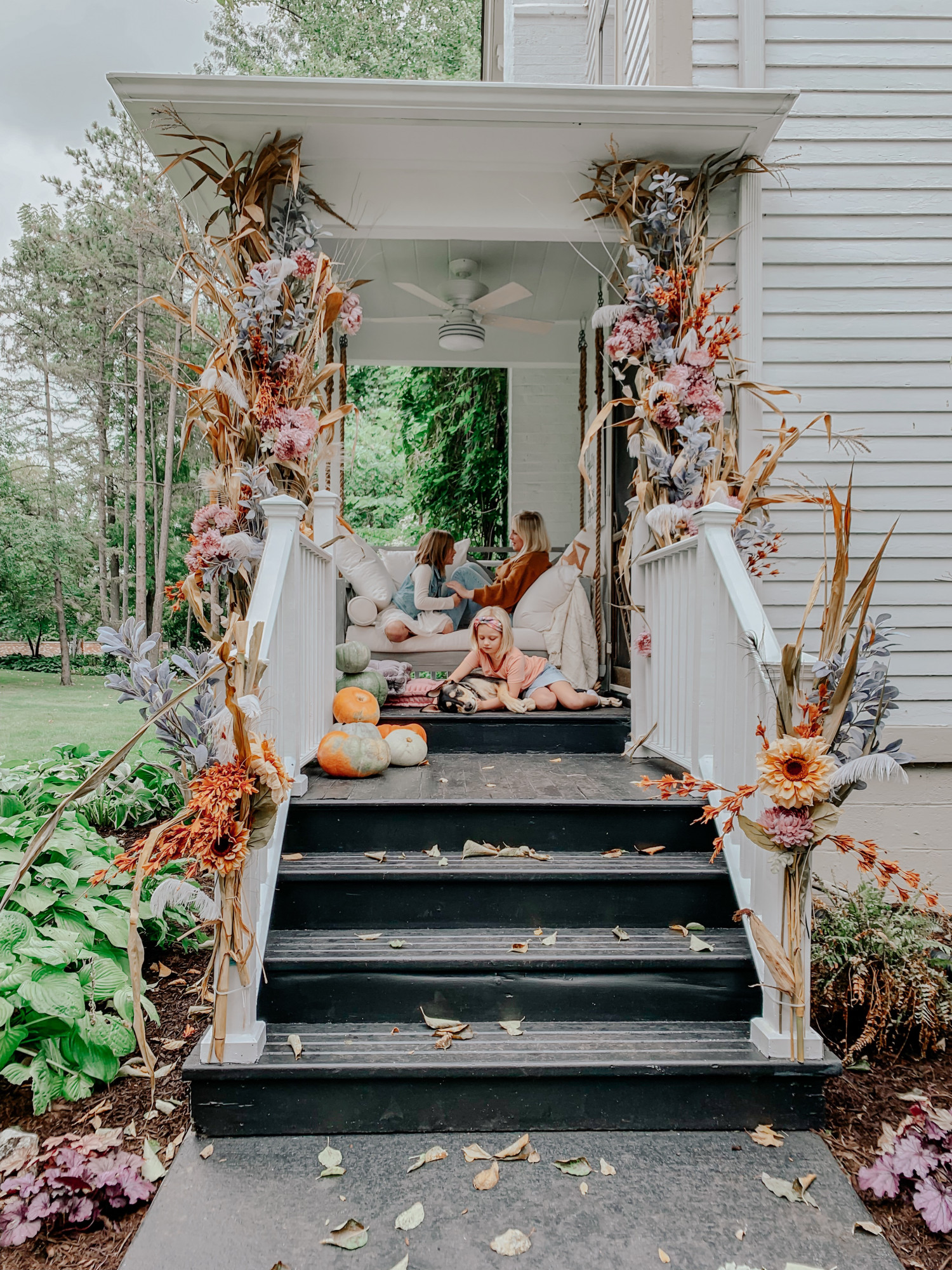
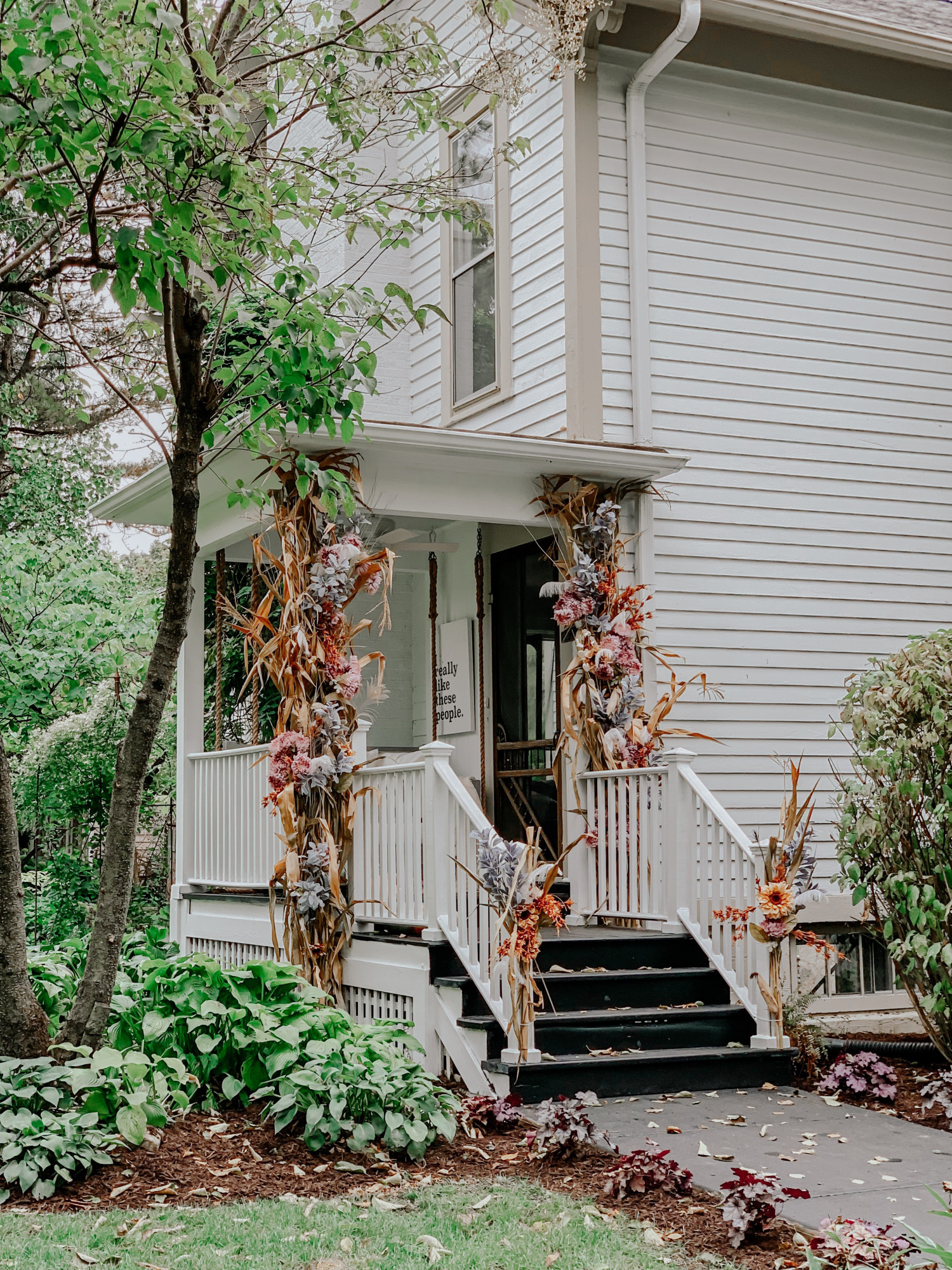
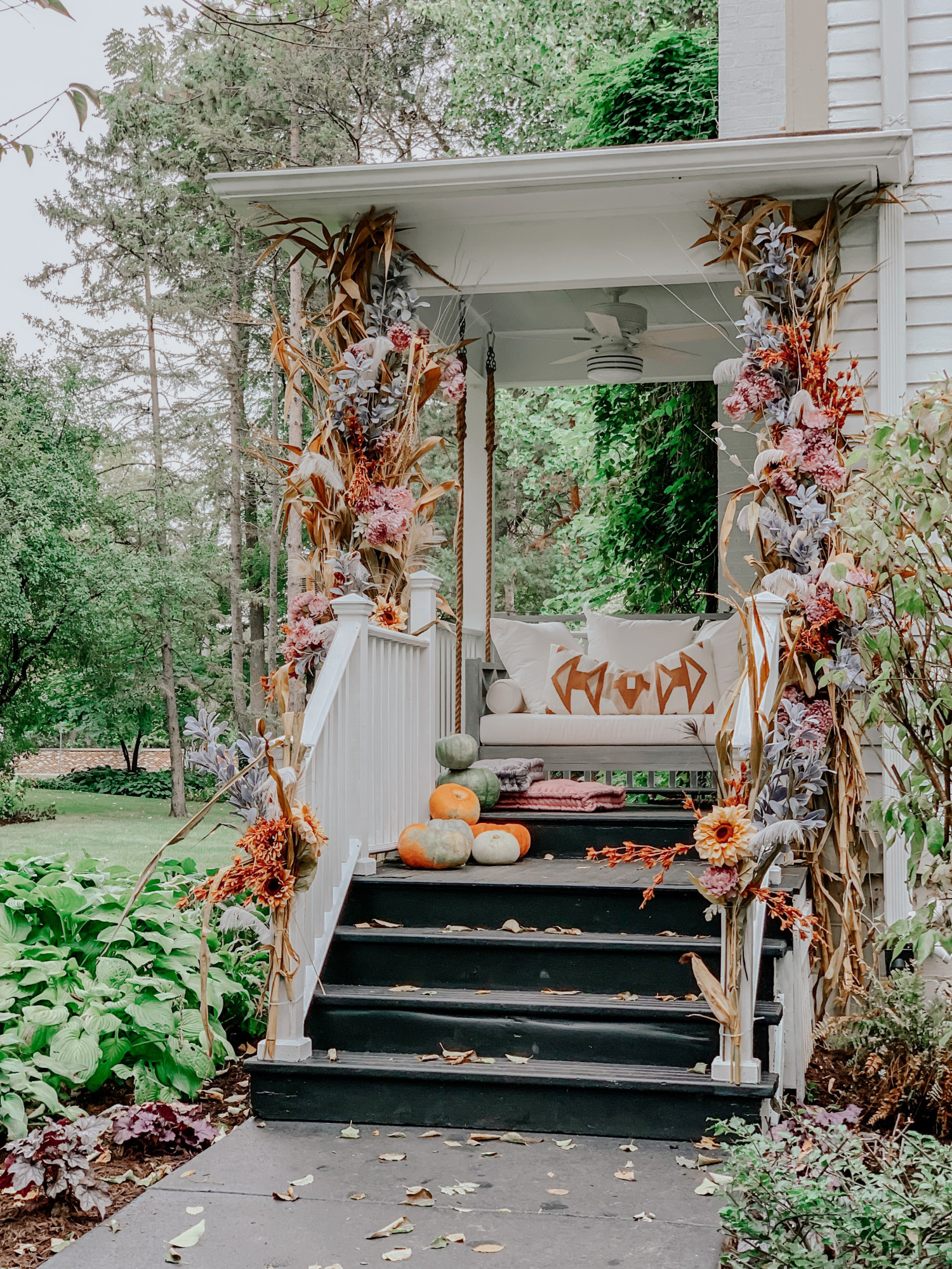
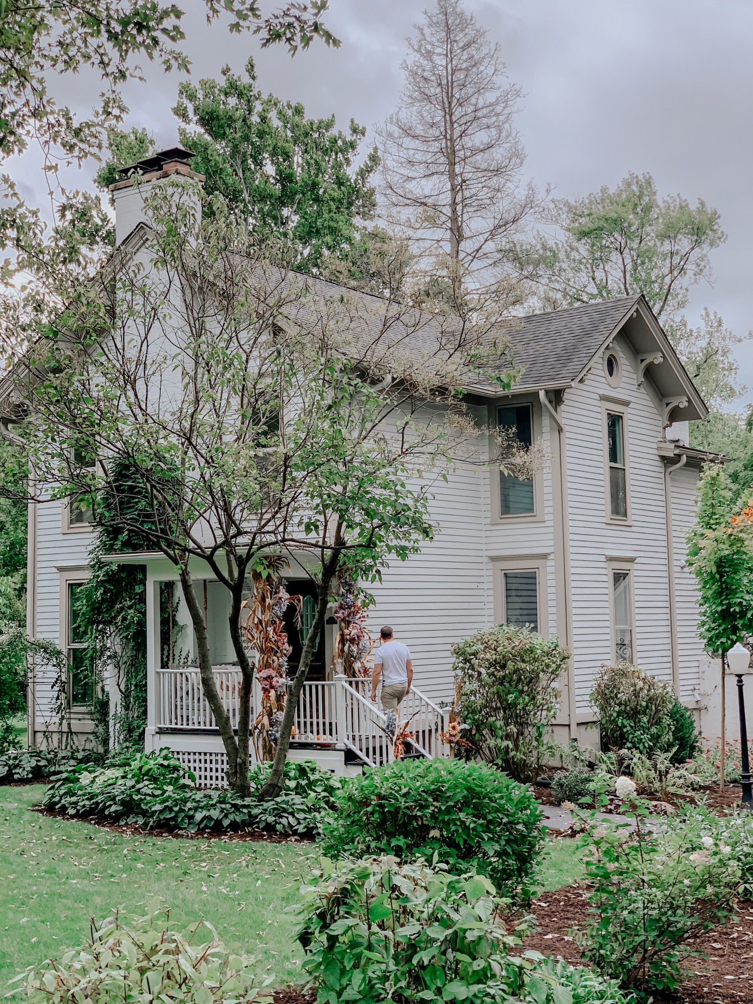
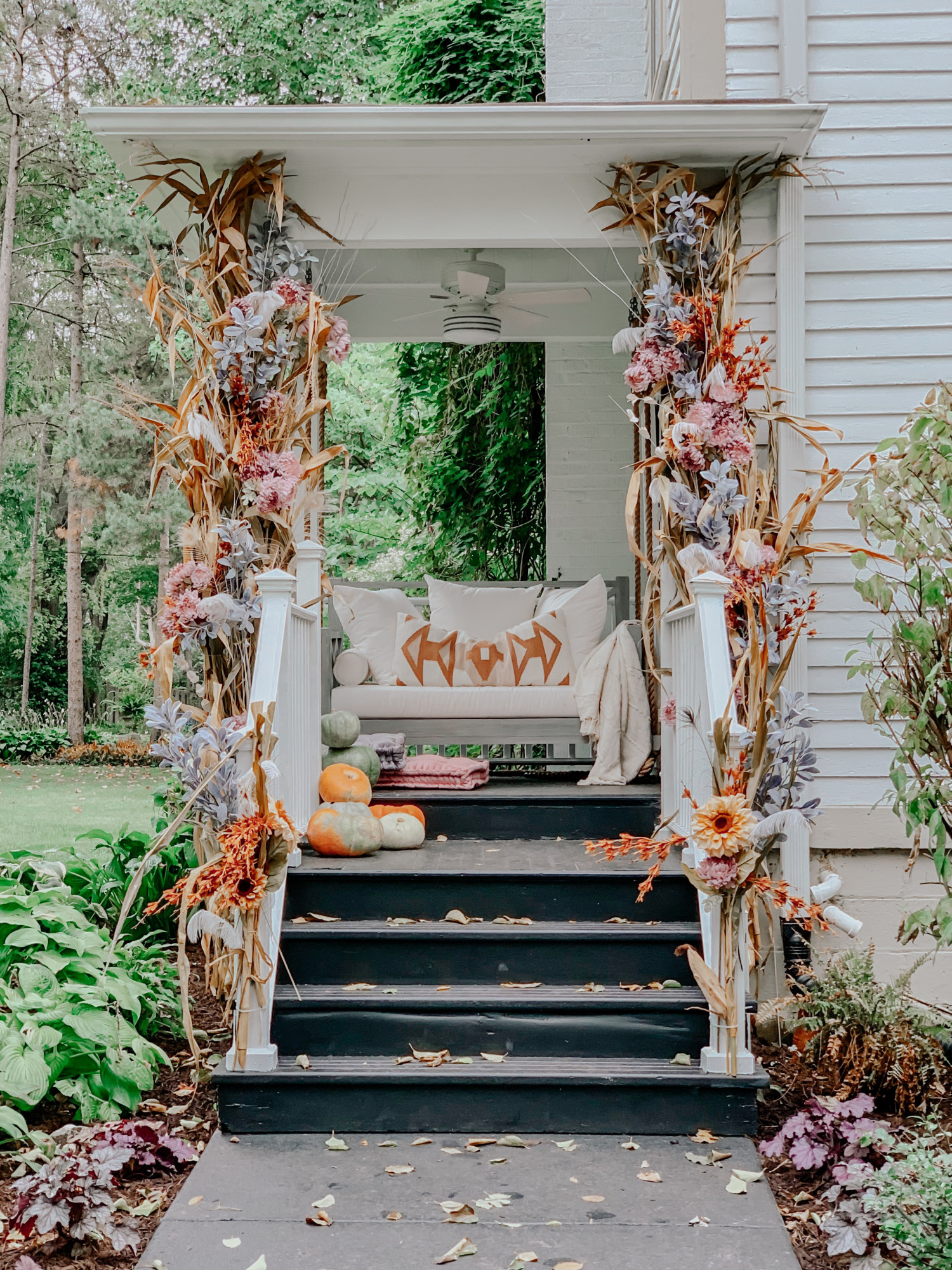
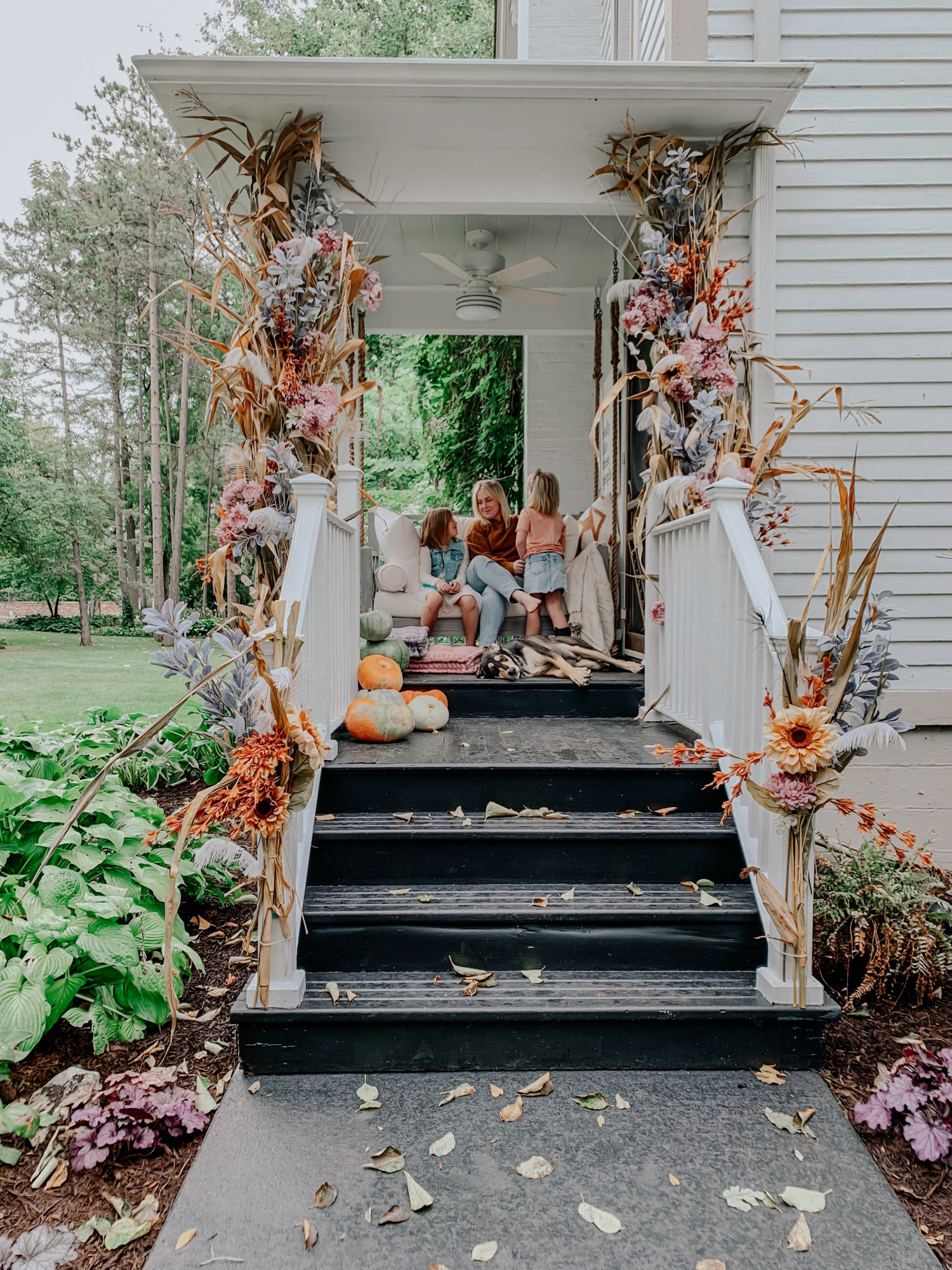
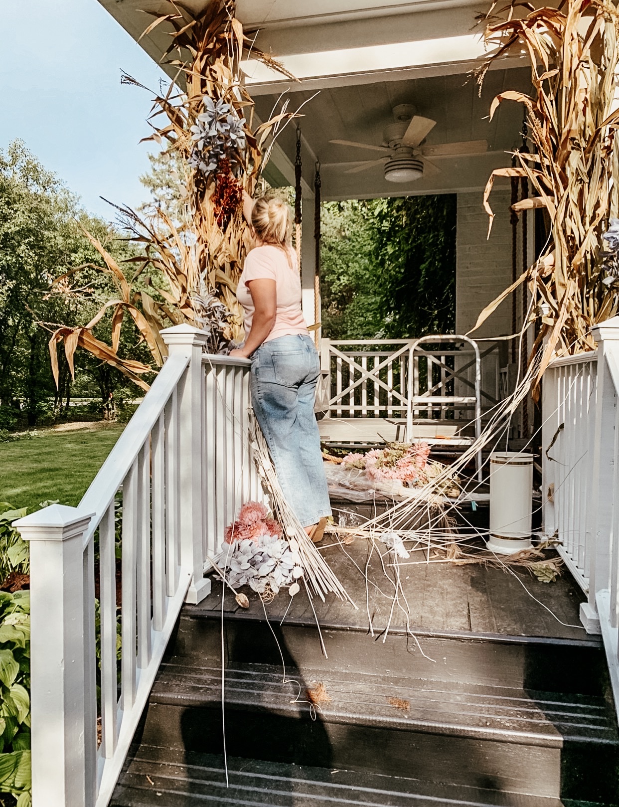
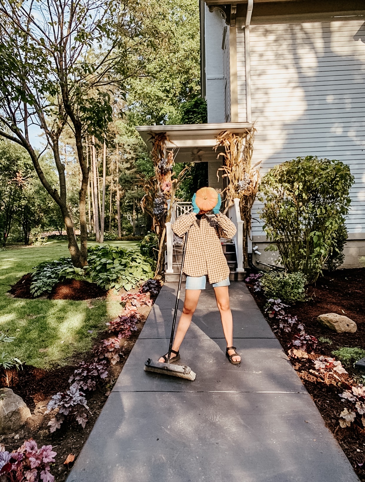
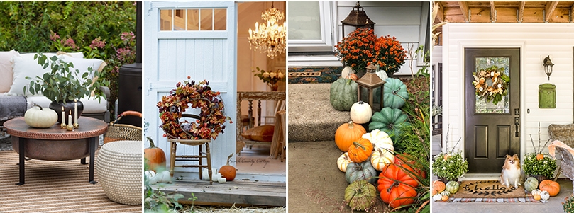
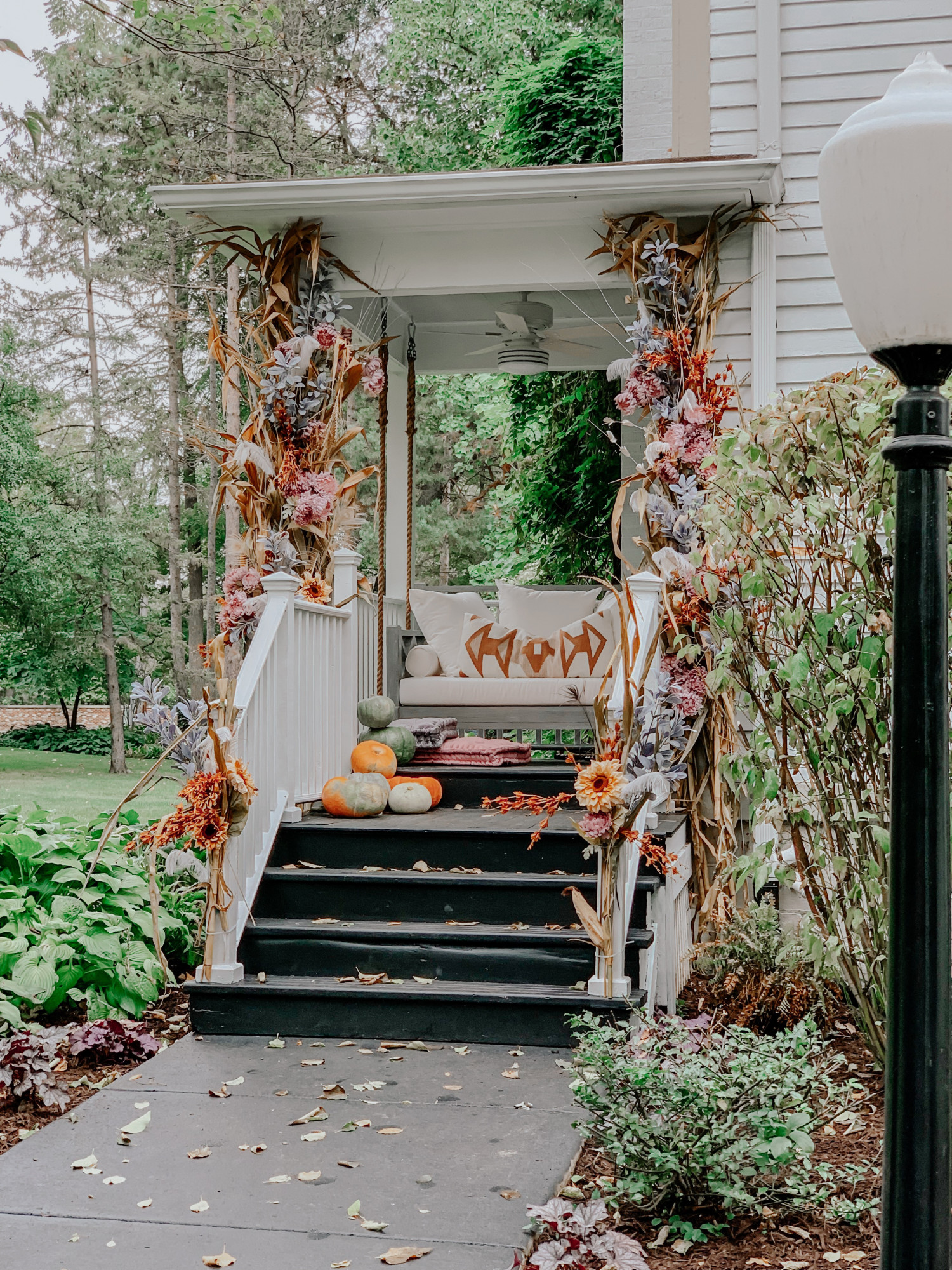
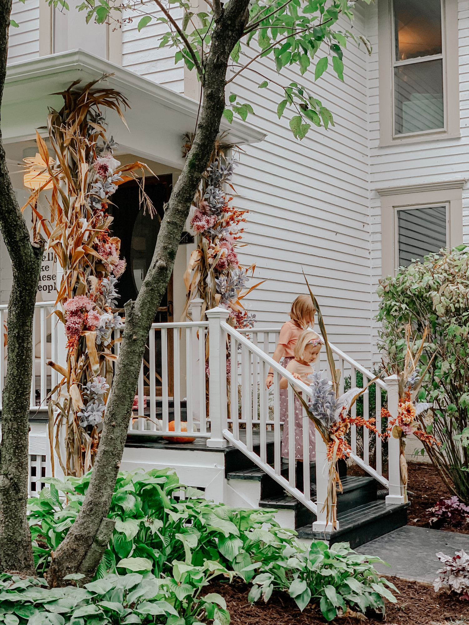
Fall has officially arrived at our home and it makes me so happy!! This year I went for an entirely different spin on fall by adding faux florals, berries, and feathers to our cornstalks. Looking at each piece individually may not appear very ‘autumn-ish’ but together I think they scream fall! We also teamed up with Hunter Fan Company, to incorporate this  Cedar Key Outdoor fan.  This fan was the inspiration for the whole color scheme of the porch.  We painted the ceiling a soft grey to play off the strips on the fan and used the light sides of the blades to contrast against the ceiling.  I love the subtle glow it gives off when it’s lit but the fan is also a pretty feature when its not on.  The floor, and concrete walkway a bold black and then lined it with purple plants. One of my favorite features of this porch is the real + fake floral trick on these corn stalks! (Real corn stalks and faux florals!) I found these faux florals at Hobby Lobby, cornstalks at a local pumpkin patch, pumpkins from Trader Joes, and paint in the color Zircon from Sherwin Williams.
This porch is extra special to me because I teamed up with some friends of mine who have small businesses to bring to you an eclectic fall look. I love how all the pieces go together without being too matchy. These darling t-shirts are from one of my favorite friends, Amy, over at The Ever Co. The lumbar pillow is from my super talented friend, Katie, from Love and Grey. My dear friend, Lindsay Letters, created this beautiful artwork from her Farmhouse Canvas Co. collection. These darling skirts are handmade from the creative Mavis and Olive. (All sources will be linked at the end of this post!)
I must admit I was nervous to reveal a new porch with a new concept considering our last couple of autumn porches at our old home were fan favorites, but the love I’ve received from comments on Instagram so far is enough to reassure me that it’s okay to put your fun spin on new spaces. As always, thank you guys for always inspiring me. 

So here it is, my autumn spin on a floral entryway, and it makes me smile so big just looking at it!! I look forward to many more books being read, snuggles being had and chai tea lattes getting sipped out here! Happy fall y’all!

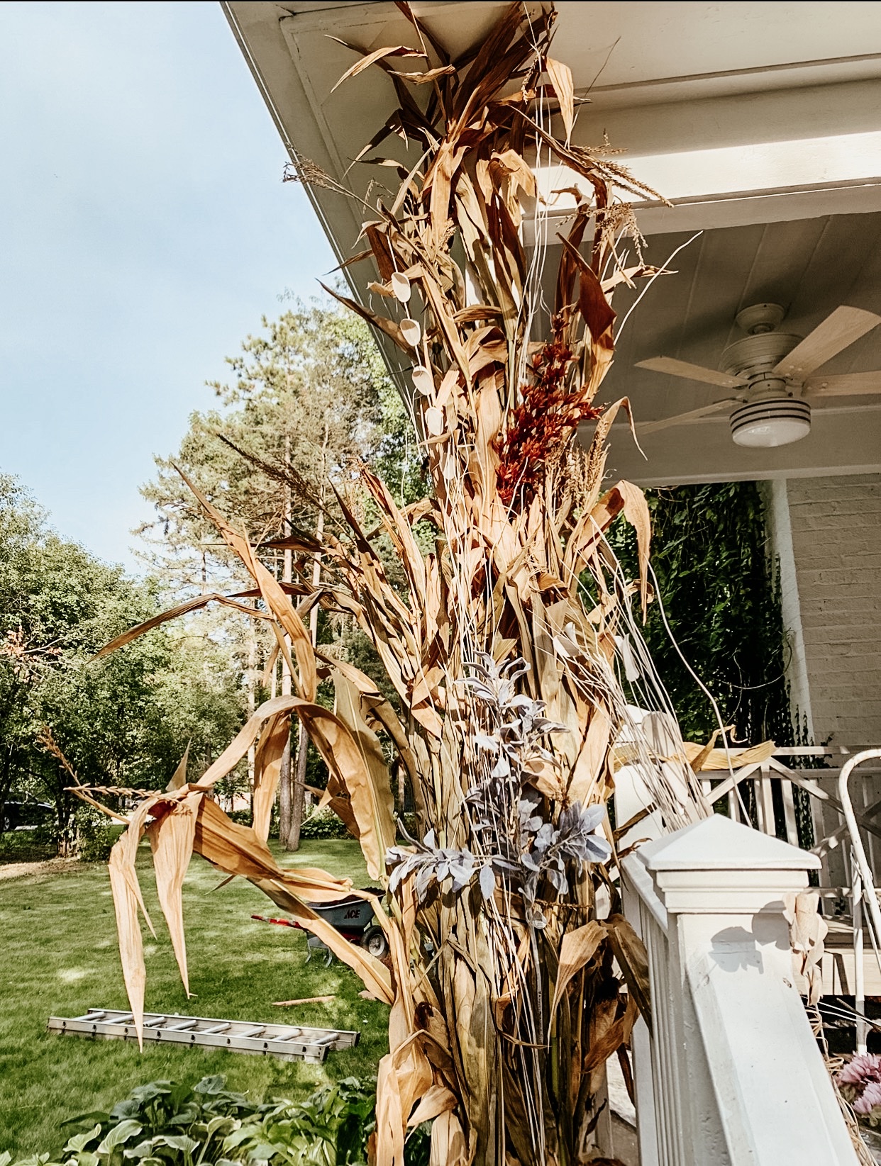
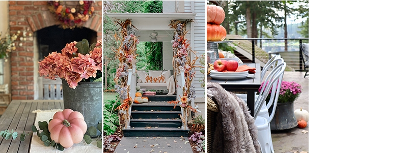
DIY, cornstalk floral.  We picked these cornstalks up at a local pumpkin farms and zip tied them to the pillars of the entryway.  I know I wanted a more whimsical feel to the traditional stalk, so that’s when I came up with the idea to add faux floral.  I bought these at Hobby Lobby and they were half off.  So although a project can get pricey, just look for stems that are on sale.

Here is the process!

It’s all about personal preference on how you’d like your arrangement to look.  I picked about five different varieties of faux flowers.  I just stuck them in the stalks and played around with their placement until it reminded me of the floral entries in Paris, but my Autumn version of it. 🙂

It’s very helpful to have someone help you to tell you where you need to add flowers to the empty spots.  You can do this yourself but it’s way more fun with two people…

Here’s an up close look at one of the stalks.

Thank you guys for visiting! I’d love to hear what you think! Don’t forget to check out these other amazingly talented friends as they share their autumn porches!


Sources:

Porch Swing Painted Fox

Sweet Shirts The Ever Co.

Darling Skirts Mavis and Olive

Ceiling Fan Hunter Fan Company

Canvas Print Lindsay Letters

Pillow Love + Grey

Ella Claire & Co. | Rooms for Rent | The Lilypad Cottage | Maison de Pax

Maison de Cinq | Boxwood Avenue | City Farmhouse | Craftberry Bush

Zevy Joy | French Country Cottage | Jennifer Rizzo | Home Stories A to Z

My 100 Year Old Home | Kindred Vintage | My Sweet Savannah

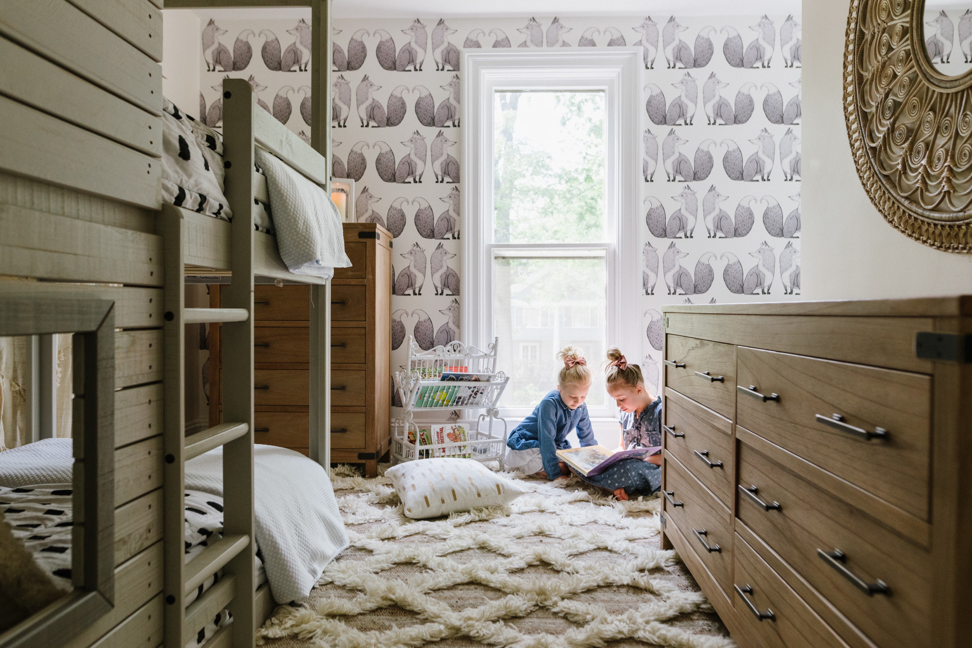
Our daughters’ bedroom with Arhaus

Hi friends!

As you know if you follow our journey over on Instagram about a month or so ago we decided to redo the girls’ bedroom!

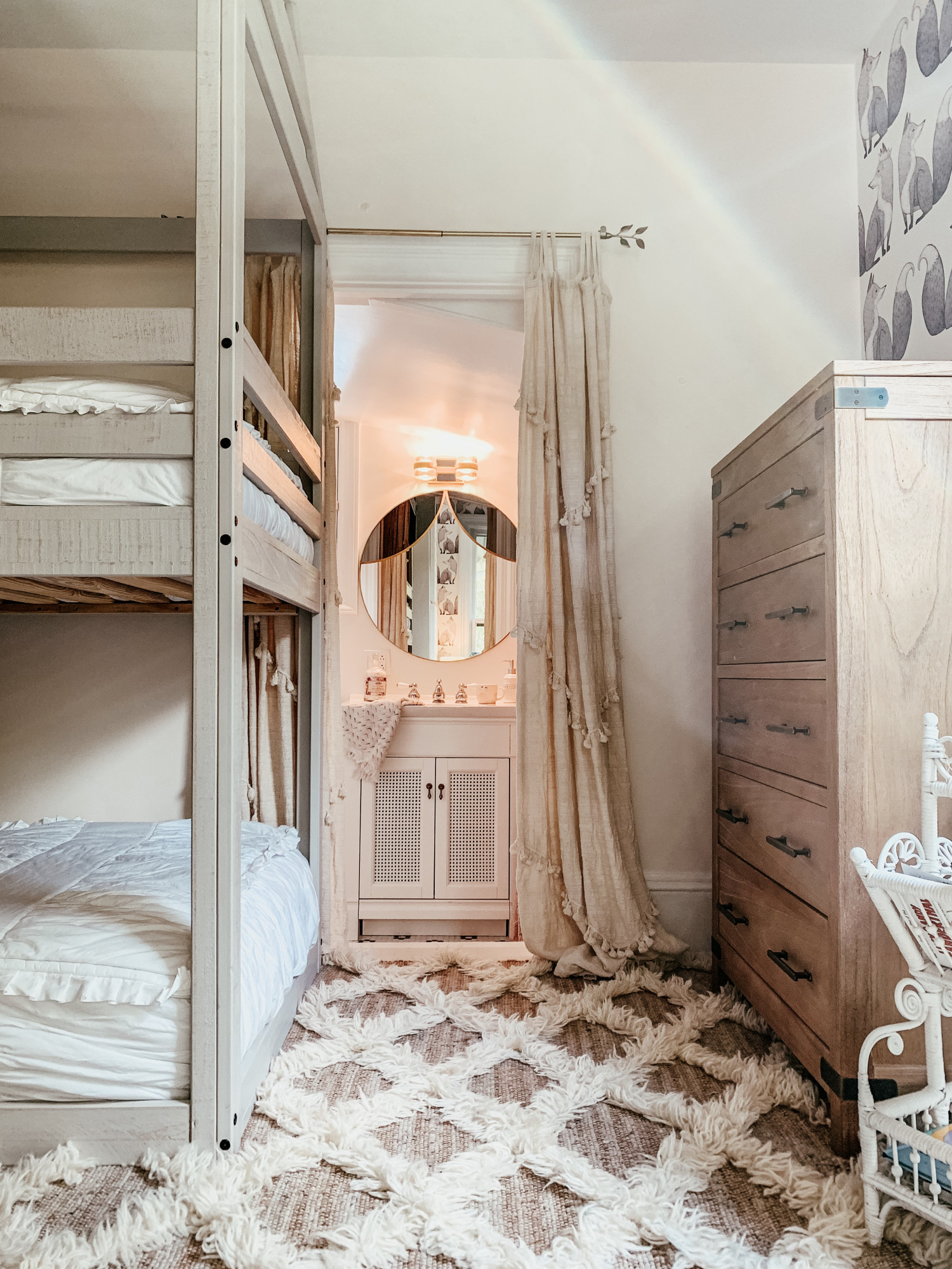
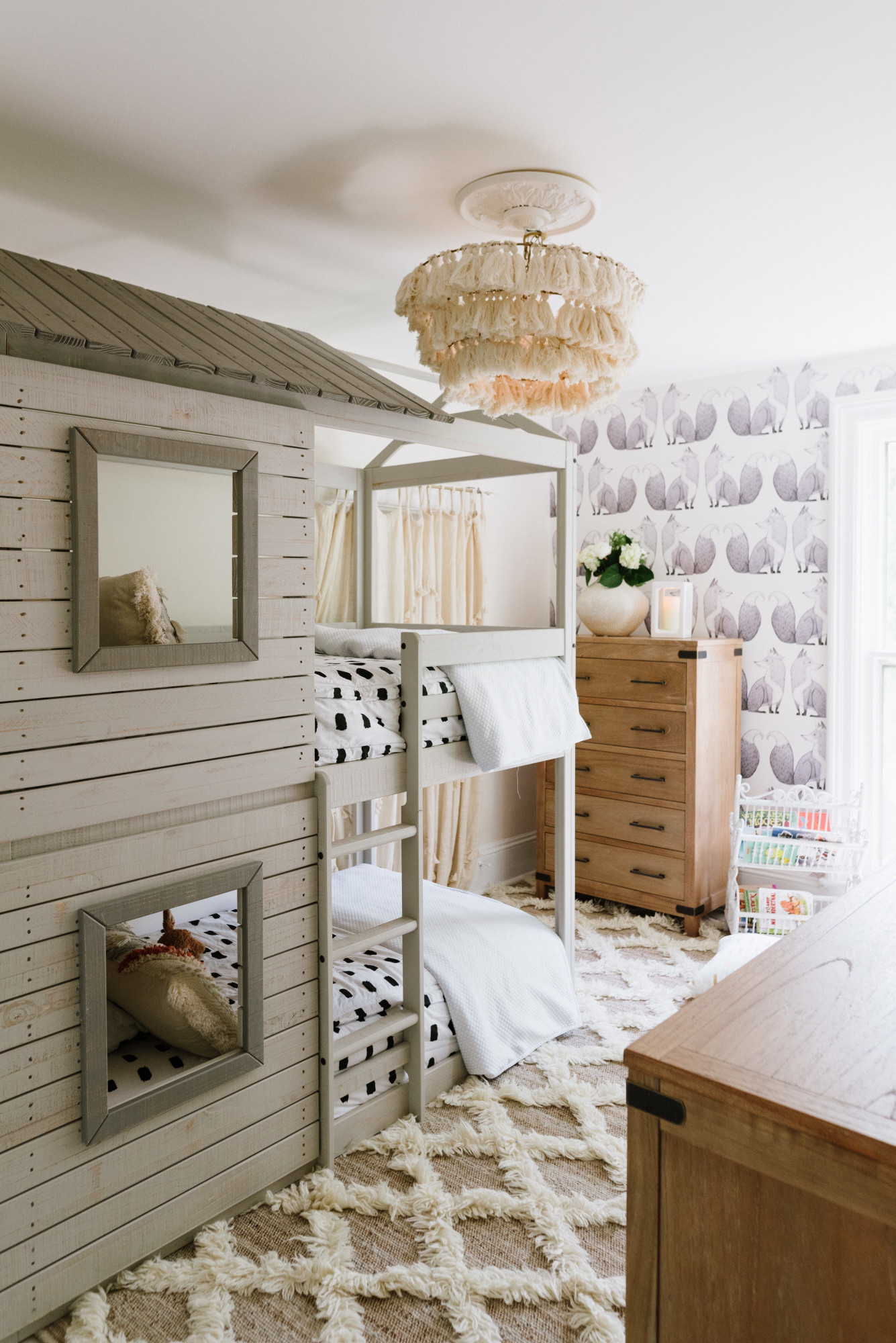
Their bedroom is actually one of the smaller rooms in the house but it is also one of the most charming since it is a vintage Jack and Jill style. It’s not your traditional Jack and Jill layout, it’s a bit more quirky and that’s why we love it! It is attached to their own bathroom which leads into one of the biggest rooms in the house, the playroom! We decided the smaller room was best utilized as the bedroom since I wanted it a calm, serene space free of tons of of toys. So since sleeping there, snuggling, reading stories, and getting dressed was about it, the size of the room worked perfectly!

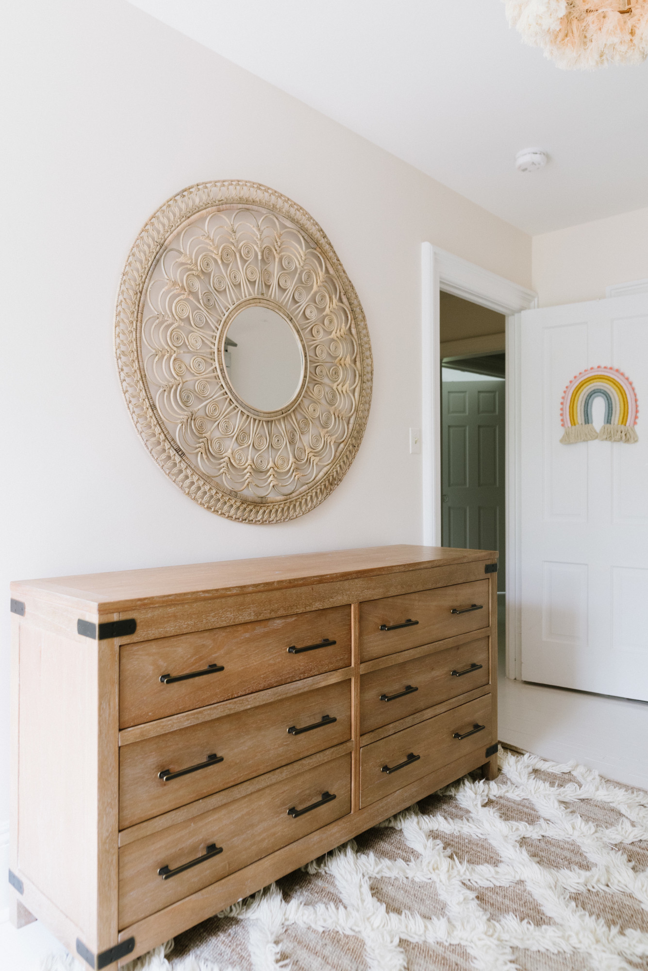
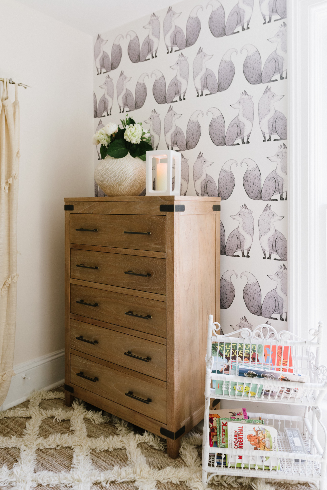
Speaking of getting dressed, when choosing the girls’ dressers I really wanted ones that would stand the test of time. That were both beautiful and strong, neutral yet striking, and that wouldn’t go out of style! I found just that in these Tremont dressers from Arhaus! They’re everything I described and more! I just love that they fit all the criteria and look stunning at the same time. They are SO well made and our girls adore them! Which is a good thing since they will have them forever! 😉

Dressers are from the Tremont collection by Arhaus.

Tremont Six Drawer dresser

Tremont Five Drawer dresser

Photos of our home taken by Sharon Hughes Photography

Seasons of Home Summer Home Tour

Summer is near!!


The weather finally broke and the sunshine is out!! Oh my word does that make me happy!! It has been a long winter to say the least, spring was a total mix of winter, (yes we got snow!), rain and slush. Regardless to say I am really excited that summer is near!
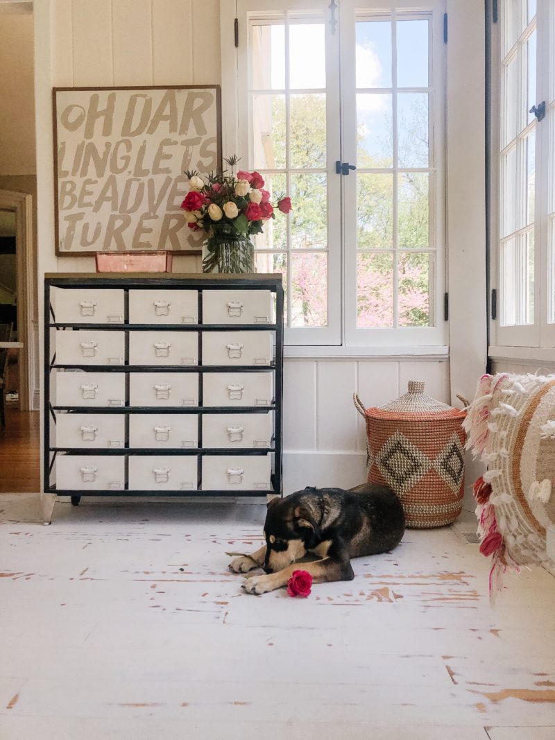
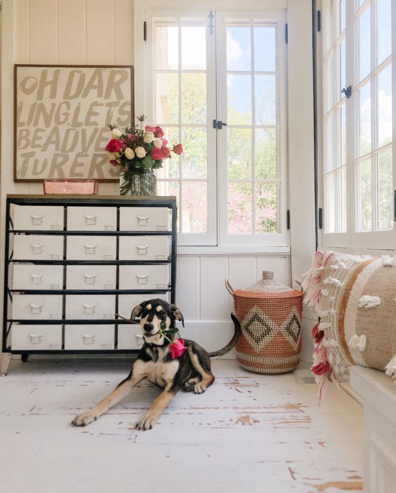
As many of you know we recently moved into our new home so I am even more excited for all the firsts here, summertime adventures being one of those things!


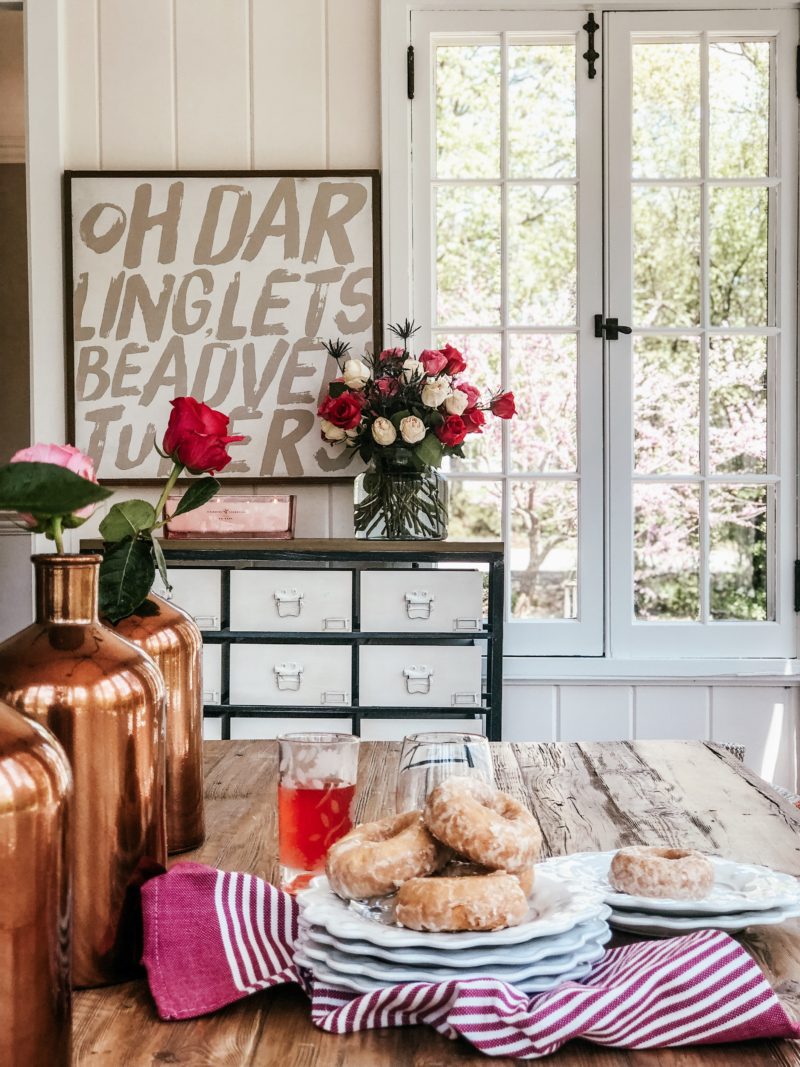
I love decorating for summer because for me, it is a lot simpler. I like things to feel very uncluttered, crisp and fresh. So simply adding new flowers to our home each week does just that! My favorite place to shop for flowers besides my own yard, is Trader Joe’s! They’re affordable and oh so pretty!

Although our Saturday mornings don’t always consist of donuts and lemonade these two things shout summer to me so I had to include them in this post! 🙂


Something else new to us this these past few months, our pup Reece! He is just four months old and filled with so much love, happiness and mischief. He fits in just perfectly around here! 😉

Make sure to hop on over to my lovely friends blogs below to check out how they’re getting ready for the warm months ahead! 👏🏻


Ella Claire | Zevy Joy | Boxwood Avenue | Home Stories A to Z

Rooms for Rent | My Sweet Savannah | Craftberry Bush | French Country Cottage

Kindred Vintage | Maison de Cinq

My Maya Bed from Arhaus

Hi beautiful friends,
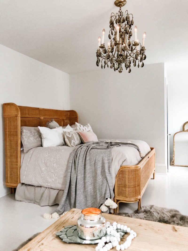
I wanted to visit the blog today to share with you details on this amazing Maya bed from Arhaus! It’s truly what dreams are made of!
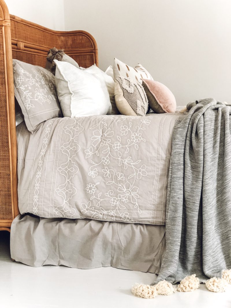
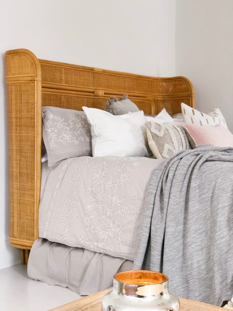
When shopping around for a bed for our new master I knew I wanted something that would make a big impact without being overwhelming. When I laid eyes on this bohemian inspired Maya bed it was exactly what I had envisioned and dreamt up for the space! A match made in Heaven!
In the past I’ve had all types of bed frames from upholstered, wooden to metal. Although I’ve loved them all I knew I wanted something unique and new to this home and master bedroom space. This bed checked all those categories for me! It has the warmth of bohemian rattan paired with the vintage frame of a sleigh bed, that curved frame is everything! I also adore the height of the headboard that is both striking yet elegant at the same time! The icing on the cake, the Maya bed super well made and sturdy, it’s truly the complete package! 
Here is a direct link to a bed that dreams are made out of! If you’re in the market for a new bed frame take it from me, you can’t go wrong with the Maya! 
Links to other Arhaus goodies in our master bedroom: